
It surprises me how often at work I see a deck with great content 😍, but horrible design 🤢. It's like wearing a custom tailored suit—except that it's covered in cat hair. How can you take them seriously? Why didn't they just use the lint roller before they left the house? Instead of being able to admire the suit, you're distracted by the cat hair. Same thing for presentation slides. Follow these super easy guidelines and I promise your slides will look amazing which will allow your message and content to shine.
This is a nearly perfect slide in my book. It's from BCG's report on pricing strategy for Consumer Packaged Goods (CPG).
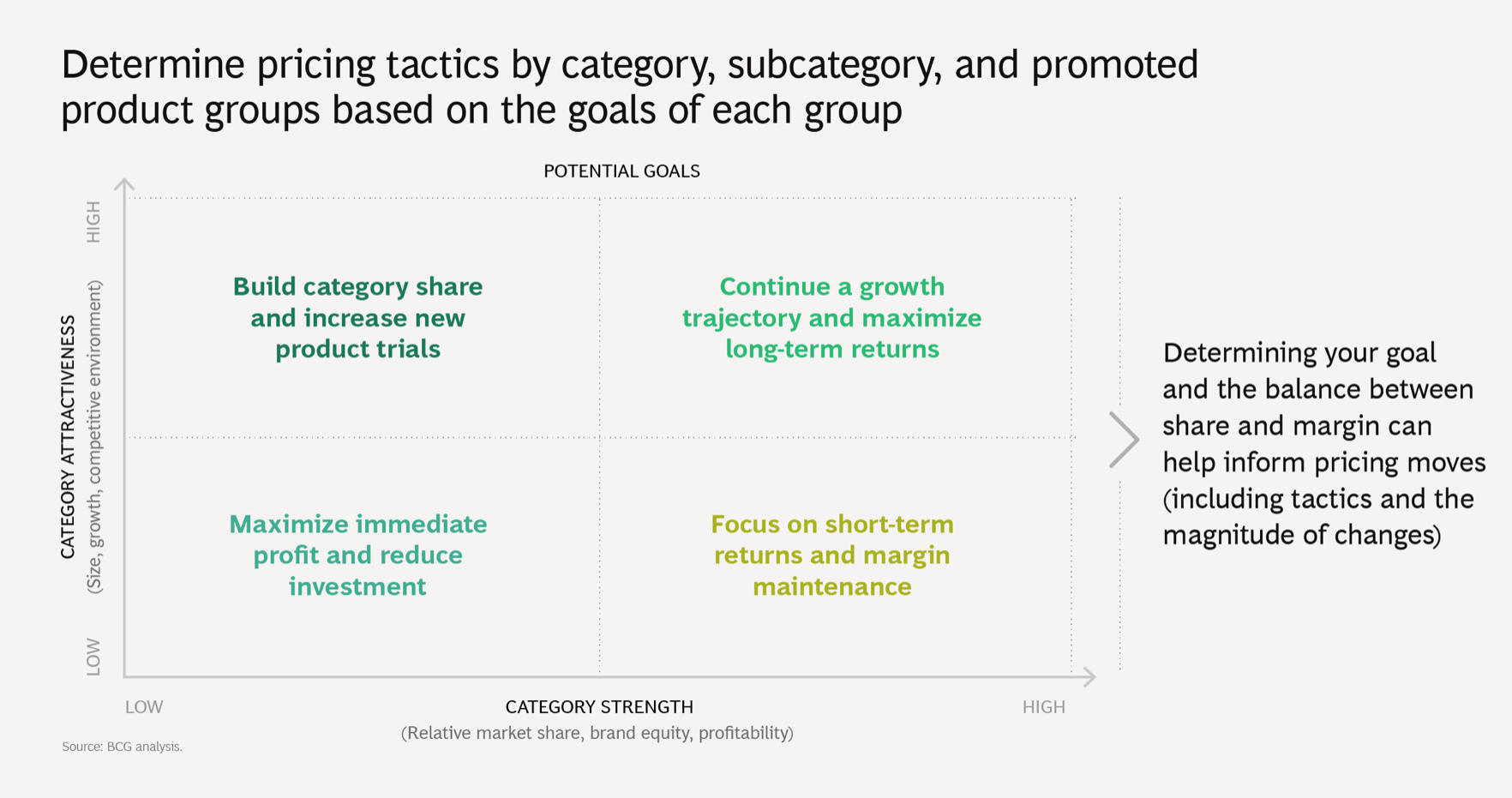
Let me explain why I absolutely ❤️ this slide's design:
- 📏 Alignment. Alignment is really underrated but is so important in making a slide. It provides the invisible structure that makes all the content on the slide work together. The text in the 2x2 matrix is perfectly center aligned within its column. The text on the right of the 2x2 matrix is perfectly vertically aligned with the middle of the chart and the greater than icon ">". The X and Y-axis labels are perfectly centered for their respective axes.
- 👯♀️ Consitency. Every headline on every slide is in the exact same place, in the exact same font, on exactly two lines. The "Source" at the bottom left of the page is consistent across every slide just like the headline. There is only one font being used on the page.
- 🎨 Colors. Colors are used strategically and not willy-nilly. Each quadrant of the 2x2 matrix has a different color because each goal is different depending on the "Category Attractiveness" or the "Category Strength." The colors are neutral here and just show that each quandrant has a different goal. It makes sense. If they had used a red color, that would suggest that that quadrant has a bad goal since red means bad.
- 🖼 Borders. Notice that there is a border around the slide where content does not appear. There isn't any text or images that go on the border. Having text too close to the edge means that the invisible border has been violated and this makes the slide look less professional. Of course, there are presentations that can have images that are bleeding off the slide (meaning the image falls off the edge of the slide) and that is totally fine if it is a deliberate decision. But, I find that it's best to keep things simple in everyday business presentations (not pitch decks which tend to be more creative and flashy).
- 💆♀️ White space. The content can breathe. Your eyes naturally go from the headline, to the chart, to the takeaway to the right of the chart. There's white space above and below the takeaway giving the content room. White space helps the reader from getting fatigued and lost in too much clutter and content. Think Apple store versus thrift shop. White space isn't just okay, it's good! Use it more strategically!
- 🧘 Balance. The slide features one chart and it's a simple 2x2 matrix (every MBAs favorite kind of chart!). I love slides that feature one really good chart with a great "so what" or takeaway. Adding a second chart on this slide would have thrown off the balance and made the slide more cluttered. Adding more text to the slide is unnecessary because there's already a lot to digest with the chart.
- 😌 Simplicity. Simple is actually very hard. It probably took many rounds of revisions and iterations to get to the final slide that we're looking at. This slide is simple and concise. It's always tempting to put more content onto a slide. It's hard to edit content from a slide because editing is often harder than the initial creation. It's hard to throw away what you put hard work into creating, but that's often what is needed in order to simplify a slide.
- 🦄 Text differentiation. This one is really subtle but once you see it, you'll always notice it. Sentences on the slide have normal sentence casing (capitalize first letter of every sentence). When it comes to the chart, text elements have special all caps casing: the X and Y-axis category names ("CATEGORY STRENGTH), the category lavels ("LOW, " HIGH"). On the best slides, charts and tables usually are differentiated from the general text on the slide so that it is clear to the user that the text belongs to the chart. In my own work, I use Georgia for sentences and Calibi for everything on a chart or in a table (thanks Abbott for getting me into this habit).
So to recap, if you follow my 8 simple reccos, you will never have to worry about "making your slides look pretty," because they will be gorgeous.
Tom's Slide Design Checklist:
✅ Alignment
✅ Consistency
✅ Colors
✅ Borders
✅ White Space
✅ Balance
✅ Simplicity
✅ Text Differentiation
👨🎓 Congrats! You're now a designer. Now get out there and make some mothertucking good slides!