
A few days ago, I offered to redesign one of James' periodontics presentations. Academic presentations can be pretty boring, maybe even worse in academic medicine. James told me he wanted to make this presentation "fun" and "high energy."
Challenge accepted. 💪
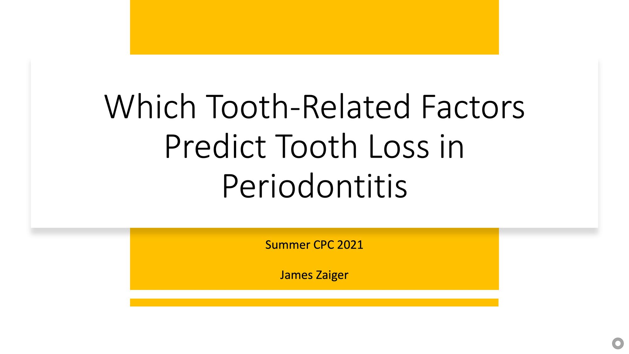
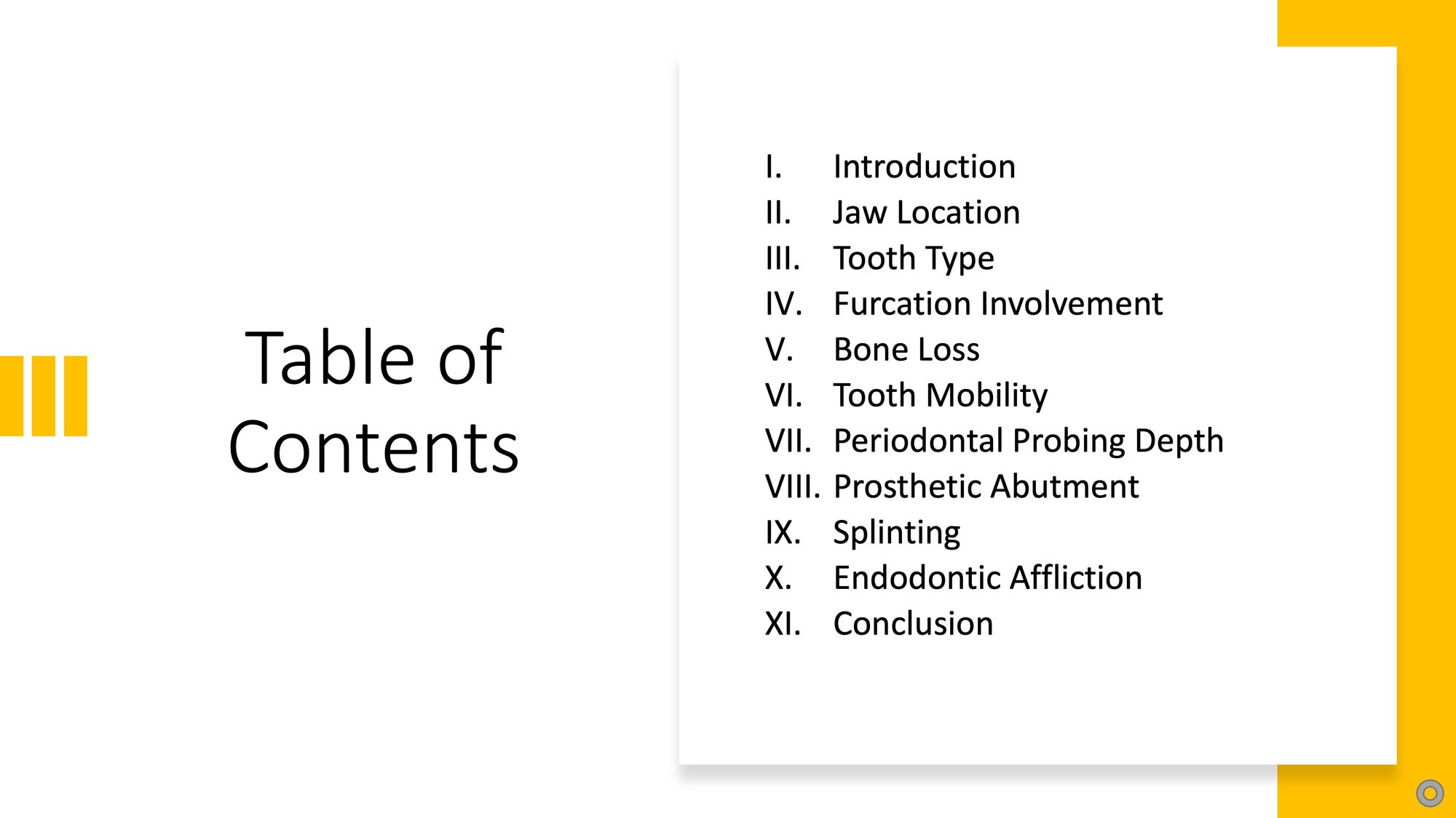
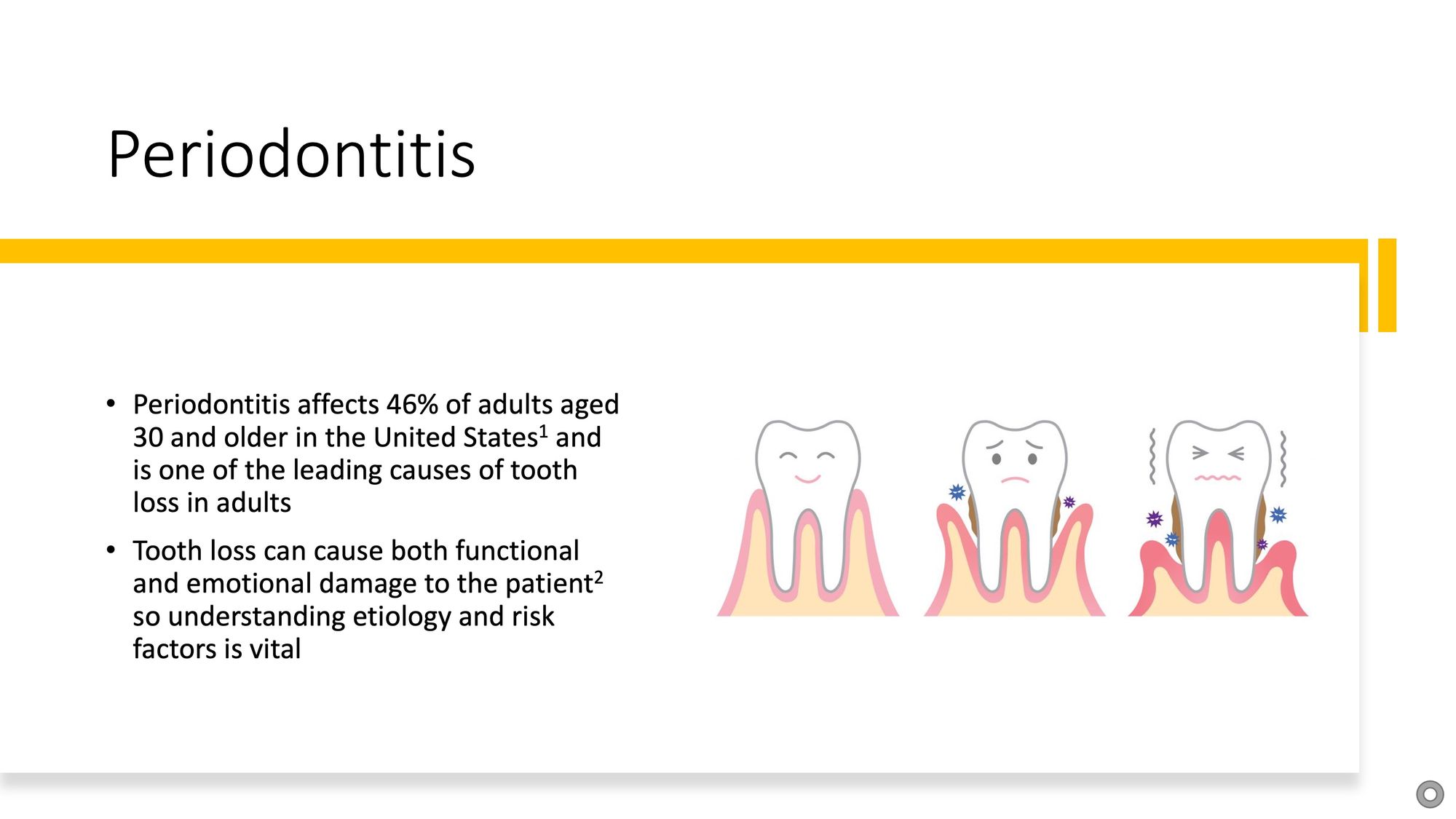
Here are the first three slides of the original presentation:
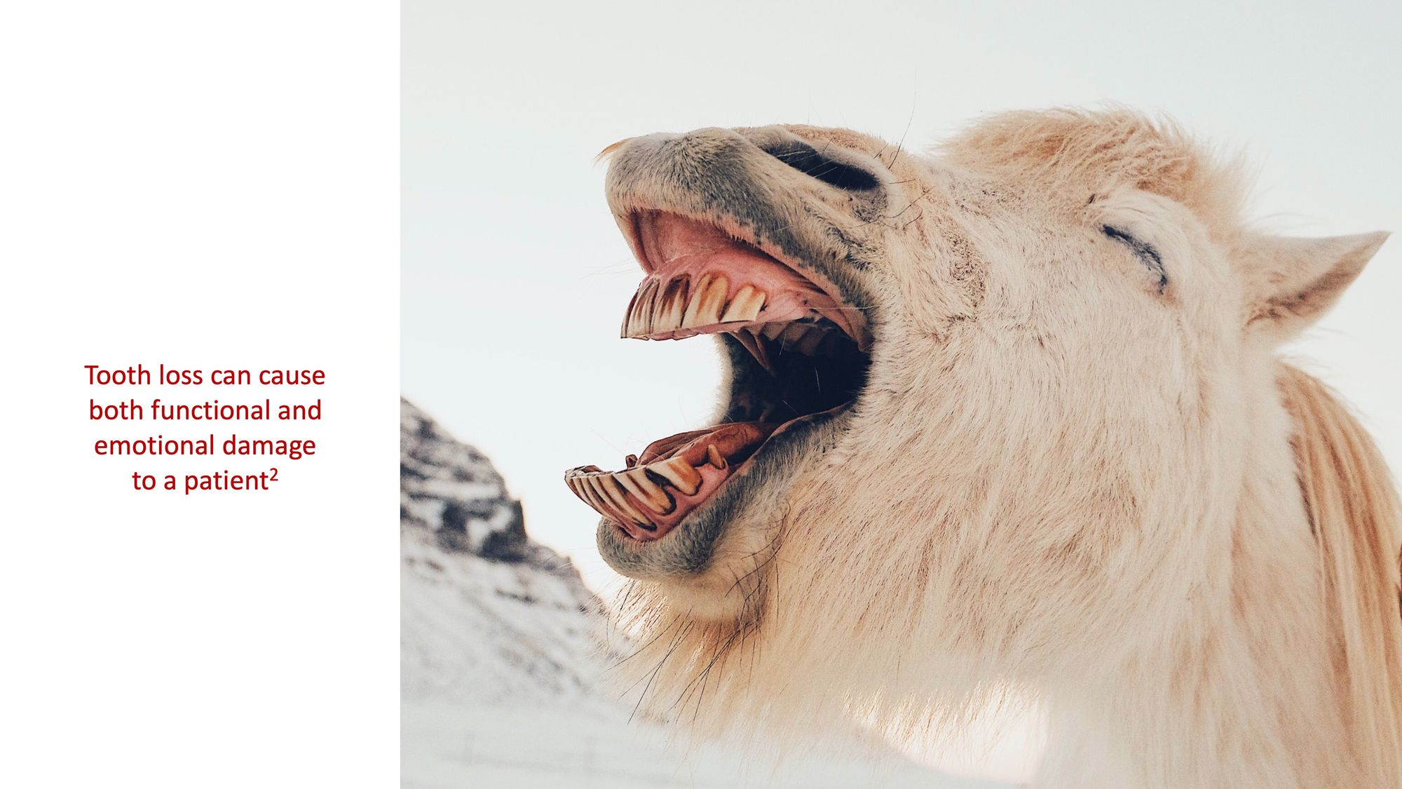
Here's the redesign:

What's the problem?
I tried to make the redesign more visual with stunning imagery and minimum I've-seen-that-a-million-times-before cutesy teeth illustrations. I was trying to minimize the use of bullet points so that the focus would shift from the slides themselves to James and his message. Yeah, I'll admit that the last slide with the yawning goat with the text about patient emotional damage wasn't the best choice 🤷♂️. It's funny that the incongruence didn't even occur to me until James pointed it out (also a reason it's always good to have someone look over your drafts!).
The problem was that I totally misunderstood the brief. This was actually supposed to be a very serious presentation to faculty and classmates in the context of a small group seminar. The "fun" and "high energy" was actually supposed to be for a different presentation about "What is Periodontics" designed for current dental students.
Stay tuned for the next iteration!