

Hey there, fellow PowerPoint enthusiasts! I know you're here because you're on a quest to find the perfect font for your presentation. Well, you're in luck. I've done the legwork and I'm here to share with you the best PowerPoint fonts that'll make your slides stand out.
Understanding Font Families
Before we dive into the specifics, let's talk about the four main font families: Serif, Sans Serif, Script, and Decorative. Serif fonts, like Times New Roman, have little strokes at the ends of the letters, while Sans Serif fonts, like Arial, do not. Script fonts mimic handwriting, and Decorative fonts are for when you're feeling a bit fancy and want to make a statement.
My Top 10 Fonts for PowerPoint
Ready for the good stuff? Here are my top 10 picks for PowerPoint fonts:
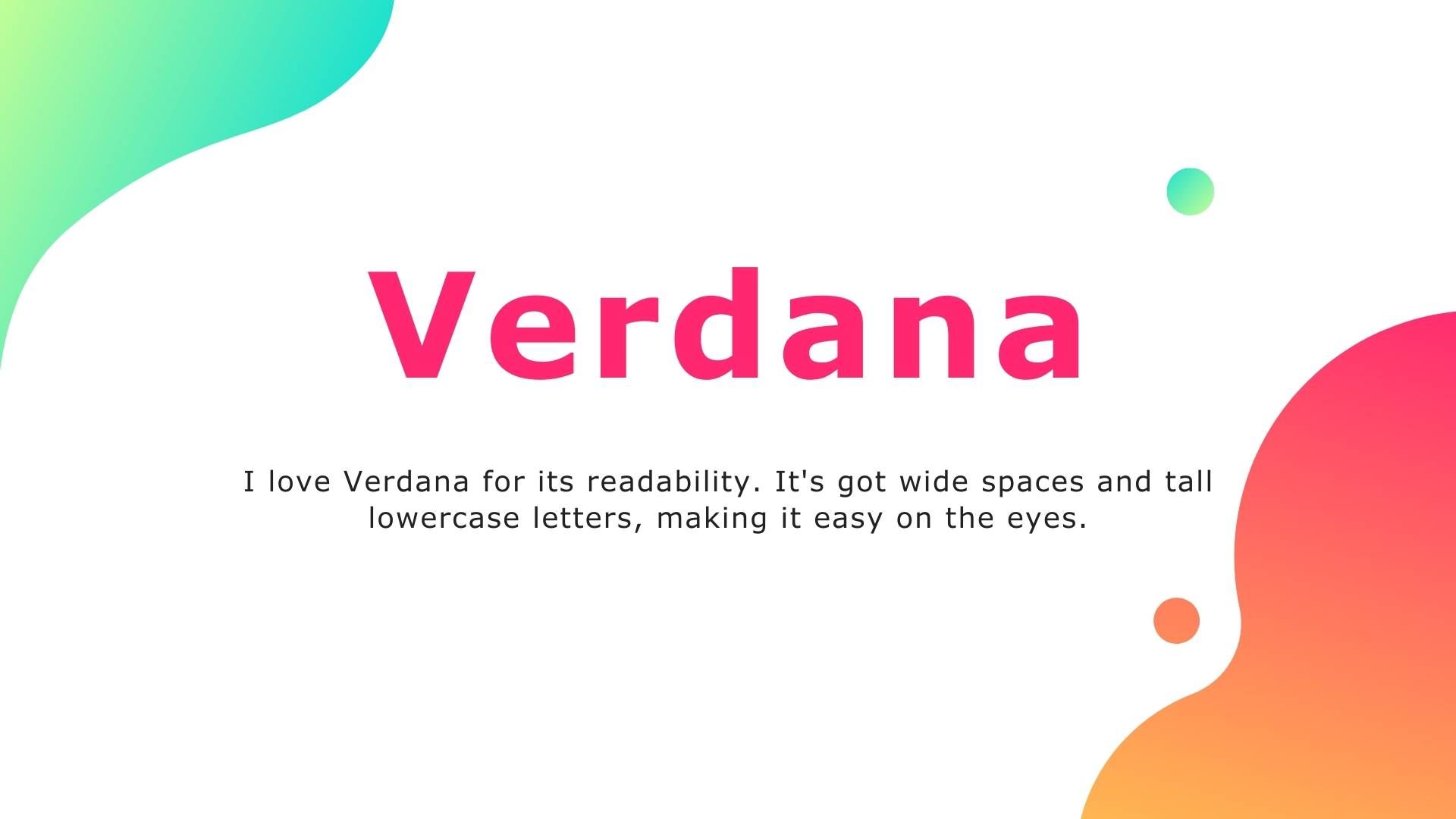
- Verdana: I love Verdana for its readability. It's got wide spaces and tall lowercase letters, making it easy on the eyes.
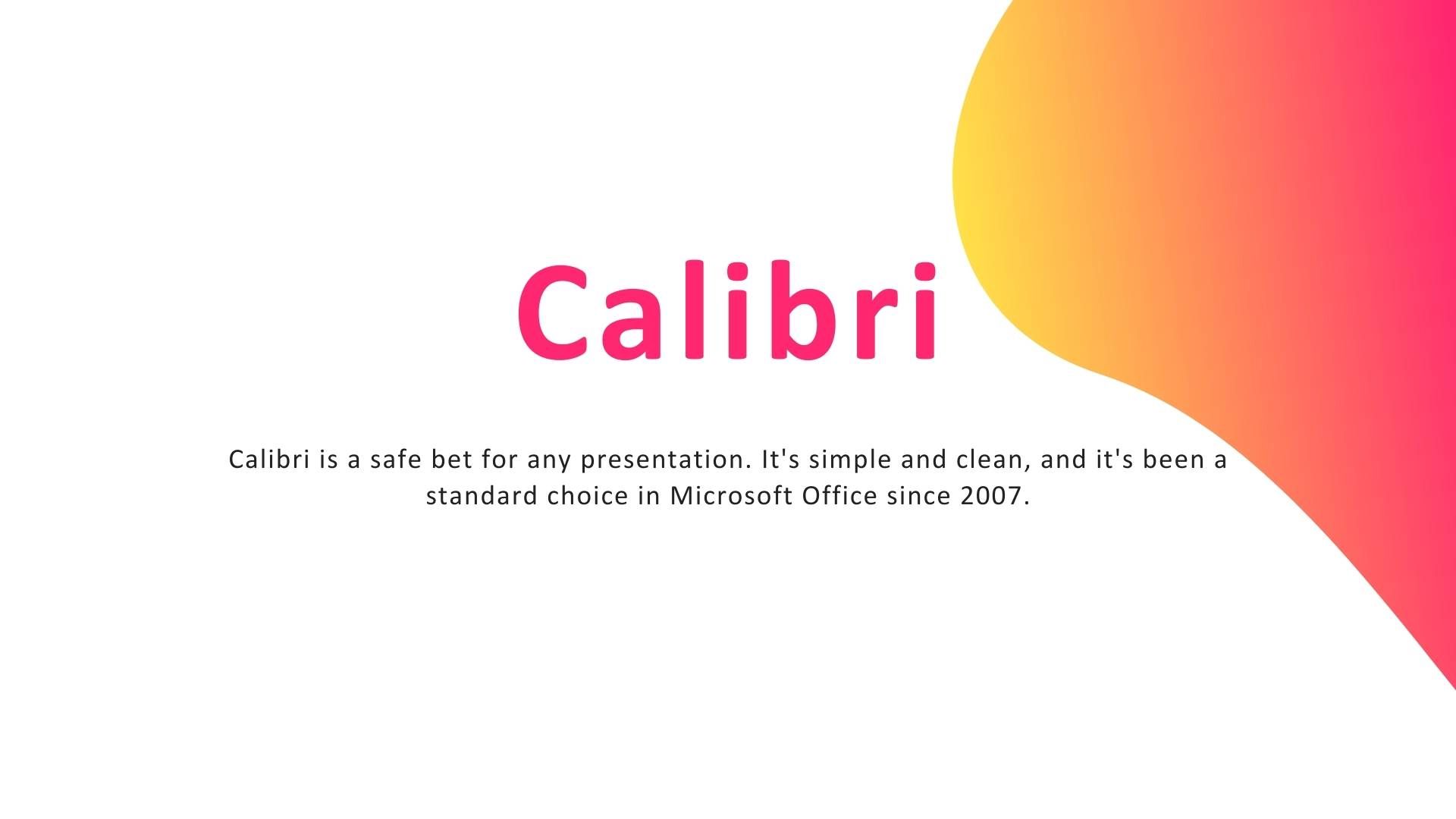
- Calibri: Calibri is a safe bet for any presentation. It's simple and clean, and it's been a standard choice in Microsoft Office since 2007.
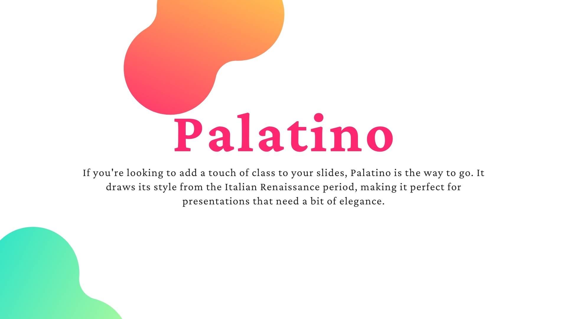
- Palatino: If you're looking to add a touch of class to your slides, Palatino is the way to go. It draws its style from the Italian Renaissance period, making it perfect for presentations that need a bit of elegance.
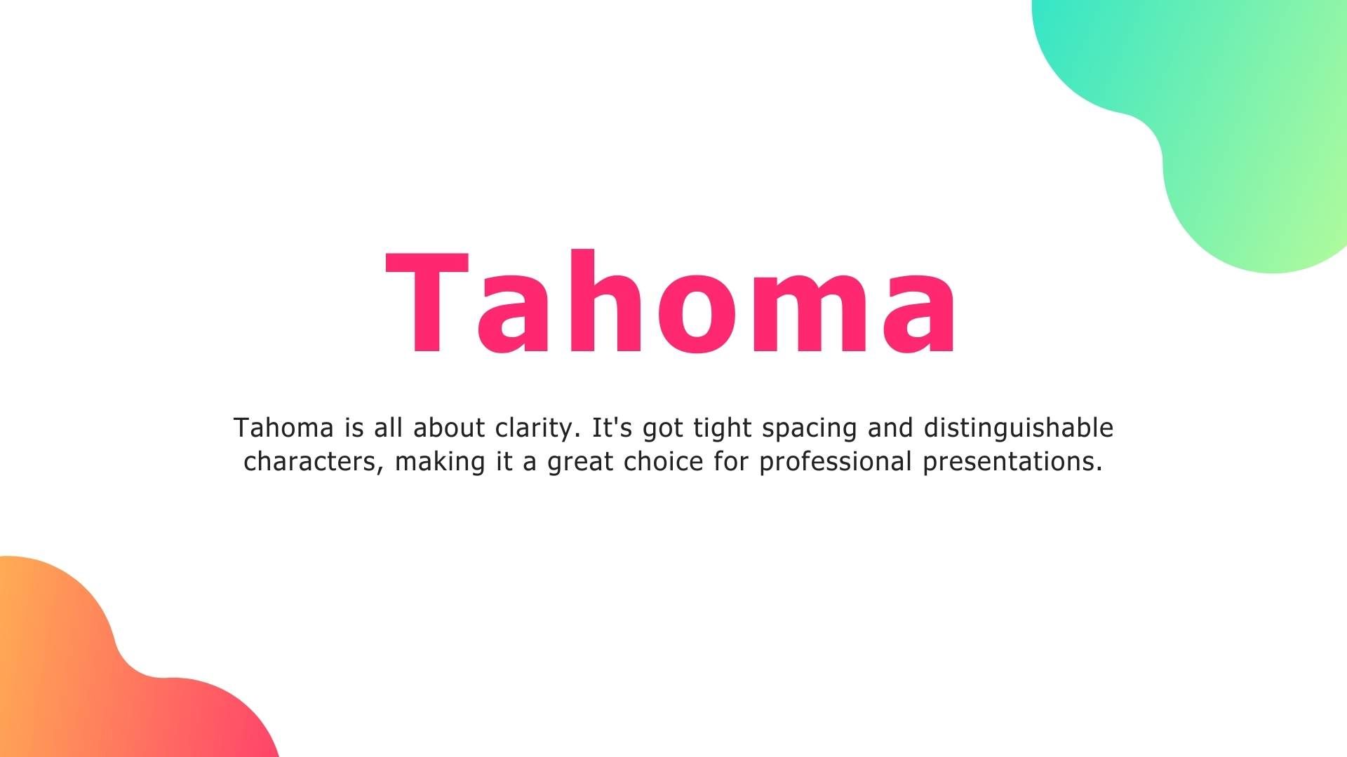
- Tahoma: Tahoma is all about clarity. It's got tight spacing and distinguishable characters, making it a great choice for professional presentations.
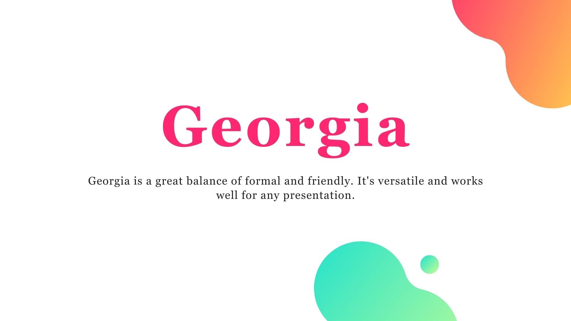
- Georgia: Georgia is a great balance of formal and friendly. It's versatile and works well for any presentation.
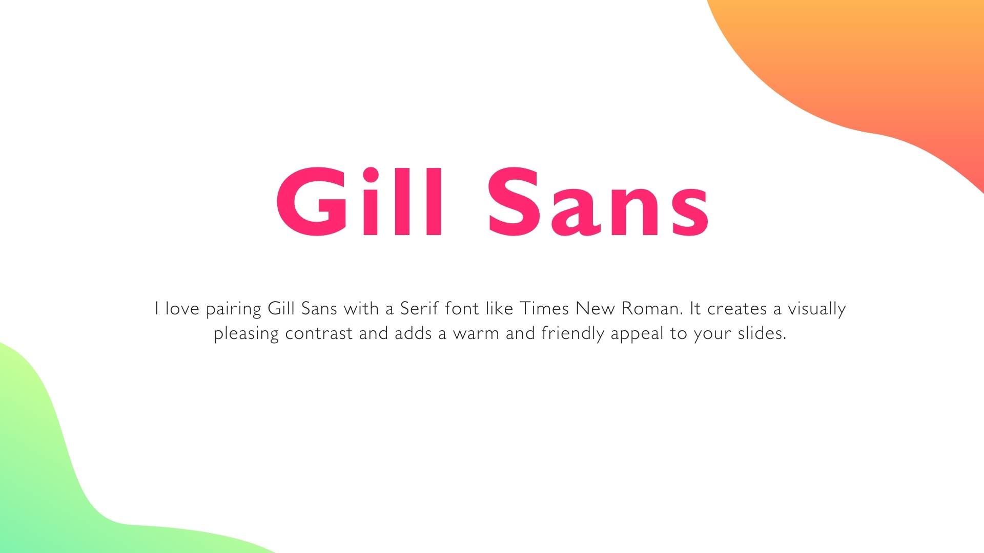
- Gill Sans: I love pairing Gill Sans with a Serif font like Times New Roman. It creates a visually pleasing contrast and adds a warm and friendly appeal to your slides.
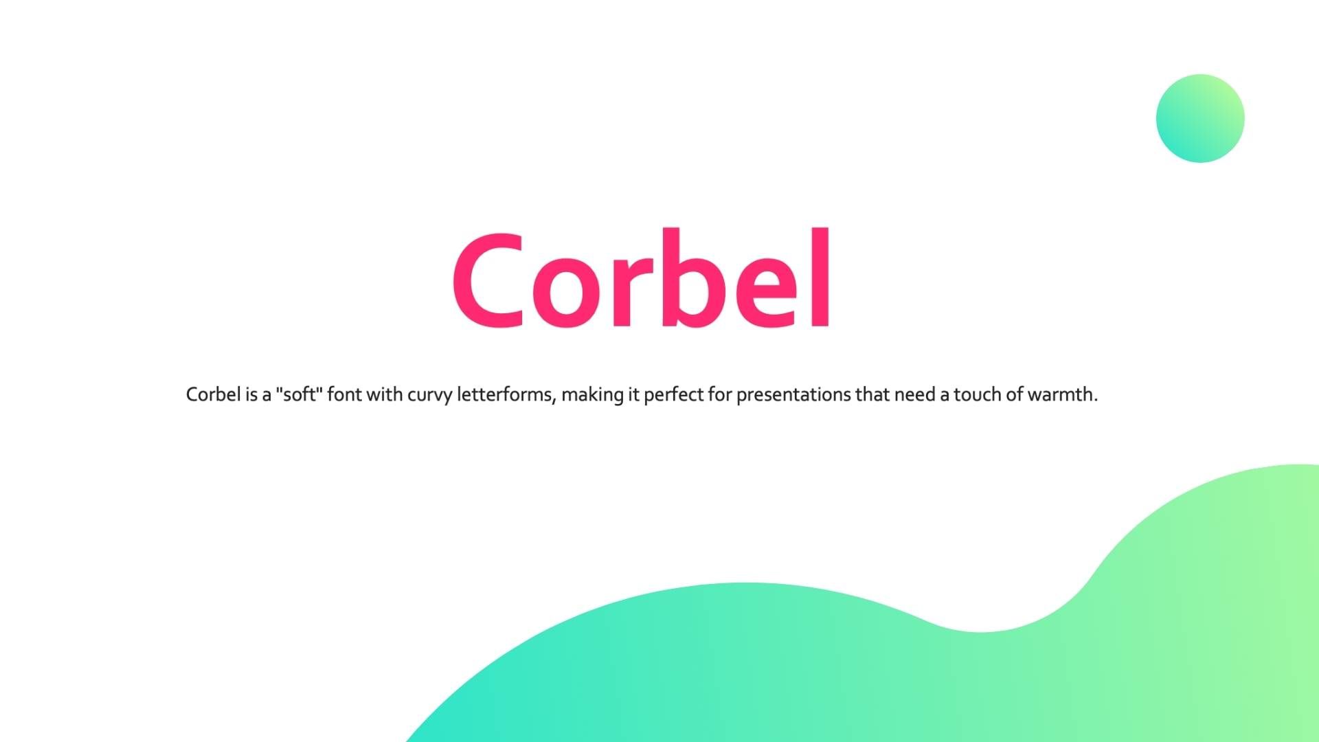
- Corbel: Corbel is a "soft" font with curvy letterforms, making it perfect for presentations that need a touch of warmth.
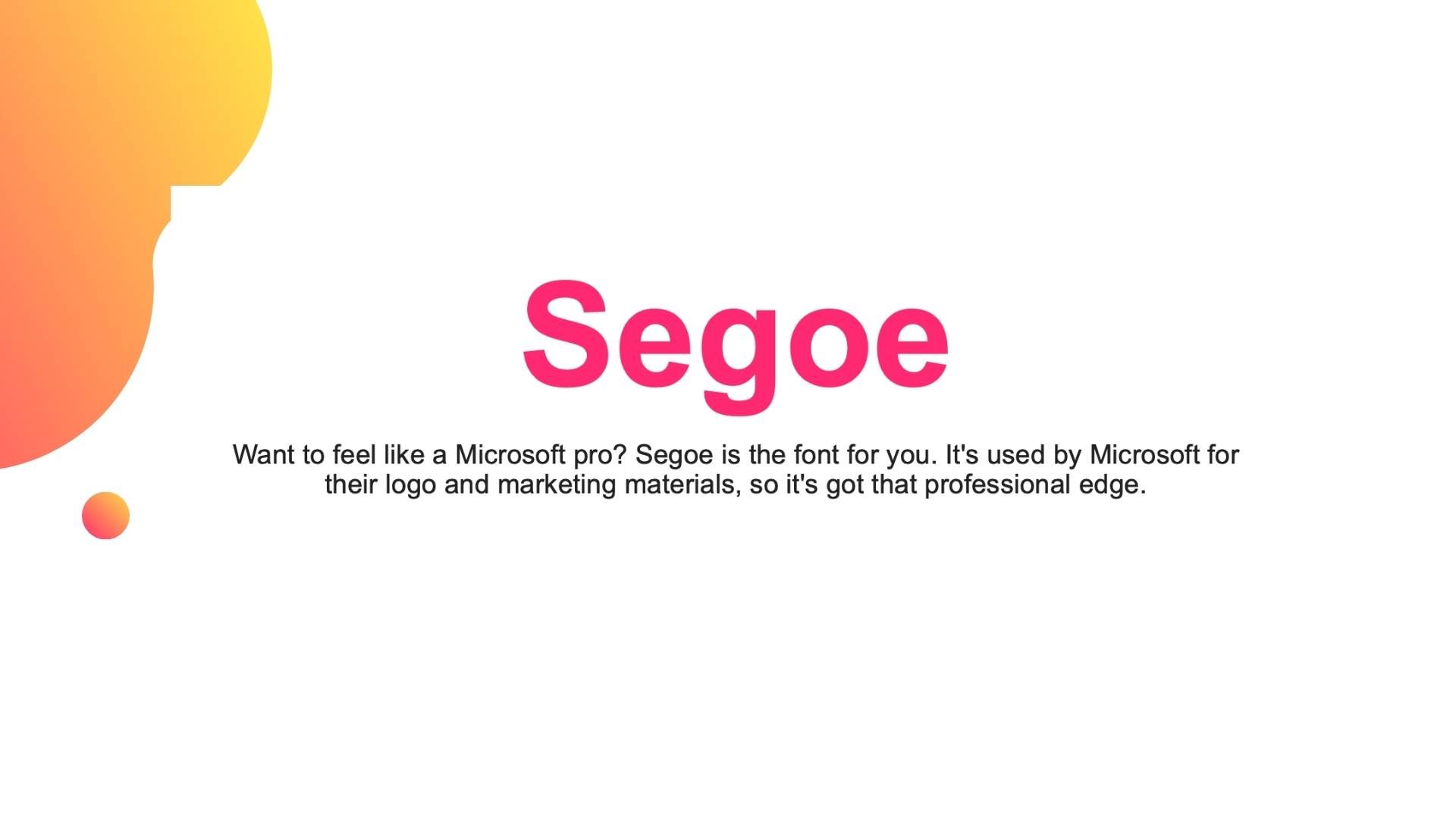
- Segoe: Want to feel like a Microsoft pro? Segoe is the font for you. It's used by Microsoft for their logo and marketing materials, so it's got that professional edge.
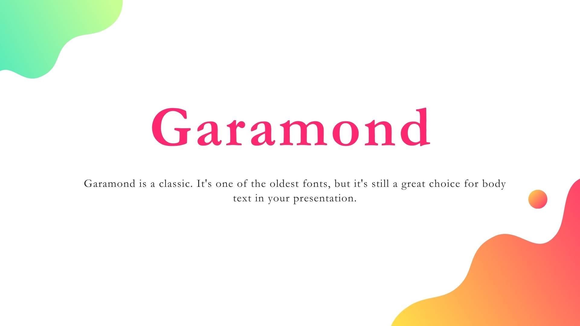
- Garamond: Garamond is a classic. It's one of the oldest fonts, but it's still a great choice for body text in your presentation.
- Century Gothic: Century Gothic is a geometric font that's great for making a bold statement. It's especially useful in advertising, such as headlines, display work, and small quantities of text.
Tips for Choosing Fonts
Now that you're armed with a list of top-notch fonts, here are some tips I've picked up along the way when choosing the perfect one for your presentation:
- Stick to Standard Fonts: They're standard for a reason. They're familiar and easy to read. You can't go wrong with classics like Calibri, Tahoma, Gill Sans, and Garamond.
- Contrast is Key: Make sure your font stands out against your slide background. You want your audience to focus on your message, not strain their eyes trying to read it.
- Pair Wisely: Pairing fonts can create a nice visual hierarchy in your presentation. Try pairing a Serif font with a Sans Serif font for a balanced look.
- Size Matters: Make sure your font is large enough to be easily read. Remember, your audience should be able to read your slides from anywhere in the room.
- Keep it Simple: Avoid overly decorative fonts that can be hard to read. You want your audience to focus on your message, not get distracted by fancy fonts.
- Consistency is Crucial: Keep your font choices consistent throughout your presentation. It not only looks more professional, but it also makes your presentation easier to follow.
Wrapping Up
Choosing the right font for your PowerPoint presentation can make a world of difference. It's not just about aesthetics but also about readability and effectiveness. So go ahead, experiment with different fonts, and find the one that best suits your presentation style. Remember, at the end of the day, your goal is to communicate your message effectively, and the right font can help you do just that.
And hey, if you've got any font-related tips or tricks up your sleeve, I'd love to hear them! Sharing is caring, after all. Happy presenting, folks!
And before you go, why not check out some of our other articles on presentation skills? Whether you're a PowerPoint newbie or a seasoned pro, there's always something new to learn. Happy presenting!