
How do you improve a classic? Can it be improved? The answer is "yes." We've learned a lot in the last 180 years since the creation of this chart which was incredible for its time and pioneering in its use of data.
What's the significance of Nightingale's Rose Chart?
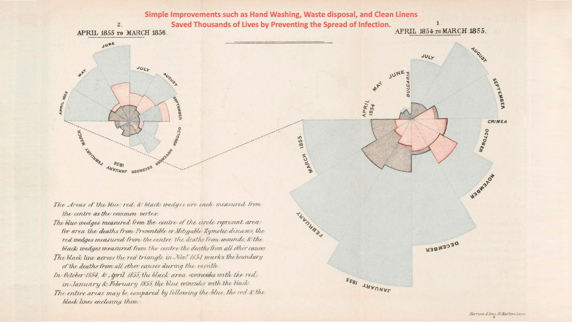
Florence Nightingale's mortality rose chart, pictured above, is an important tool for understanding the impact of diseases and mortality rates in the 19th century. It is a graphical representation of the deaths that occurred during the Crimean War of 1854-1856, during the time Nightingale served as a nurse.
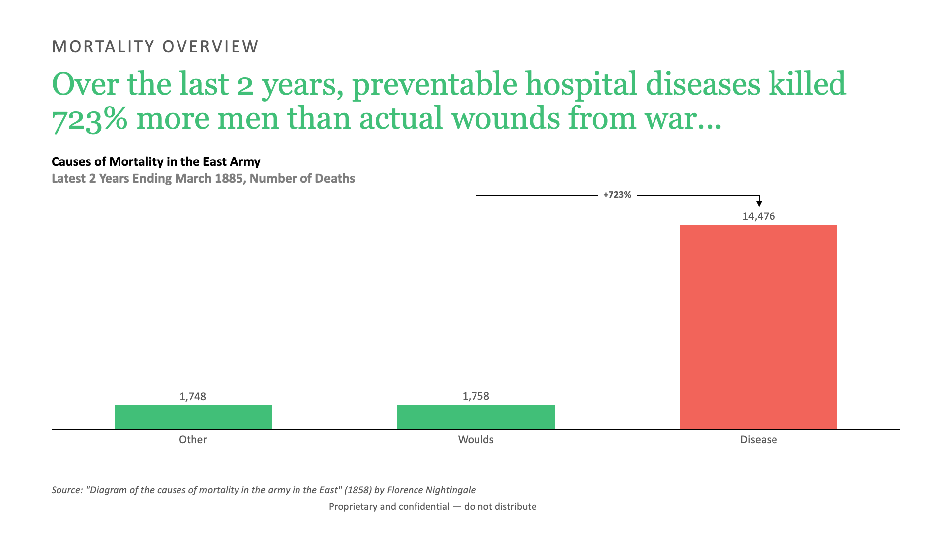
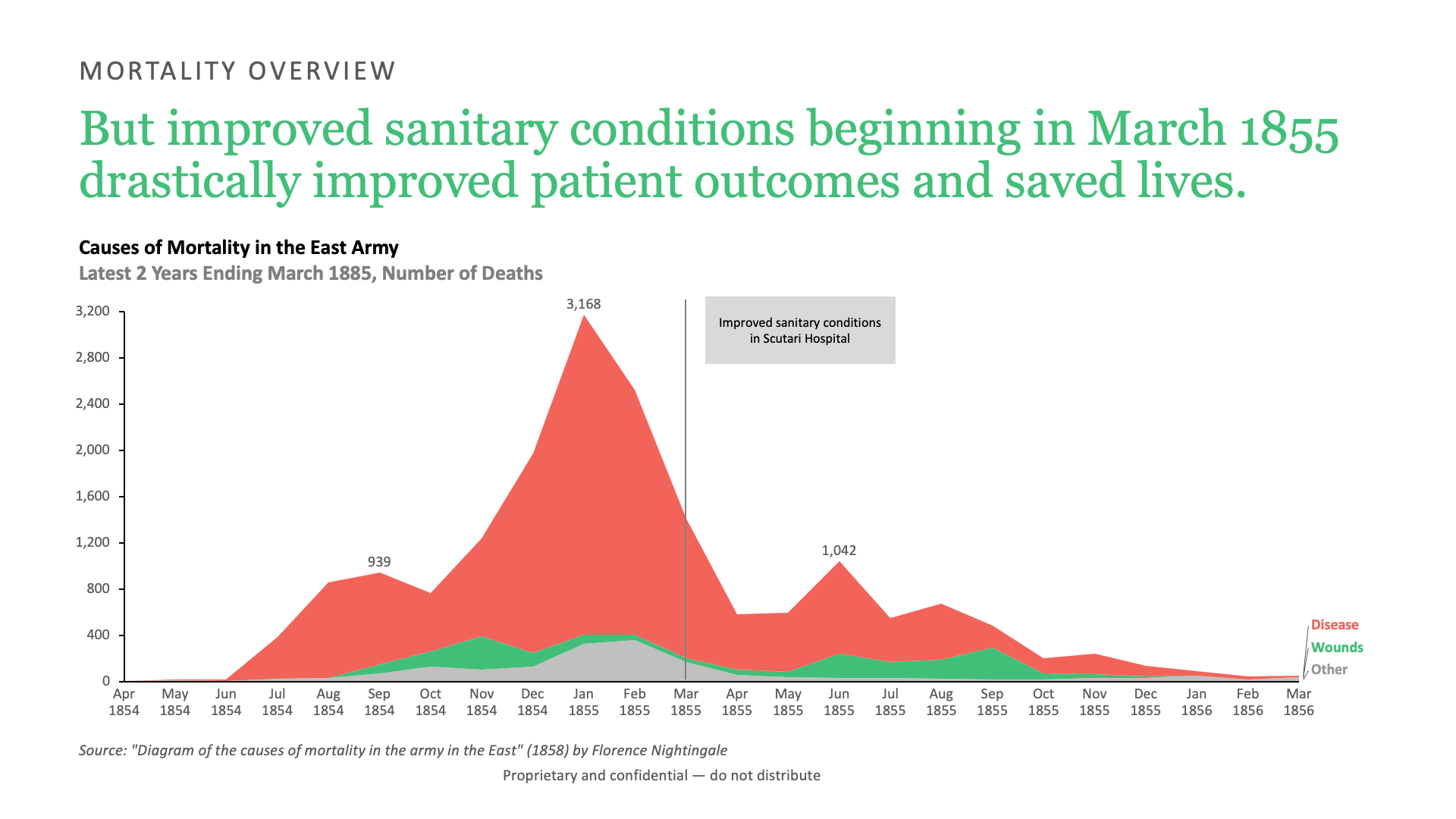
The rose displays a series of wedges that vary in size according to the number of deaths from specific causes, such as wounds, infections, and diseases. By analyzing the chart, Nightingale was able to show that poor sanitary conditions and lack of proper medical care were major factors in the high mortality rates of soldiers during the war. More soldiers died from preventable diseases than from wounds from war.
The significance of this chart historically is its ability to convey complex information in a clear and concise manner. It helped to illustrate the importance of hygiene and sanitation in reducing mortality rates, leading to significant improvements in healthcare practices.
Nightingale's use of data visualization in the mortality rose chart is considered a pioneering example of modern data science, and her work influenced the development of the field of medical statistics.
Overall, the mortality rose chart is an important historical artifact that continues to inspire advancements in healthcare and data analysis. It serves as a powerful reminder of the importance of evidence-based practices and the impact that data visualization can have on shaping our understanding of the world around us.
What can be improved?
Looking at the chart through the eyes of someone living in 2023, there are a few areas of opportunity that immediately stand out.
- Chart orientation. People read left to right, but the chart's data begins on the right and then moves to the left. The first date is April 1854, which you would expect to begin in the top left and continue on the right. Instead, it is the opposite.
- Message clarity. The chart is gorgeous. The colors, the shape, the text elements. However, it does not clearly convey the message. The reader has to really work hard to figure out what is going on. Instead of describing the chart "Diagram of the Causes of Mortality," this space could be used to make a point.
- Too much text. There's a lot to read in the bottom left. But it could be simplified with a legend that explains what each color means. It would be even better to work within existing conventions so that less explanation is required.
- Chart selection. In my presentation design workshop for college students, I make the argument that the humble bar and line chart is all you need for 80%+ of impactful data visualizations. These chart types were invented 100 years before Nightingale's famous rose chart.
Nightingale's rose chart in 2023
Working through each point outlined above, here's what the reimagined chart would look like.
Conclusion
I like how the updated charts turned out, and I hope Florence Nightingale would agree!
If there were only one thing I could change about her original chart, it would be updating the title to make a point instead of making the reader work so hard for it.