

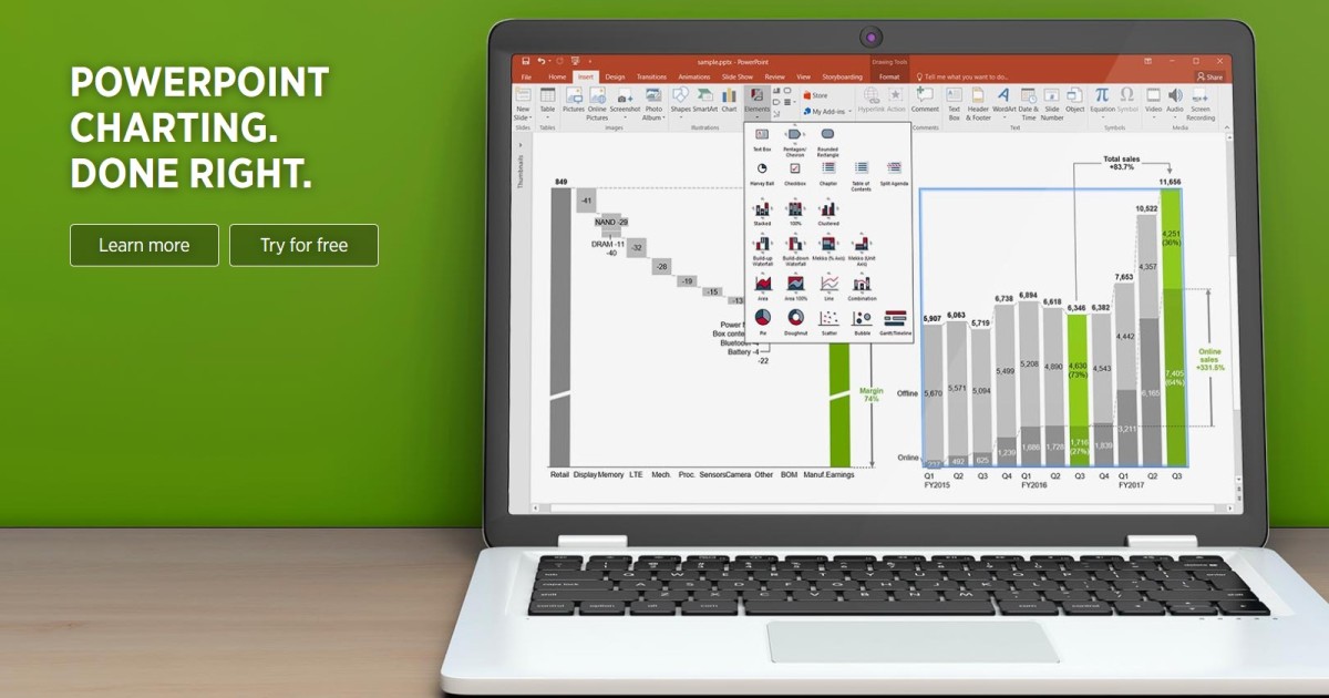
Do you spend a lot of time making charts and graphs in PowerPoint? I know I do, and there is one tool that I could not live without—Think Cell.
Think Cell 📈📉📊
As an associate brand manager by day, I'm always working in PowerPoint and trying to make sense of data by building lots of charts and graphs. I rely heavily on Think Cell and wouldn't be as productive without it. However, if you only occasionally need to create charts, Think Cell will be overkill, and you can probably do with just the native charting features built into PowerPoint.
Think Cell is like having a full-fledged DSLR camera versus an iPhone camera. Of course, it's a lot harder to learn, but there are some key features and capabilities that you can't live without once you've made the change.
Overall I would give Think Cell a 5/5. It's an add-in that improves my productivity in PowerPoint and helps me create professional, beautiful charts.
Key Features
- Easy to create a new Think Cell chart
- Quickly add key details to the chart (CAGR arrows, difference arrows, labels, etc.) with just a few clicks.
- Build very advanced charts beyond what is available in the native charting tool in PowerPoint. The two chart types available in Think Cell and not in PowerPoint are Gantt charts and Mekko charts.
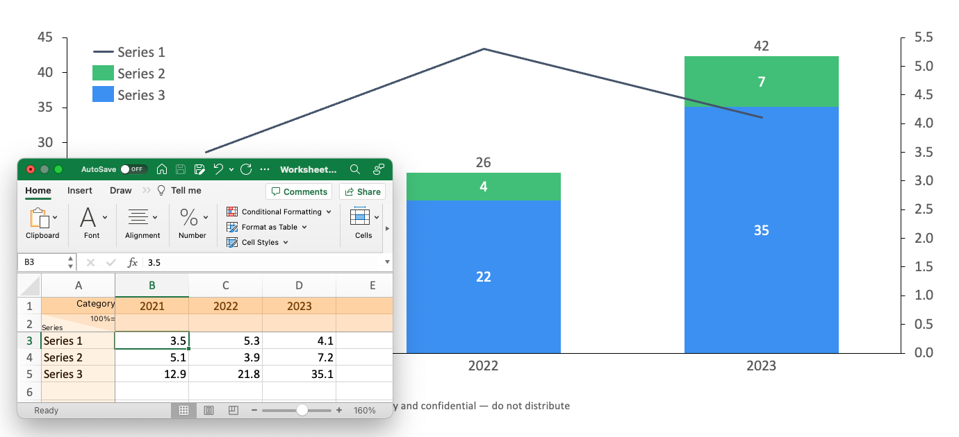
- Connects to Excel for data linking and automation; this saves time and reduces errors when creating charts that rely on Excel data from a .xlsx file.
- It seamlessly integrates into PowerPoint and is compatible with Windows and Mac systems.
User Experience
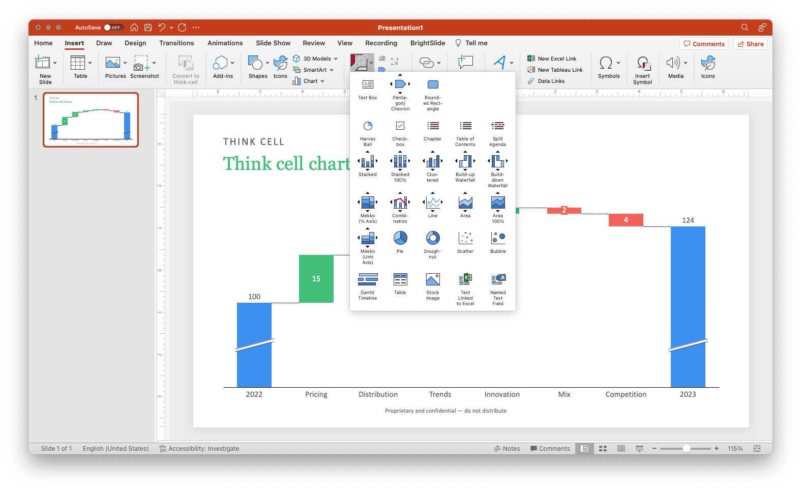
- Think Cell lives in the Insert tab of the PowerPoint ribbon and is very easy to navigate to
- There's a learning curve if you are used to building charts with native PowerPoint charting tools.
- After selecting a chart type from the menu, it will be dropped onto the slide and open up an excel sheet that is easy to follow and understand; you can see if the rows or columns should be categories or periods.
- It's designed for maximum productivity, so while a little harder to learn, you can do more with fewer clicks once you've gotten used to it.
What I Like/Dislike
Like 👍
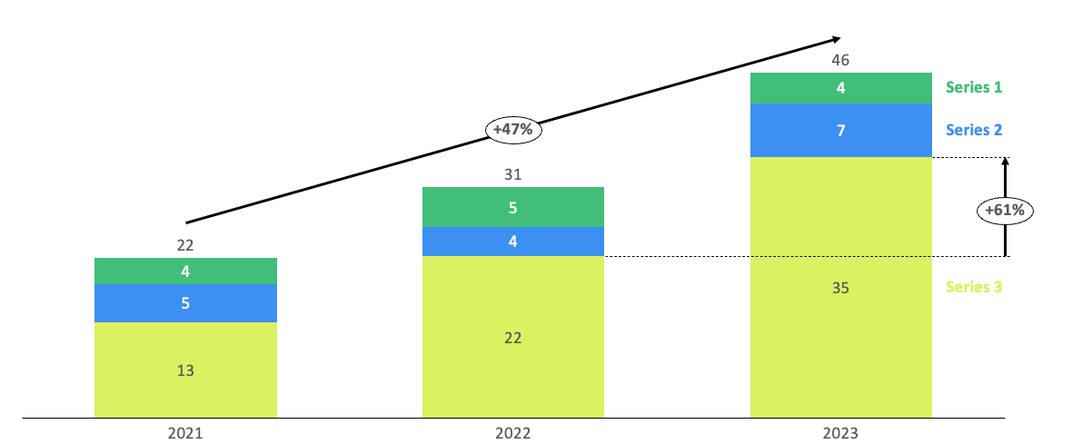
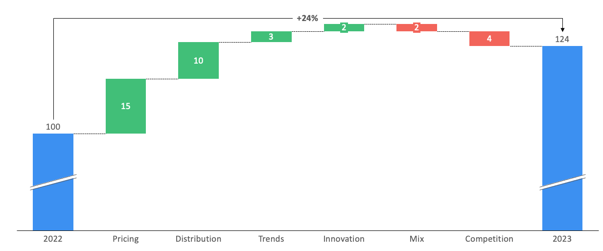
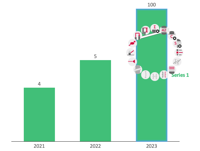
- Chart decorations. It is so easy to add what Think Cell calls chart decorations: the labels, arrows, data callouts, etc. These details make it much easier for the audience to understand the data quickly.
- Waterfall charts are so easy to create and customize. I love waterfall charts. My team loves waterfall charts. Abbott loves waterfall charts. There's no easier way that I've found to make custom waterfall charts.
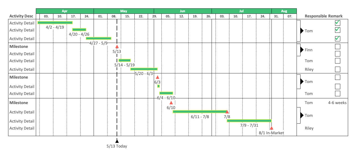
- Gantt charts. If you are managing projects or have to build timelines, then Gantt charts are your best friend. I love Think Cell's Gantt chart.
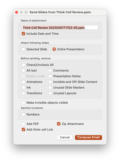
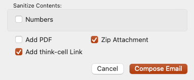
- Send individual slides. This is a feature I use almost daily. It allows you to choose a few slides to share with colleagues and timestamps the exported PPTX and PDF file so you know when it was created. I also love all the options to eliminate comments and presentation notes; I don't want people to see that.
- Advanced charts. Two kinds of Mekko charts are included: a % Axis and a Unit Axis. Unfortunately, I don't even know how to make a Mekko chart any other way other than Think Cell.
- Easily rotate the axis. Another great feature is how easy it is to turn the chart so that the X-axis is top/bottom/left/right. I sometimes use this feature for spacing reasons (more categories can fit horizontally than vertically) or to show negative numbers.
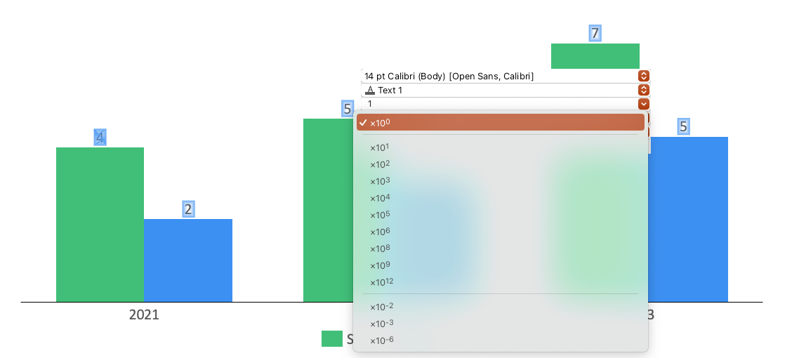
- Ease of changing display units. Easily the most underrated feature. I use this every single day. Sometimes numbers are in the $100,000,000s, and with one click, it becomes much easier to read $10M.
- Compatibility. I can still share slides even if the person receiving the PowerPoint file doesn't have Think Cell. It usually works, and the receiver can see the charts.
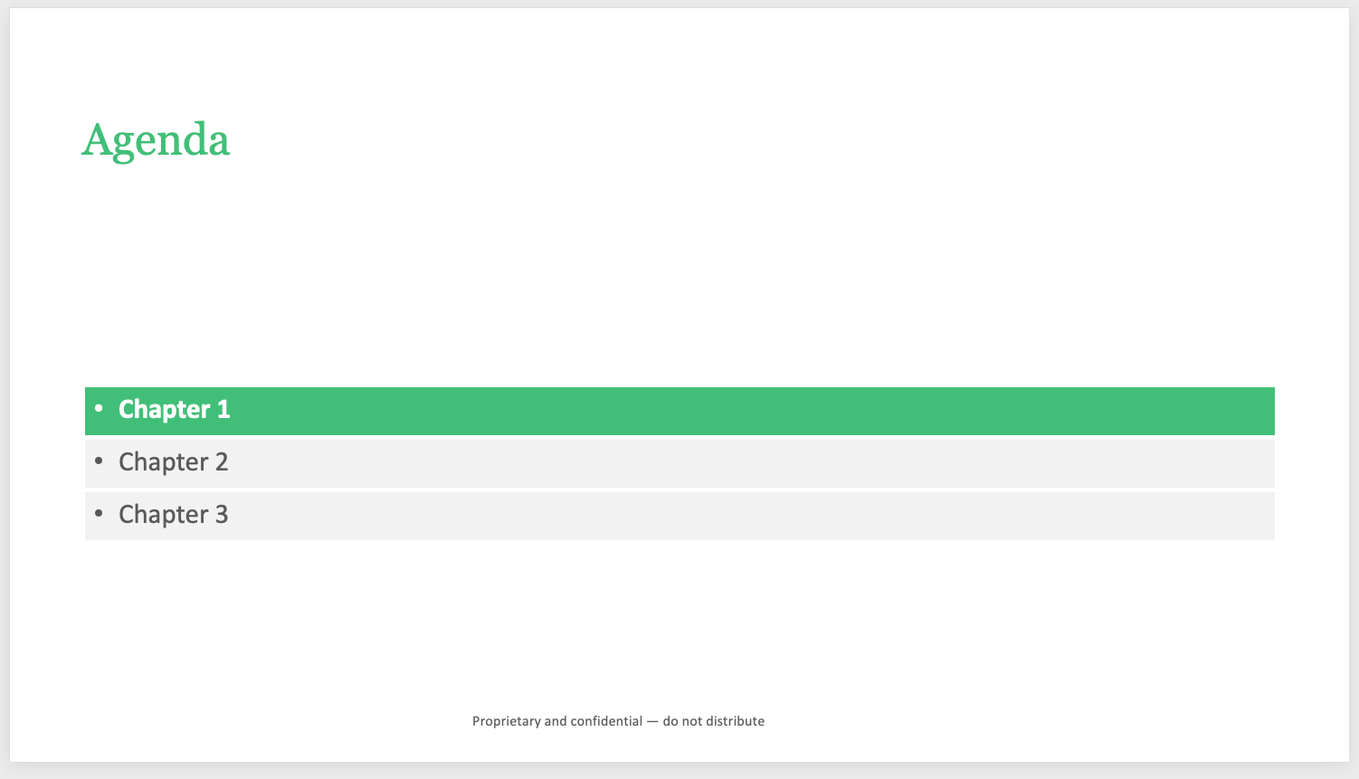
- Clickable Chapter Navigation. If you add these section breaks/chapters, you can click to jump to that section when in presentation mode or if exported as a PDF. It's a cool feature for longer presentations (if people know to click!).
- The default for Data to live in the PPT file. This is a big one for me because I hate when data is linked to an external Excel sheet. Those PowerPoints are shared through the org, and the links to the Excel file always get broken. It's so much easier to be able to right-click on a chart and see the data right there in PowerPoint.
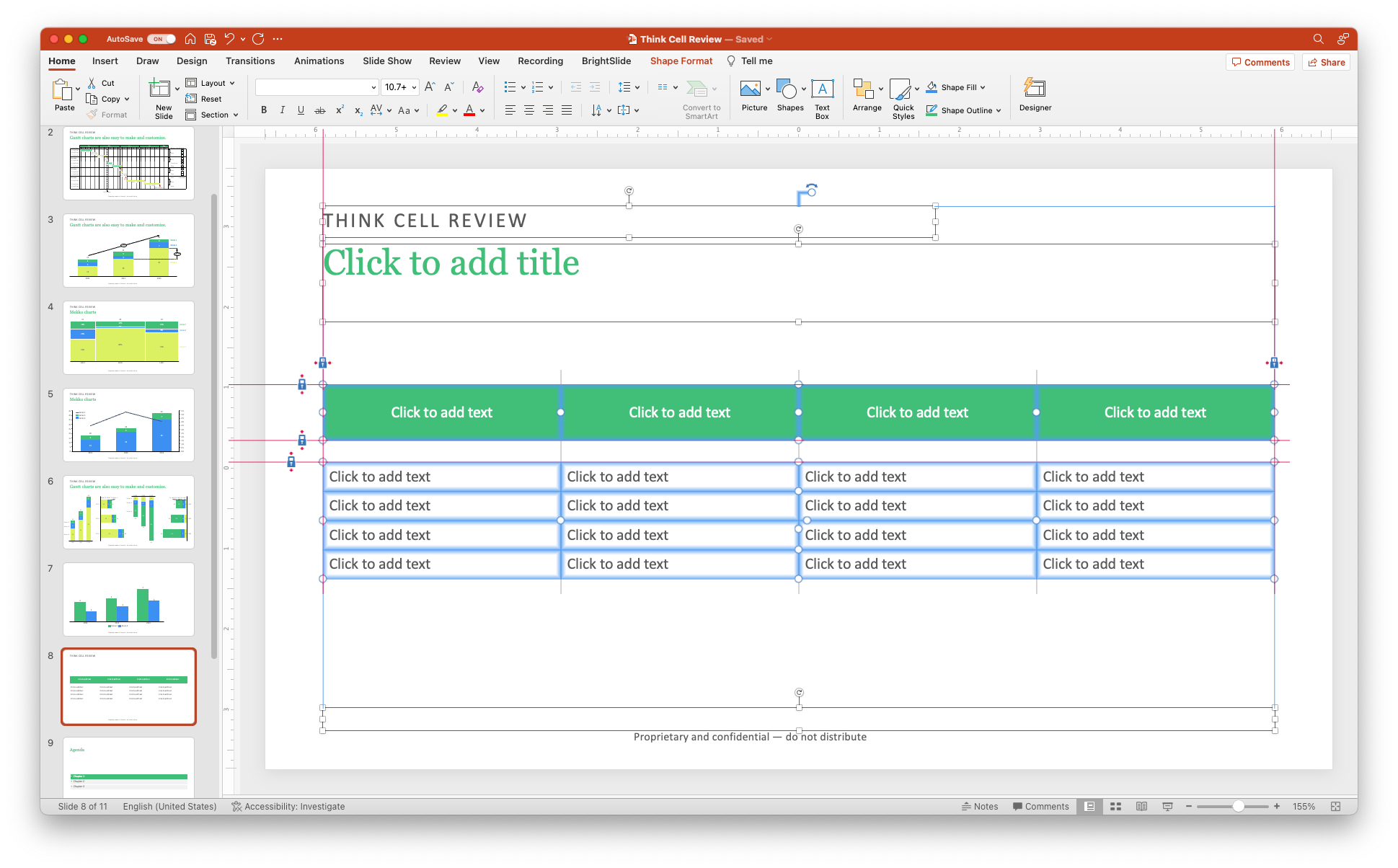
- Perfect alignment helper. If I use the Think cell text boxes and other elements, the add-in helps me keep things nice and aligned.
- Quick access to chart customizations. Create an "Other" bucket? No prob. Get rid of all labels and all data points for that clean aesthetic? Done. Make all the bar charts on the slide have the same scale for the Y-axis. You got it. It's all accessible through a right-click to bring up the options.
Dislike 👎
- Program crashes. Having Think Cell will cause PowerPoint to crash more often, so I always save it to OneDrive and ensure Autosave is always on.
- Compatibility issues. For some more complex charts, if the person receiving your PowerPoint file doesn't have Think Cell, the chart will become individual shapes and lines, meaning it cannot be edited easily (or at all!). Instead, the person will have to recreate the chart with the native chart tools in PowerPoint.
- Steep learning curve. It took time and practice to get used to Think Cell, and early on, I had to go back to the native charting tools just to hit my deadline.
- Think Cell's training videos are just okay. Thankfully, Dan at SlideScience has much more helpful tutorial videos on his site, which is hosted on YouTube. They're so good that even Think Cell hosts them on their website! But the official training videos are a bit lackluster.
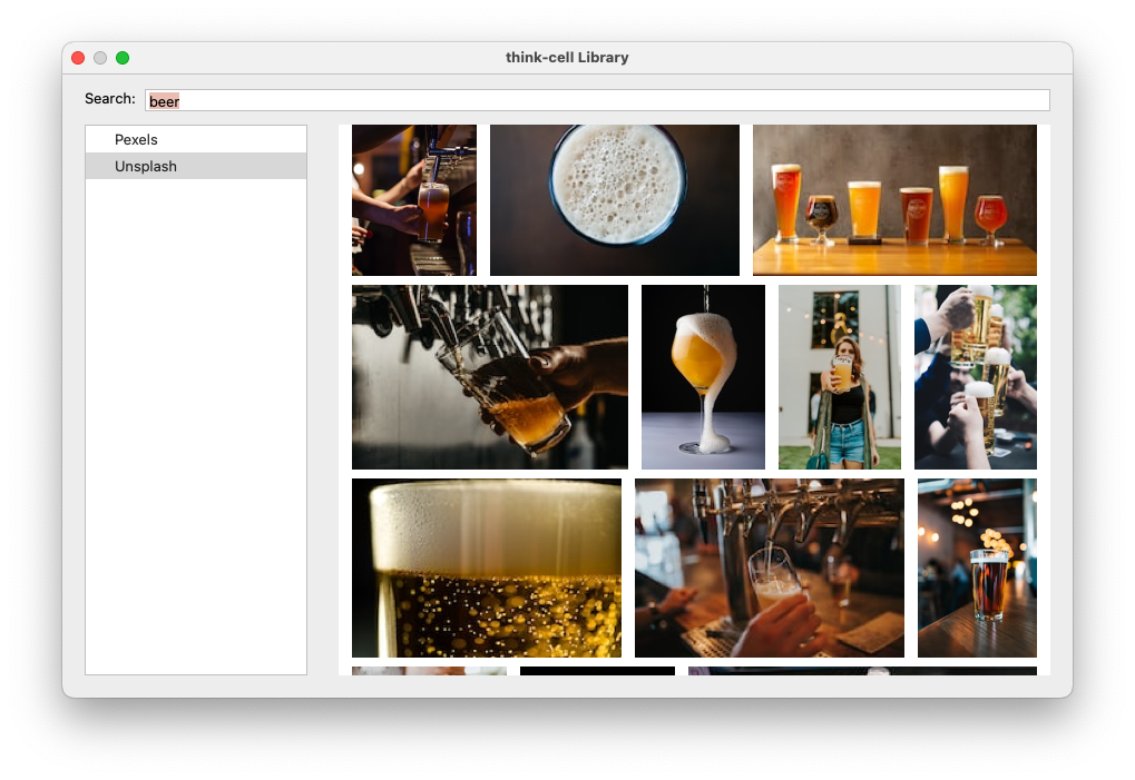
- Stock image tool limited. It's the right move to include the stock image tool! If you read this blog, you know I love Unsplash. However, even though Unsplash is built into the stock photo Think Cell tool, the number of images it returns is very limited.

- Add Think Cell link check box when sharing. I get it. If I were the marketing manager, I'd want to add this too. But, as a power user, I always leave it unchecked. Hotmail's growth hack of adding a link to create your own Hotmail account may have worked in the 90s, but it feels a little dated in 2023.
My Wish List 🧞♂️
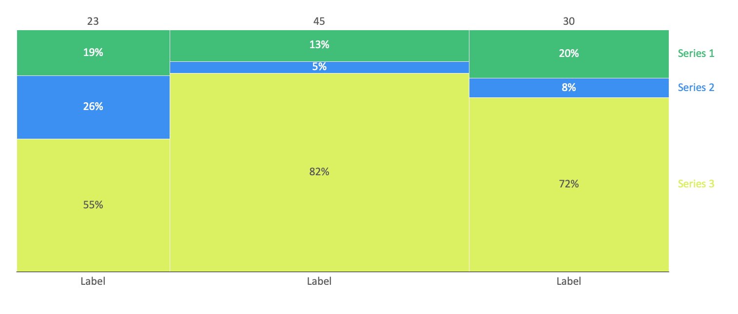
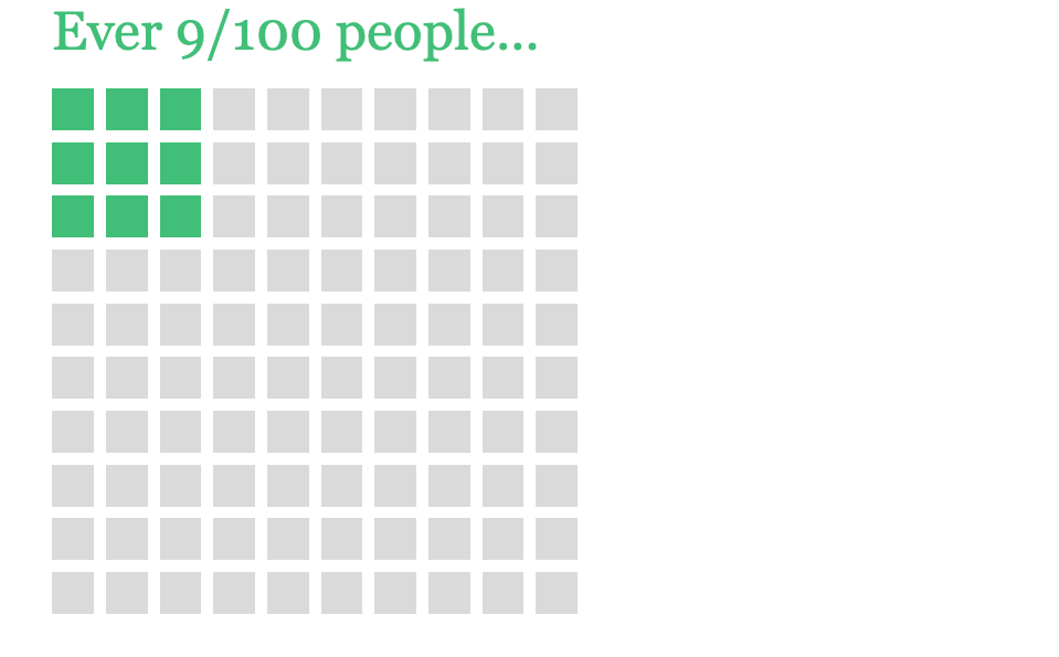
- Square area charts. I love this chart because it is a great visual representation of a part relative to the whole. Other charts do this as well, but when used in the proper context, it makes a very bold statement that is beautiful in its simplicity. For now, I rely on the Brightslide add-in to create this.
- Dot plots. This data visualization allows you to compare the range between different categories easily. It's not as common as the standard line or bar chart, but it can be useful. Maybe there's a way to hack together a dot plot in Think Cell with the bubble chart, but I haven't tried.
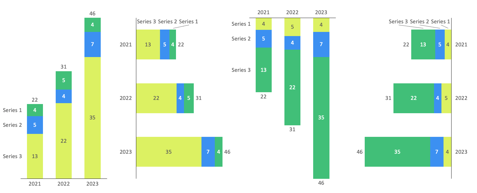
- Have AI help ideate/explore data visualzations. Tome.app can create a complete presentation with a one-sentence prompt. For example, I created the chart below by telling ChatGPT to "Act as a data scientist. Please create a data visualization for the following table in HTML. Make it colorful and insightful."
This is the code that ChatGPT gave me.
<!DOCTYPE html>
<html>
  <head>
    <title>Data Visualization Example</title>
    <script src="https://cdn.jsdelivr.net/npm/chart.js"></script>
    <style>
      /* Add some basic styles */
      body {
        font-family: Arial, sans-serif;
        margin: 0;
        padding: 0;
      }
      h1 {
        text-align: center;
        margin-top: 1rem;
        font-size: 2rem;
        color: #3f5efb;
      }
      canvas {
        margin: 2rem auto;
        max-width: 90%;
        border-radius: 5px;
        box-shadow: 0 5px 15px rgba(0,0,0,0.3);
      }
    </style>
  </head>
  <body>
    <h1>Data Viz Example</h1>
    <canvas id="myChart"></canvas>
    <script>
      const data = {
        labels: ['Cats', 'Dogs', 'Birds'],
        datasets: [
          {
            label: '2021',
            data: [3.5, 5.1, 12.9],
            backgroundColor: '#ffa600'
          },
          {
            label: '2022',
            data: [5.3, 3.9, 21.8],
            backgroundColor: '#ff6361'
          },
          {
            label: '2023',
            data: [4.1, 7.2, 35.1],
            backgroundColor: '#bc5090'
          }
        ]
      };
      const options = {
        scales: {
          yAxes: [{
            ticks: {
              beginAtZero: true,
              fontColor: '#3f5efb',
            },
            gridLines: {
              color: '#e8e8e8'
            }
          }],
          xAxes: [{
            ticks: {
              fontColor: '#3f5efb'
            },
            gridLines: {
              color: '#e8e8e8'
            }
          }]
        },
        legend: {
          labels: {
            fontColor: '#3f5efb'
          }
        }
      };
      const ctx = document.getElementById('myChart').getContext('2d');
      const myChart = new Chart(ctx, {
        type: 'bar',
        data: data,
        options: options
      });
    </script>
  </body>
</html>
And this is what it looks like when rendered as HTML. It's even interactive!
Data Viz Example
Product Updates
I've been using Think Cell daily for almost two years, and there's a significant product update every six months to a year. I always look forward to it because there are many new, valuable features.
You can read about the latest features on their What's New Page.
Conclusion
Overall, I love Think Cell and wish PowerPoint had this built in as a default. But, since it's not, Think Cell is the answer.
What do you think? Have you used Think Cell?