Use Unsplash
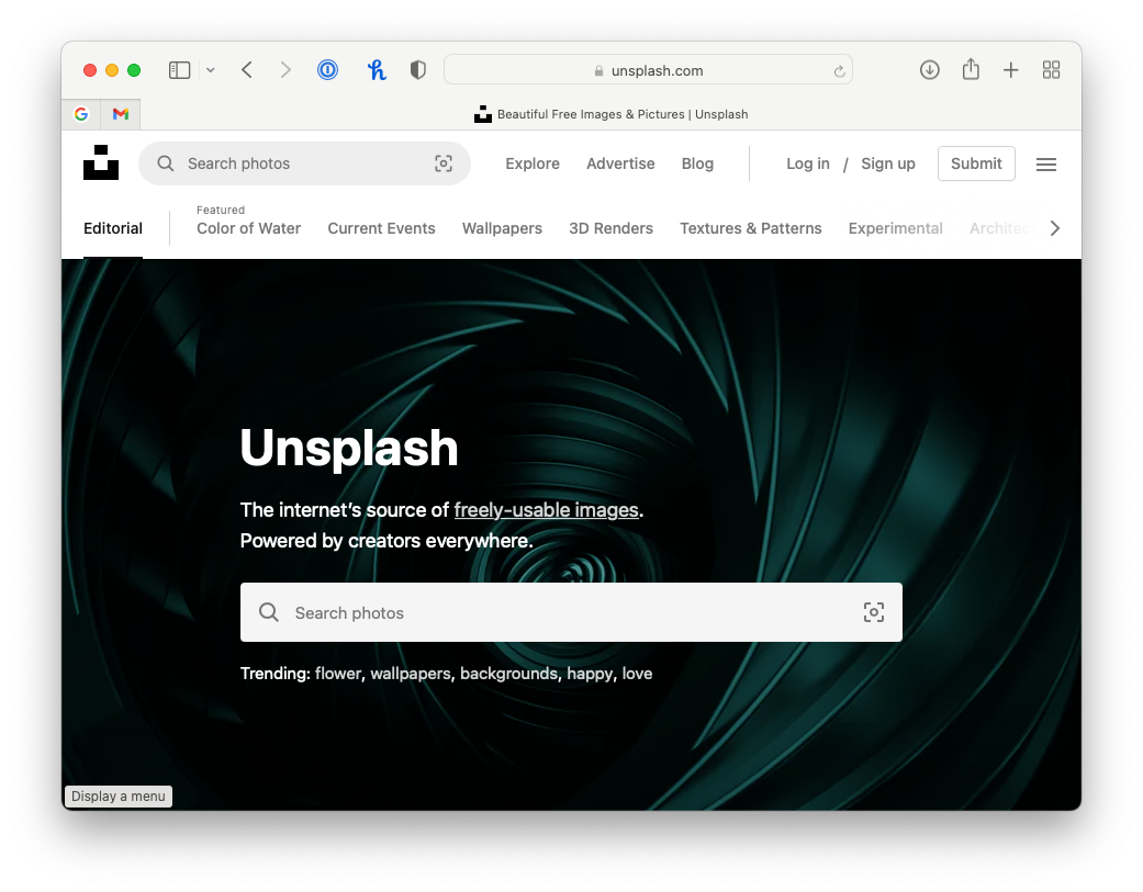
So often, I see images that are pixelated or images that were hastily grabbed from the top result from a quick Google image search. Professional presentations have images that are high quality and high resolution. I love Unsplash because it has freely usable images and they are super high quality. Google image search is a good option if used correctly which means using the additional tools to filter for only high-quality images. Another trick is to not chose the first image because it is very likely that someone else will have used that image and it may be a bit cliche. You want your presentation to be unique and impactful so put a little extra work into choosing the image that best supports your message!
Be Consistent

Make sure the key elements are in the exact same place from slide 1 to slide 299.
This one is really easy. Make sure that your headline is in the same place, in the same font, at the same pt size aross every single slide--no exceptions.
Make sure that the page number is always in the bottom right and that the "Proprietary and confidential" (or whatever other text you might have) is always on the bottom left in the exact same place. The easiest way to do this is by making the change on the slide master.
Use literal tables
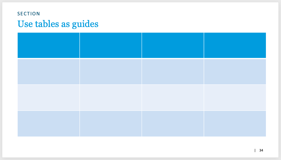
Imagine each slide as a table. I will often draw a 3x3 or 4x4 table on my slide and use it to guide where I put text and images. If you imagine every slide as a table and put your text, charts, and images aligned and proportioned accordingly, then the overall slide will have an organized and clean feel.
Things will be aligned and just look "right." It will feel like it has structure and order--and that's because it does. More advanced presentation designers will use a grid, but I find that too constrictive because grids are usually fixed and too much work.
I prefer to draw an empty 3x3 table (4x4 if it's going to be a slide with heavier content) and place my text and charts on it. When I'm done, I simply delete the table. Voila!
Use Blueprints
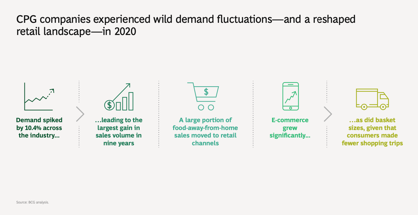
Find your favorite slide blueprints and know when to use them.
For example, this is one of my favorites. It's basically a list of 5 things laid out horizontally.
This one is from BCG's article on the CPG industry. It's a little more complicated than just a simple list since they are creating a relationship between items in the list. However, it's my go-to whenever I want to list out 3-6 items and provide some commentary or description.
Less is often more.
Always chose simplicity and clarity.
I once had a manager tell me about the concept of "killing your babies." It's much harder to cut out content than to just leave it in. It's hard to throw away a chart you spent 30 minutes perfecting or commentary you spent the last hour writing.
However, it's usually better to err on the side of simplicity. Your audience will appreciate it and it will strengthen your main message.
Having extra text, charts, or images on the slide that doesn't support the slide's headline/argument is a distraction. If you must, you can always make a copy with even more detail and put it in the appendix since there's no limit to appendix slides.
I hope you found some of this helpful! Let me know what you think!


