What are the best PowerPoint design ideas?
Are you working on a PowerPoint presentation that looks kind of blah? Do you want to make your slides look more professional and polished, but not sure how?
Well, you're in the right place! I've compiled this list of over 95+ design ideas you can quickly implement in your next PowerPoint presentation.
If you put these design ideas into practice, you're going to create a presentation that not only communicates your message effectively but also leaves a lasting impression on your audience, whether it's your team, manager, or client.
Don't ever settle for bland, uninspired, or ugly slides. It doesn't take that much work to improve a presentation drastically. Here are some specific ideas to help you raise the bar on your next presentation.
Let's dive in.
95+💡 and counting.
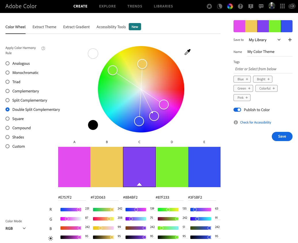
Idea #1: Chose the right colors
Don't use the boring default colors that PowerPoint gives you!
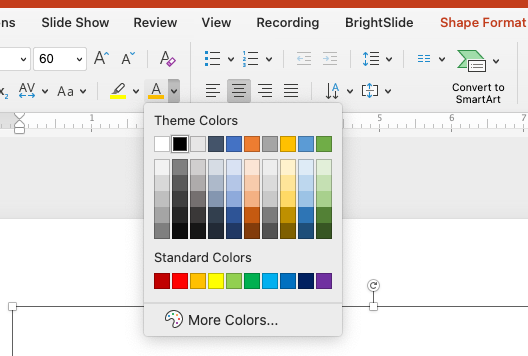
Take a minute to either use your company's official color scheme by importing the theme, or if that doesn't exist, create your color theme using Canva or Adobe Color pickers.
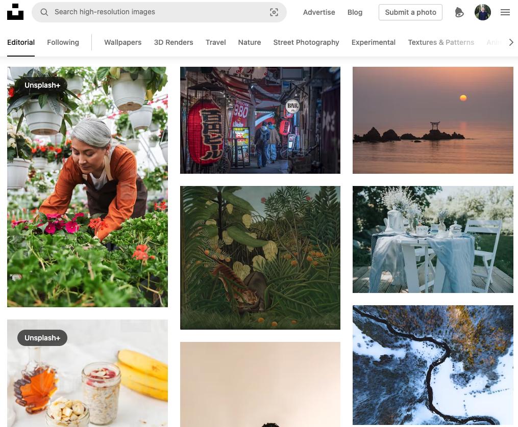
Idea #2: Use high-quality images
You can find amazing royalty-free images from Unsplash or Pexels. So start with these two sites instead of searching Google images.
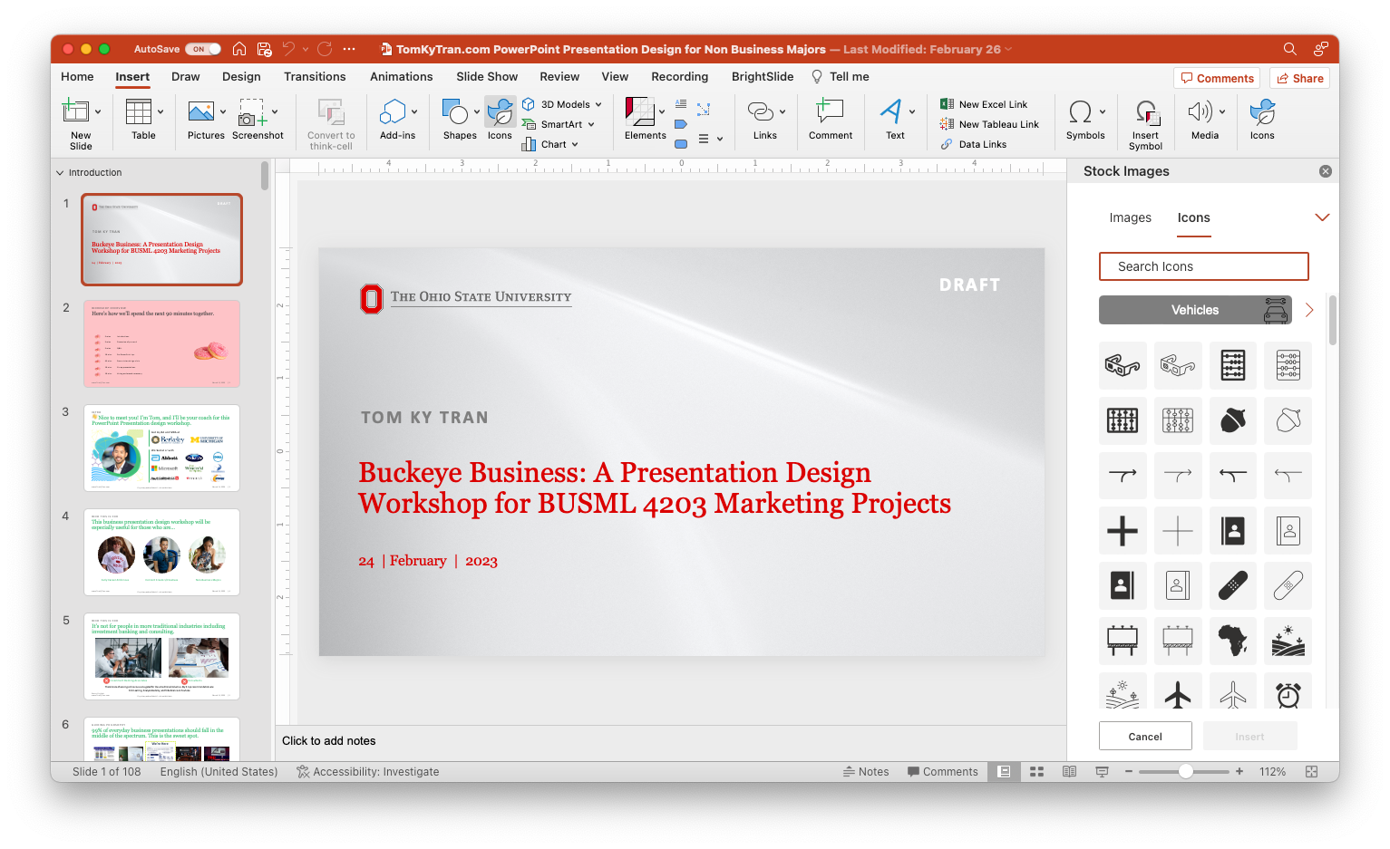
Idea #3: Use icons to illustrate ideas
There are hundreds of great icons available in Microsoft PowerPoint. You can click on Insert on the ribbon and look for the Icons button. These icons are a great way to add a nice little touch to your PowerPoint slide.
Idea #4: Use a consistent layout
This means making sure that all slides have the same formatting and layout. If you are building a presentation and pulling slides from many different presentations, take a little bit of time to reformat them so that they all have the same general look and feel.
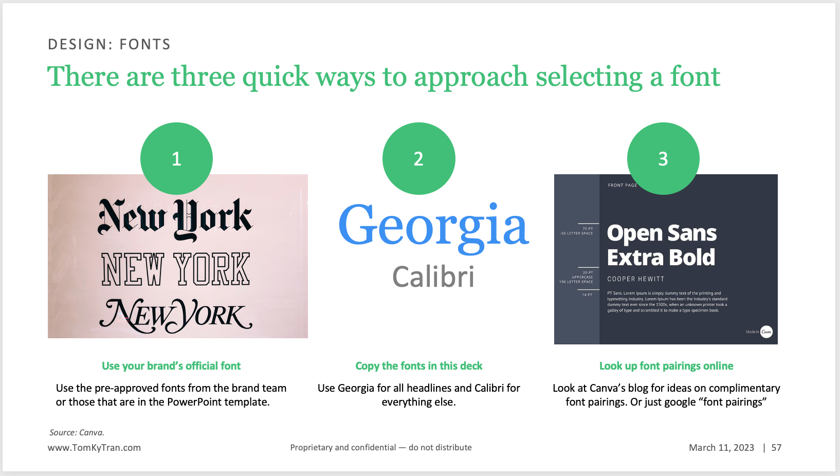
Idea #5: Choose the right font pairing
If you're at a Fortune 500 company, chances are that corporate branding worked with a design agency like Duarte to create a great-looking corporate template with everything ready to go.
The general rule of thumb I follow is to have one font for the headlines and one for additional text on the slide.
Idea #6: Be concise with text
Generally, less is more. For example, no one wants to read a slide like this:
There's too much text on it, even if the information is important.
Idea #7: Upgrade your bullet points
One really easy way to upgrade your bullet points is to take them and lay them out horizontally on the slide. Then, add a little icon for each idea. This is a much more elevated look and feel (and so easy to do!)
Using bullet points :
Laying out the bullet points horizontally:
Idea #8: Use hierarchy
What this means is to think about what you want the reader to pay attention to and what should stand out on the page. Then, organize the information on the slide in a way that makes logical sense and makes it easy to follow along. Generally, what this means in practice is to have bigger text or ideas higher up on the page and smaller details or double clicks lower on the page.
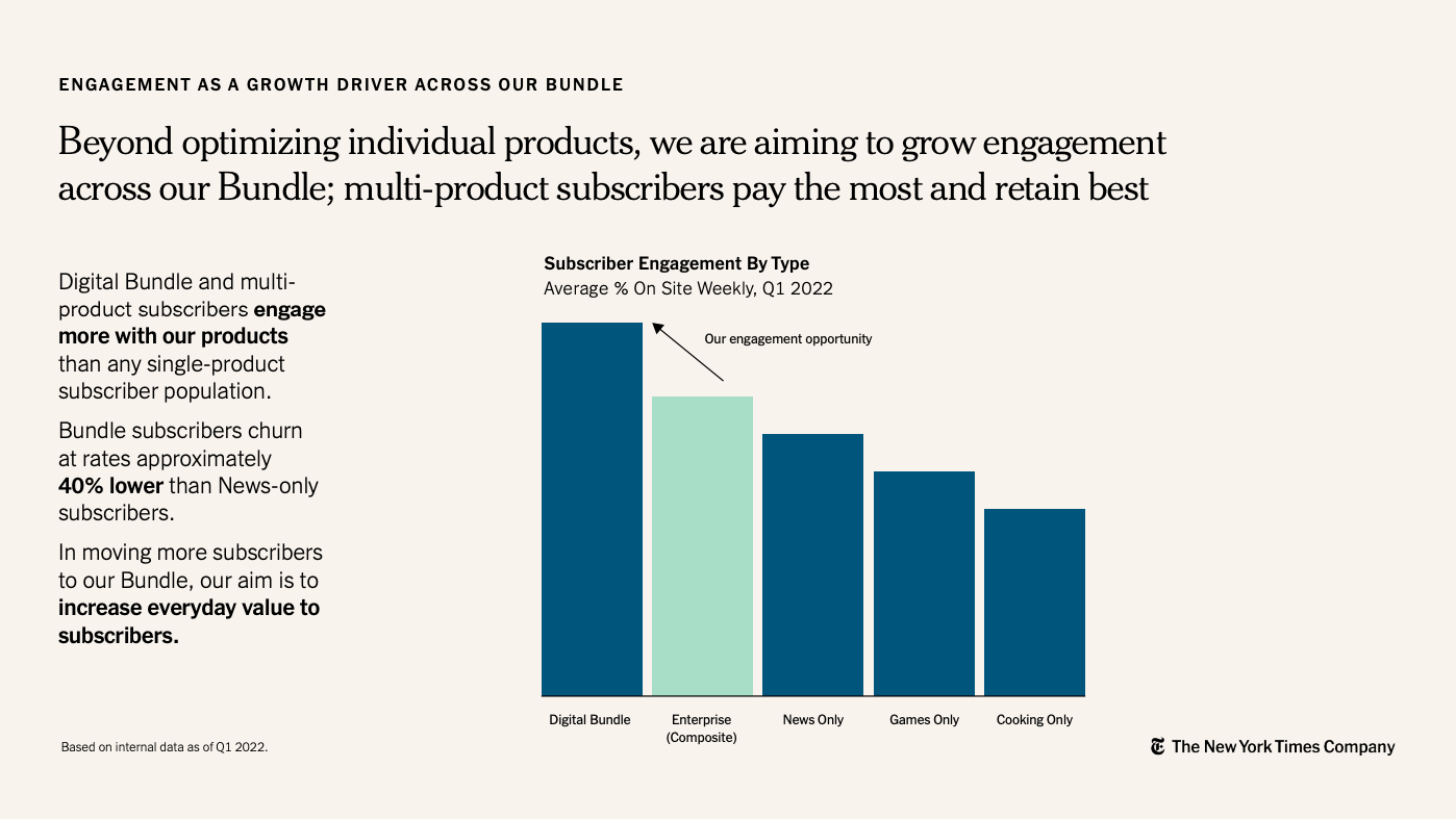
Idea #9: Use thin lines to create separation
Draw thin lines to help create separation between elements on the page. Pro tip is to hold the shift key so that they lines are straight. If I have two different charts on a slide, I'll use thin lines right in the middle to create separation.
In the NYT's example below, the thin white lines add a nice, whimsical touch. It would still be very well organizedand easy to read without the line. However, the line give the slide a little more structure.
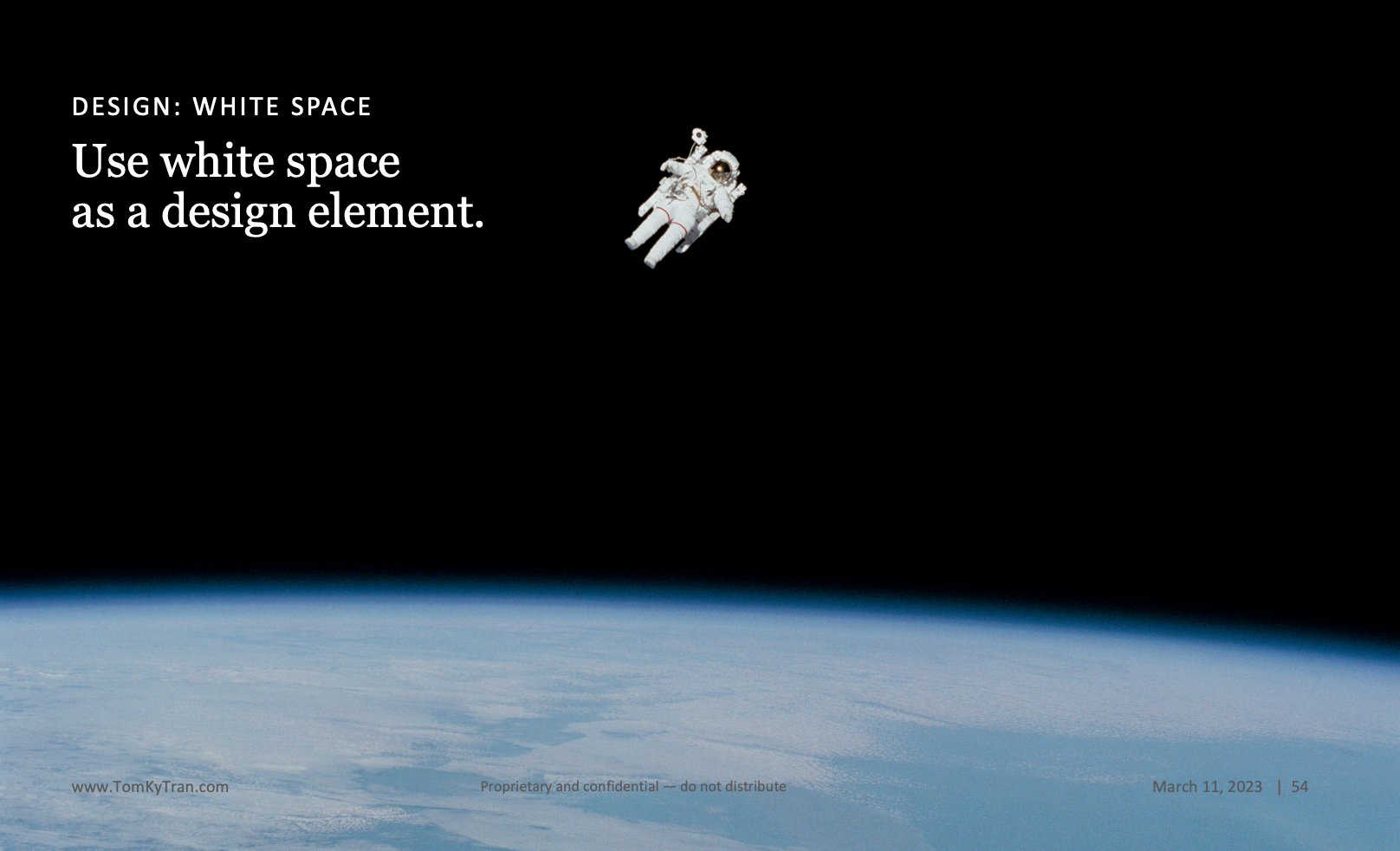
Idea #10: Use negative space
You dont' have to fill up every inch of the slide with content or pictures. Leave some room around the text. Leave some white space on the slide.
Or, just look at the slide below as an example of using white space. If you're not used to using white space, it does take some time getting used to.
Idea#11: Filter Google image search for "large"
If you have to add logos to a slide, just remember to try and find the highest resolution images you can on Google. You presentation will look much more professional and much more polished. Attention to details add up.
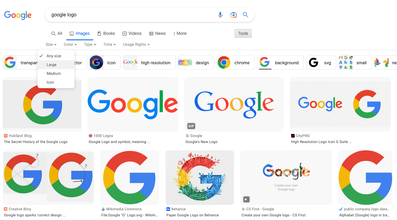
This is also true if you are looking for other images on Google. But if you remember my design tip from earlier, don't start on Google images because there are much better sites to find incredible imagery.
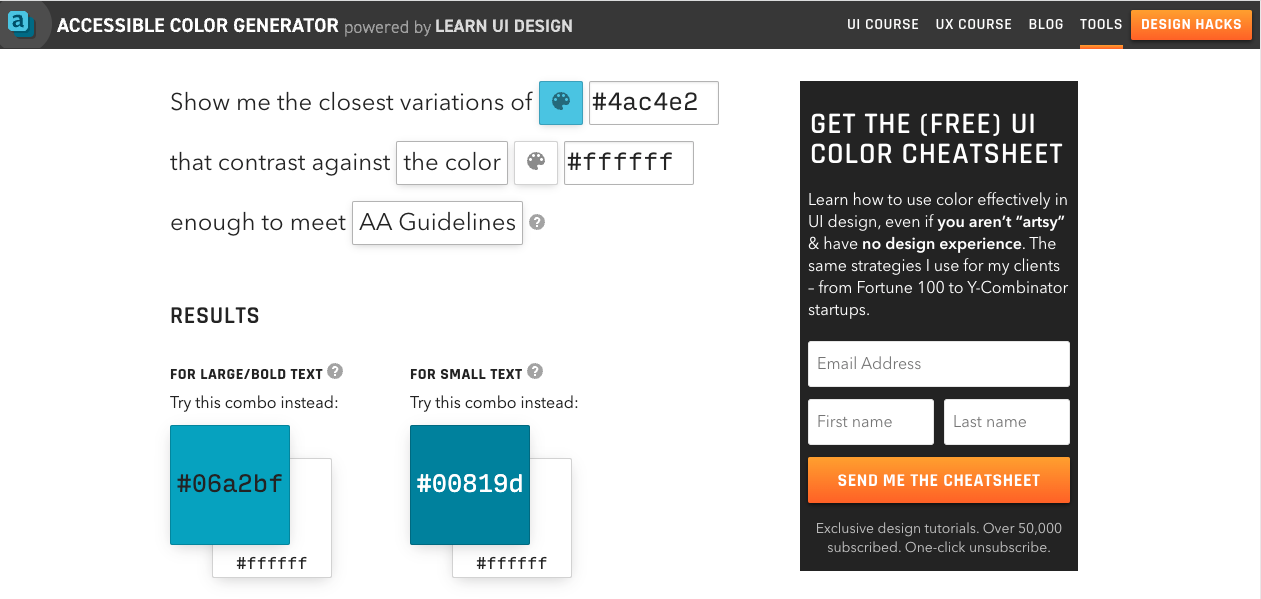
Idea #12: Use high contrast colors for text
Use a dark color if the background is white. Use a light color if the background is dark. Don't ever use yellow text on a white background because it's not going to be readable.
A tip I got from a friend in the Presentation Guild was to use a web tool such as The Accessible Color Generator to ensure colors you're using are readable for people with low vision or colorblindness.
Idea #13: Tables are you friend
Use tables to organize your content. I mean this literally. Draw a table (4x4, 5x5, etc), lay out your content, then delete the table. Your slide will now have this hidden structure that just makes everything on the page feel balanced.
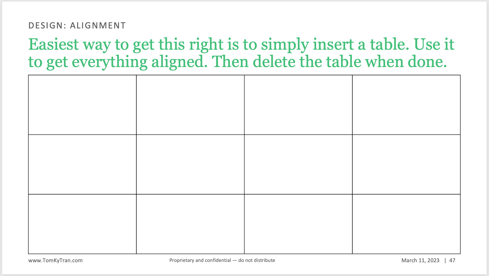
Here is another example of using a table to organize content.
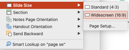
Idea#14: Use widescreen page ratio
It's 2023. Everything is digital. People read on their laptops, iPads, or widescreen monitors. It still surprises me when I see a PowerPoint presentation made with the 4:3 ratio. It just looks like something out of the 90s.
Sure, there are some situations where people want to see a printed copy of the presentaiton and you could argue the 4:3 ratio is better. But I don't buy it.
Compare the following two slides:
Always use the 16:9 page ratio. If it isn't currently your default—it's time to make the switch.
Idea #15: Keep it simple
If you can, always opt for simplicity over something complicated. If a slide is feeling too crowded, then edit some content out. Or, break up the one slide into two or three or even four slides.
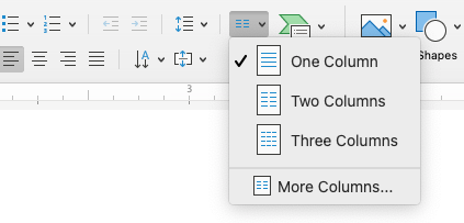
Idea #16: Use columns for huge blocks of text
If you have to include a lot of text on a slide because of a legal or regulatory requirement, then use columns to make the text more reader friendly. Think back to printed newspapers or even magazine columns. The text never stretches across the entire width of the paper. Same idea here.
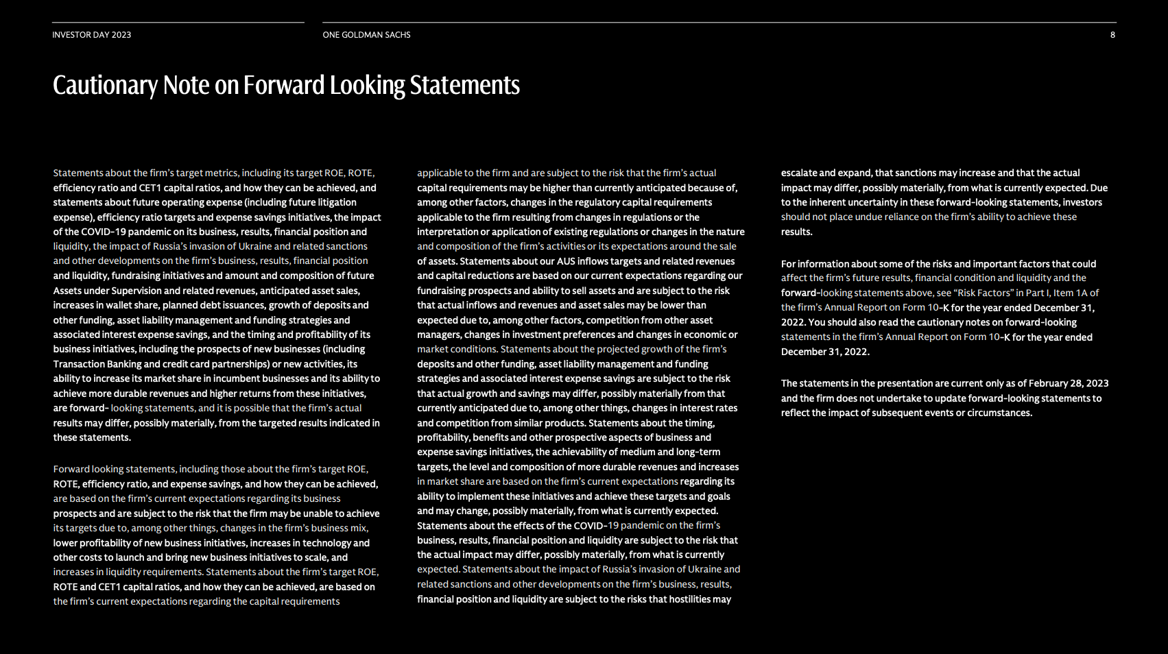
You can access this feature in the PowerPoint ribbon.
Idea #17: Respect (slide) boundaries
This isn't a hard and fast rule. However, if you keep the contents of your slide within the slide's boundaries, it will look more professional and clean. If you're going to break the boundaries, then do it with intentionality.
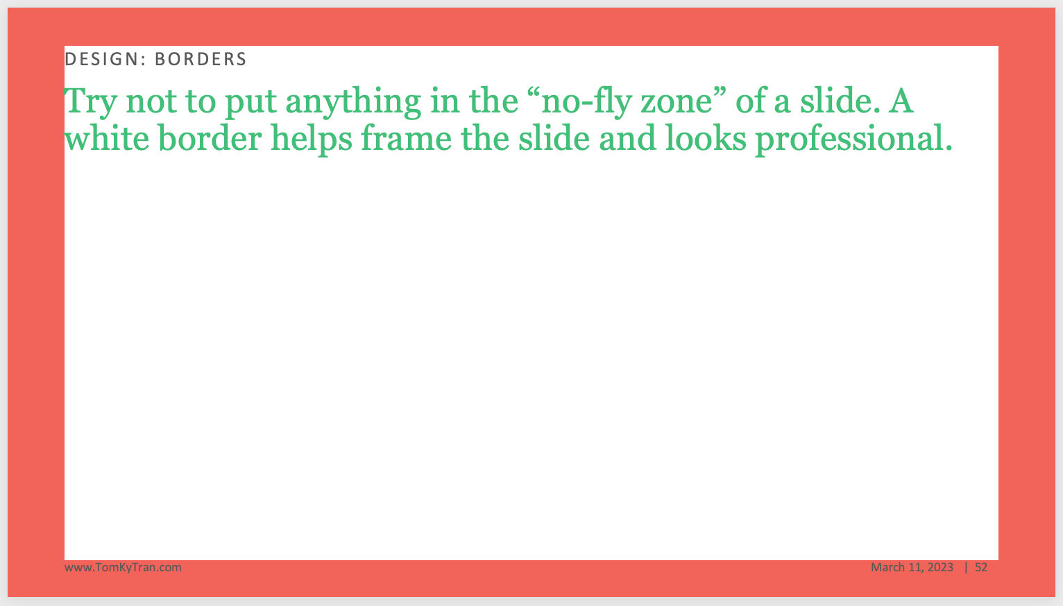
There are two common exceptions to this rule.
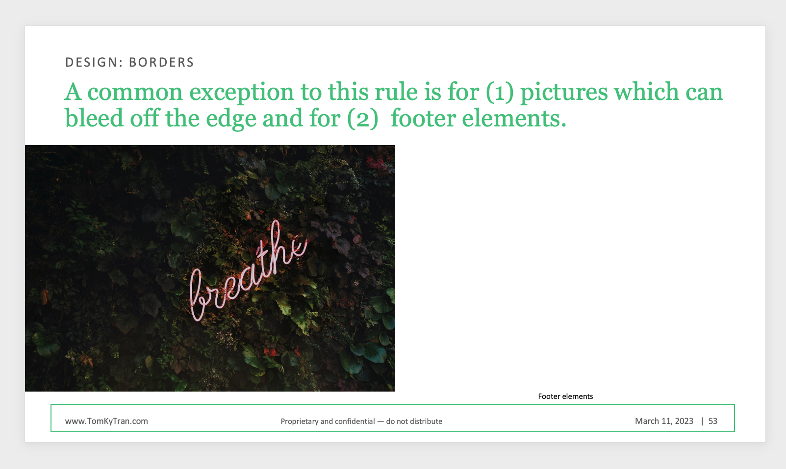
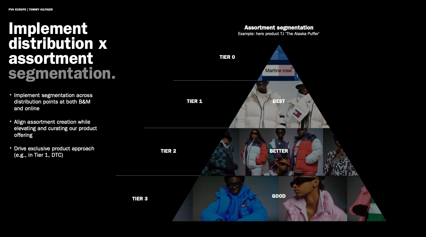
Idea #18: Use diagrams
Sometimes, an idea is easier to show with a diagram rather than explaining by text. If you decide to use a diagram, try to draw it with the basic shape tools built in PowerPoint.
Here's an example of a Pyramid diagram with different tiers.
Idea #19: Disguise SmartArt
PowerPoint's SmartArt looks very amateur unless you know how to disguise it well. There is definitely a stigma against SmartArt and I've seen many brand guides and PowerPoint presentation templates warn against using it.
I generally agree because when SmartArt is used willy-nilly, it looks very unprofessional.
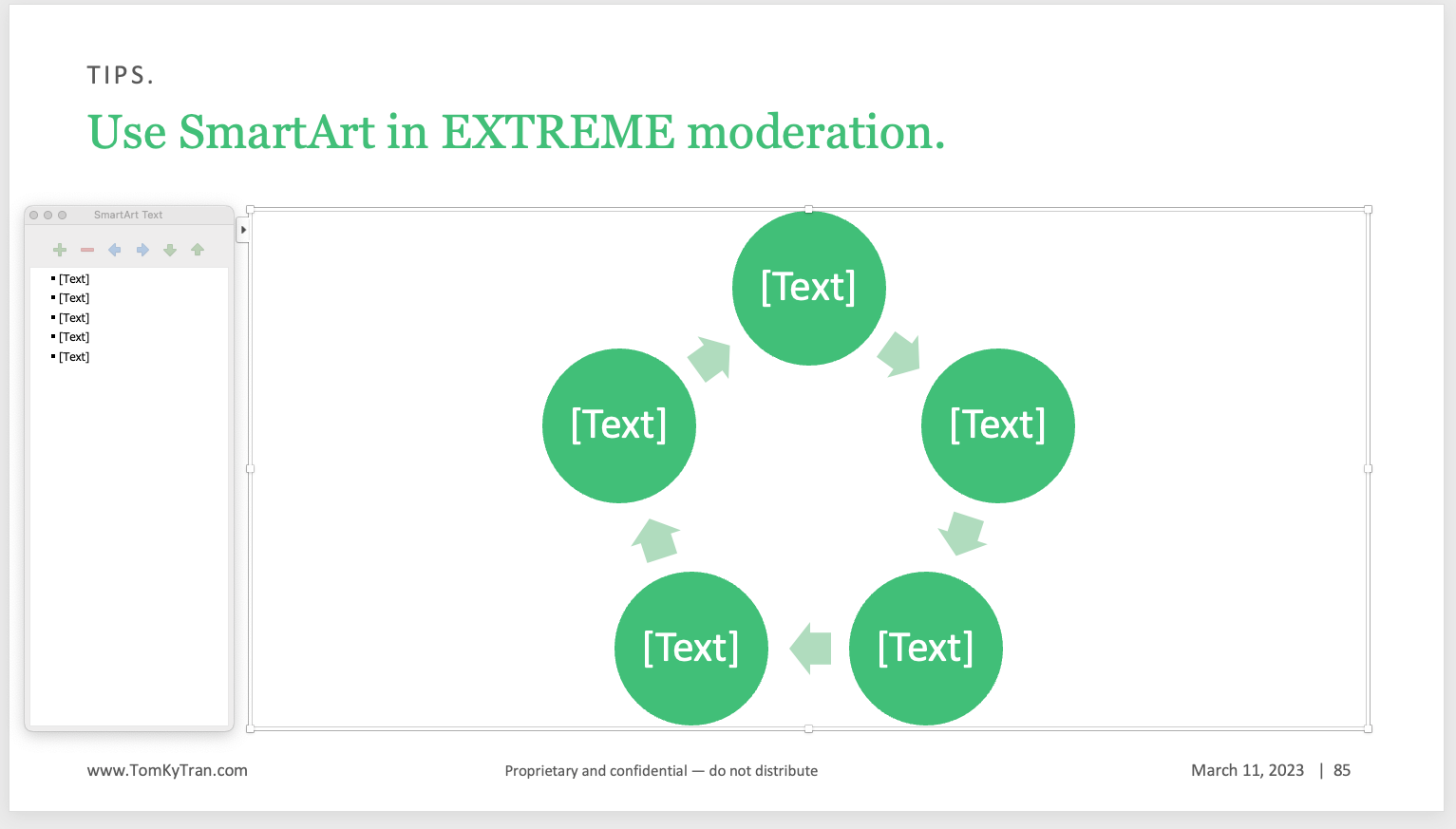
However, if you strip it down to just the essential shapes and make the text 8pt Calibri (or whatever your body text is), then it could work:
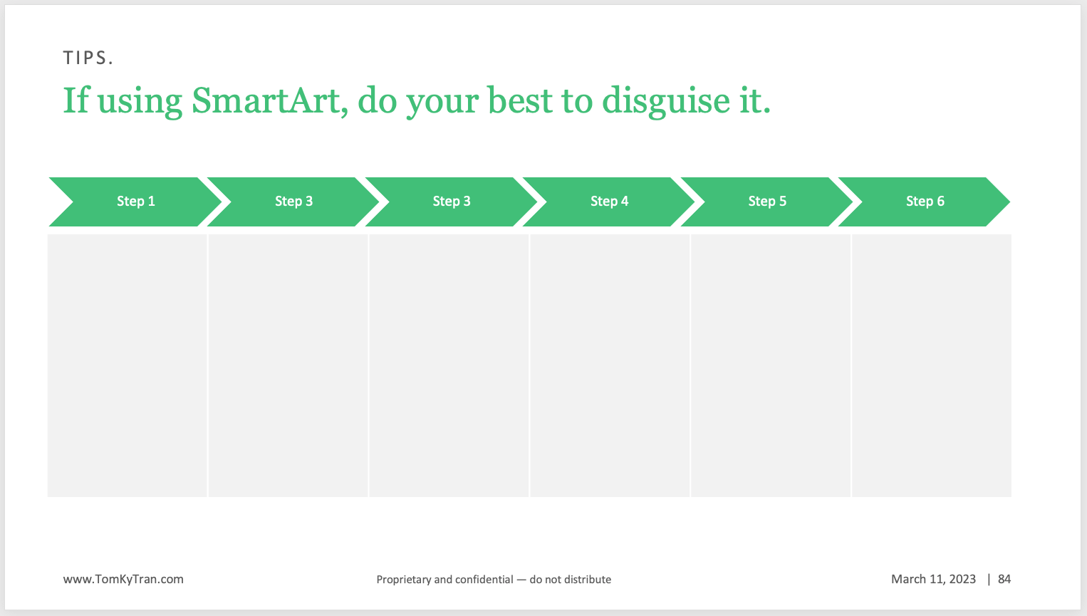
Proceed with caution! Some of the SmartArt options should never, ever be used.
Idea #20: Use the grid
Turn on the grid under View.
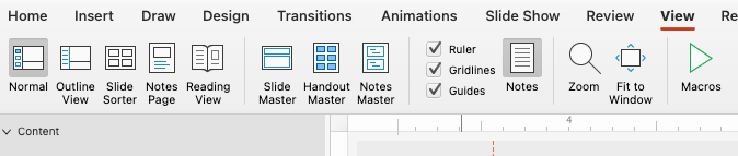
Use the grid to help you align elements on the slide so that there is some underlying structure.
Idea #21: Design in Threes
Three is a magical number. People remember lists of three. Our culture loves lists groups of three.
Here are some examples of famous threes.
- The Three Musketeers - a novel by Alexandre Dumas about three French soldiers who protect their king and country.
- The Three Stooges - a comedy team from the early 20th century known for their slapstick humor.
- The Three Wise Men - also known as the Three Kings or Magi, they are mentioned in the Bible as the men who visited Jesus after his birth.
- The Three Little Pigs - a fairy tale about three pigs who build houses of straw, sticks, and bricks, respectively, and are targeted by a hungry wolf.
- The Three Blind Mice - a nursery rhyme about three mice who are chased by a farmer's wife and lose their tails.
- The Three Billy Goats Gruff - a Norwegian fairy tale about three goats who must outsmart a troll in order to cross a bridge.
- The Three Bears - a children's story about a family of bears whose house is visited by a little girl named Goldilocks.
Group your content into three buckets when possible. Here are some examples of this in practice.
Idea #22: Avoid cliches
When you're trying to find an image that captures an idea, don't settle for the first image that you find. Keep looking until you find something that is more unique.
Here are three ways of showing the future. Think about which one you would prefer and why.


Idea #23: Avoid clip art
There are so many better alternatives for adding images to your presentation. Think about icons. Think about photos.
Idea #24: Use alignment
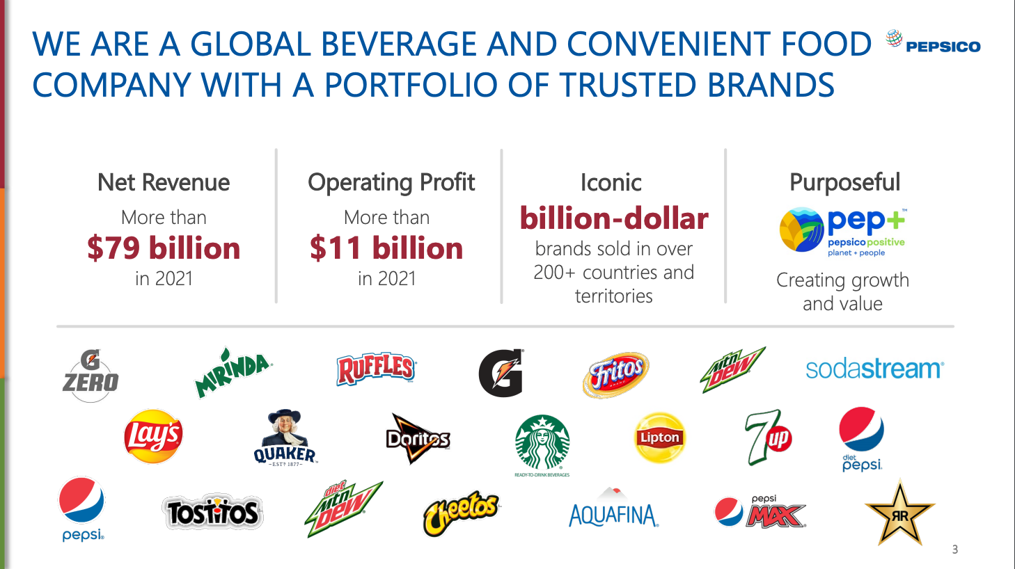
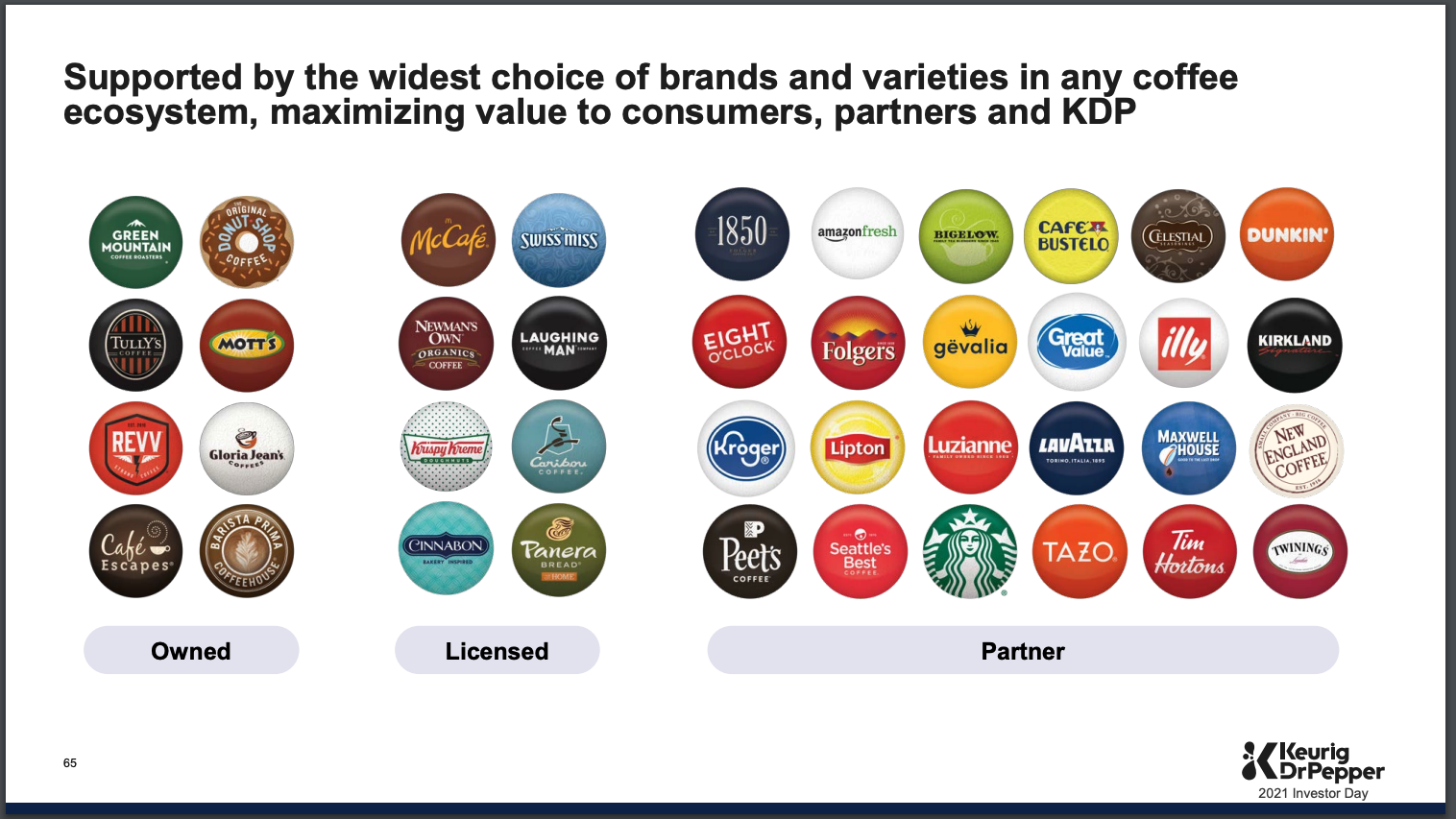
If you have a slide that's going to show a lot of logos, then use PowerPoint's alignment feature to help! Notice how well aligned each row if logos are in the slide below. Notice how the second row of logos is offset from the top row just a bit.
Idea #25: Have fun 🍩🦄
If you're working on a presentation, don't forget to have a little fun with the design. It doesn't have to be all work no play. I love Krispy Kreme's use of their own products to highlight the 5 pillars of their investment thesis.
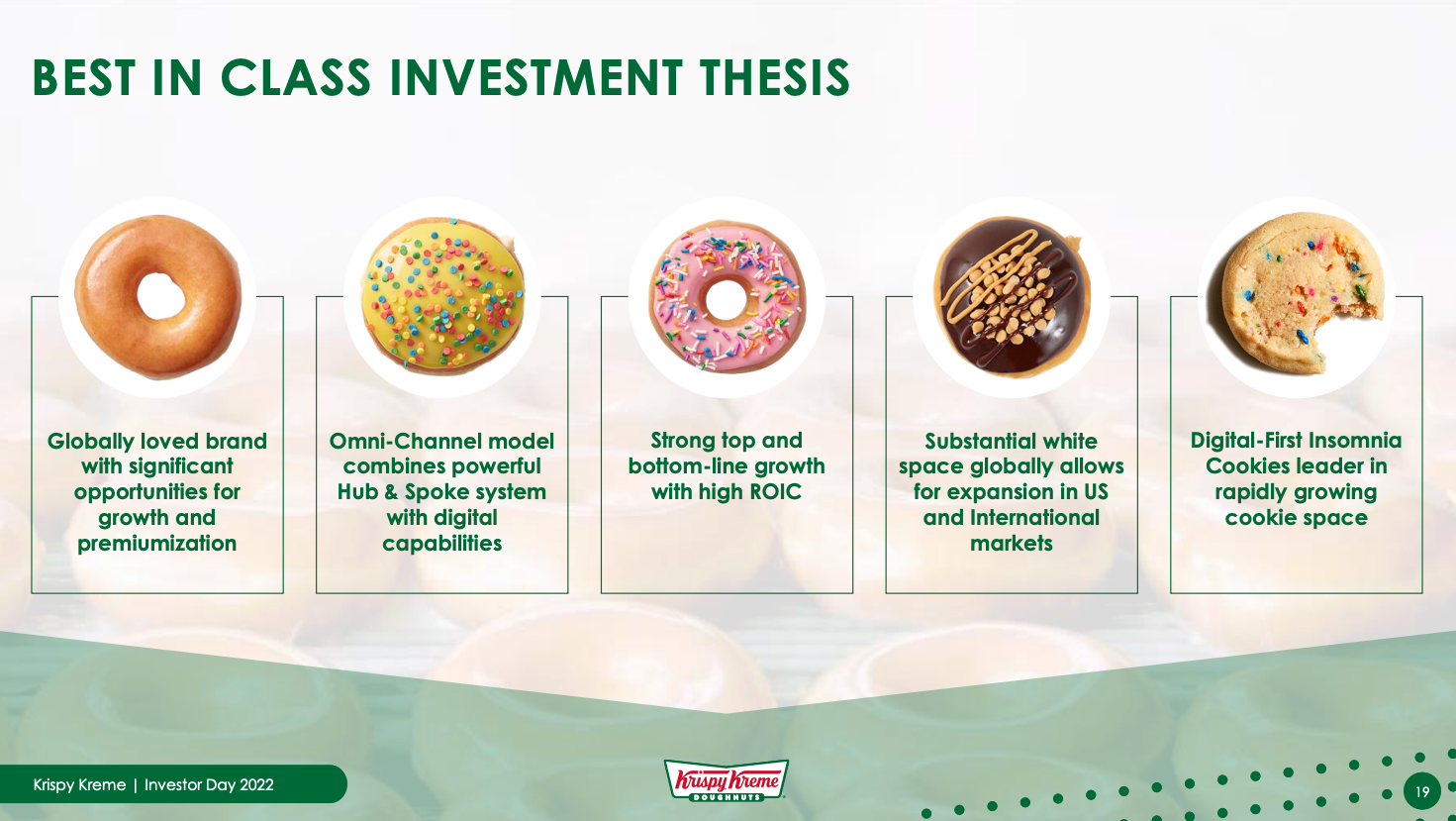
It's playful, it's whimsical. And most importantly, it works! Here's another example of using a donut as a literal kind of expanded donut chart.
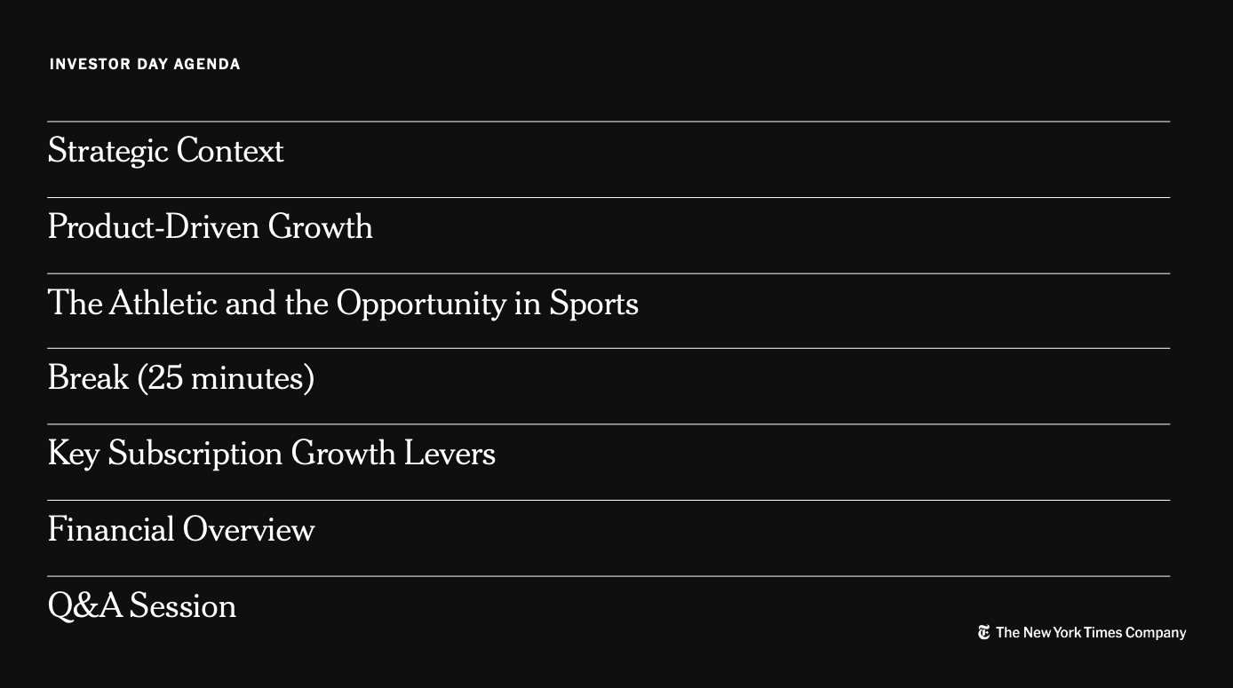
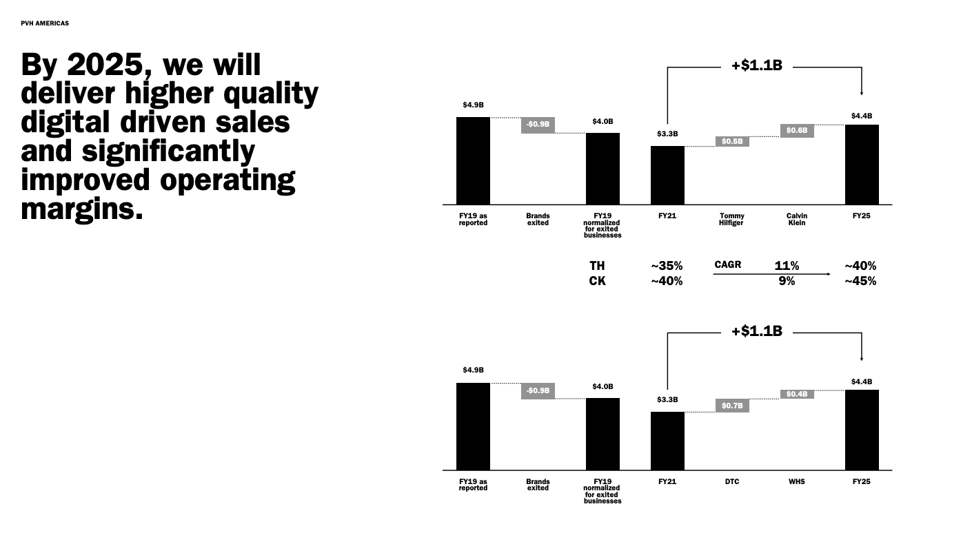
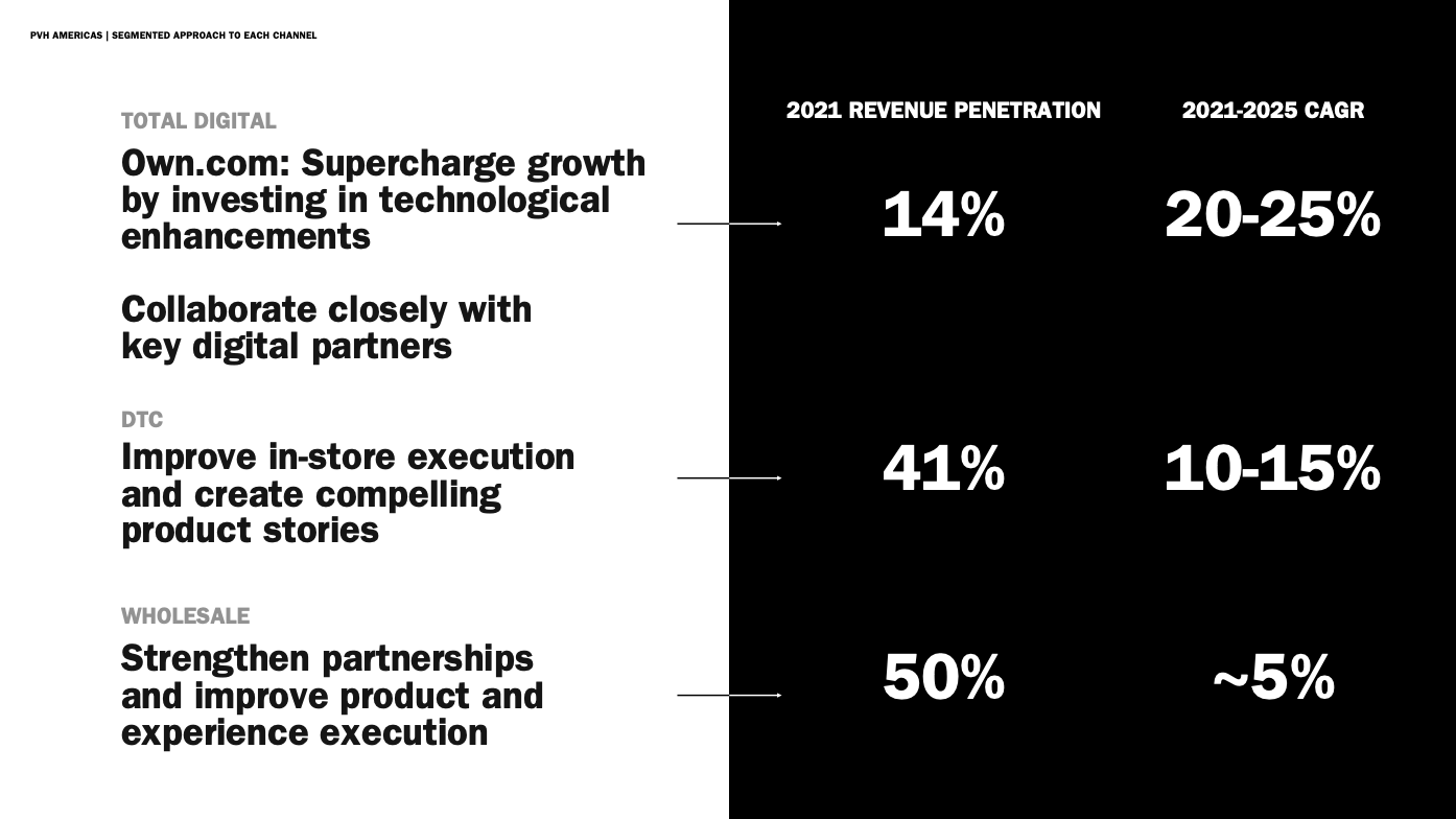
Idea #26: Don't forget the agenda slide
Help your readers navigate the deck by adding a simple agenda like the one below from PVH. Add it before every section to break up different chapters or sections.
I really like the text treatment of the chapter. It's bold and clear. Other previous chapters are in light grey. Still readale, but it is clear where we are going next.

Idea #27: Drop the drop shadows
Most slides are better off clean and simple. This means no extra drop shadows or weird lighting effects on the elements on the page. It is one less thing you have to think about and have to make consistent throughout the presentation. Also, drop shadows just feel dated.
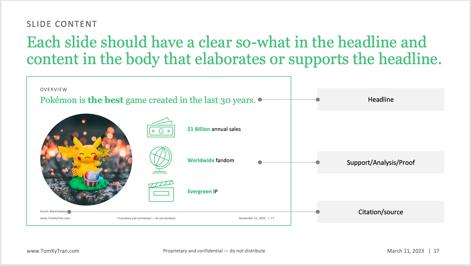
Idea #28: Use eyebrow identification
"Eyebrow identification" is the text above the headline on a slide. It can be the name of the chapter or something that helps the reader understand where the content of the slide fits into the structure and organization of the overall presentaiton.
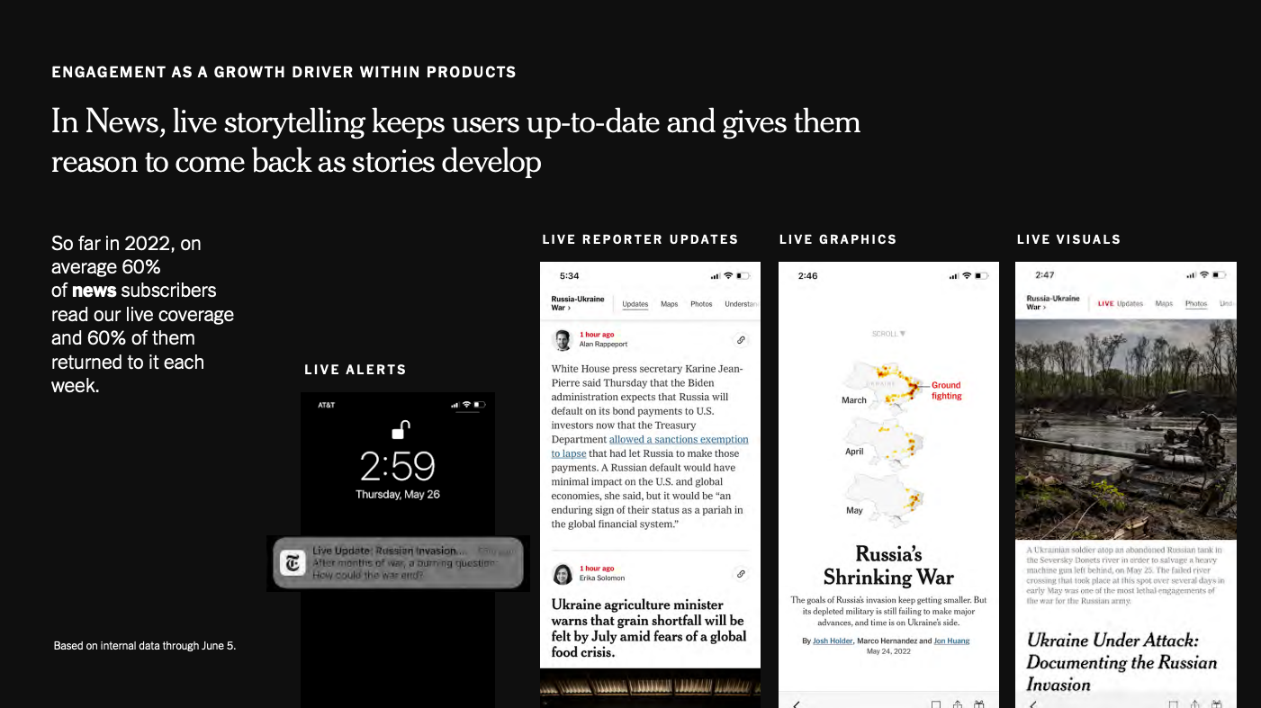
For example, the eyebrow identification on the NYT's slide below is "ENGAGEMENT AS A GROWTH DRIVER WITHIN PRODUCTS" and all the pages in the section have the same eyebrow identification.
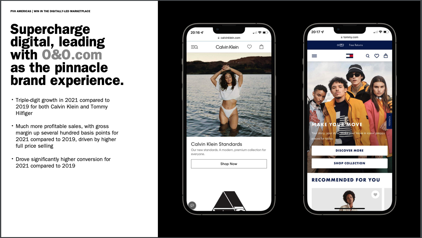
Idea #29: Put screenshots in context
If you're going to be talking about digital or social media, for example, then show it on the slide as it would be seen by a consumer. Ask a presentation designer to help set up the iPhone shape. Then add in a screenshot proportionally as an image.
I love the example below because it clearly shows how two fashion brands come to live on brand owned and operated (O&O) sites and how consumers are going to most likely experience it (through their mobile device).
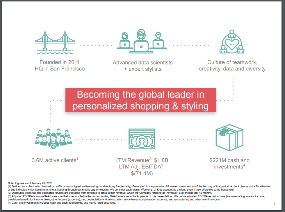
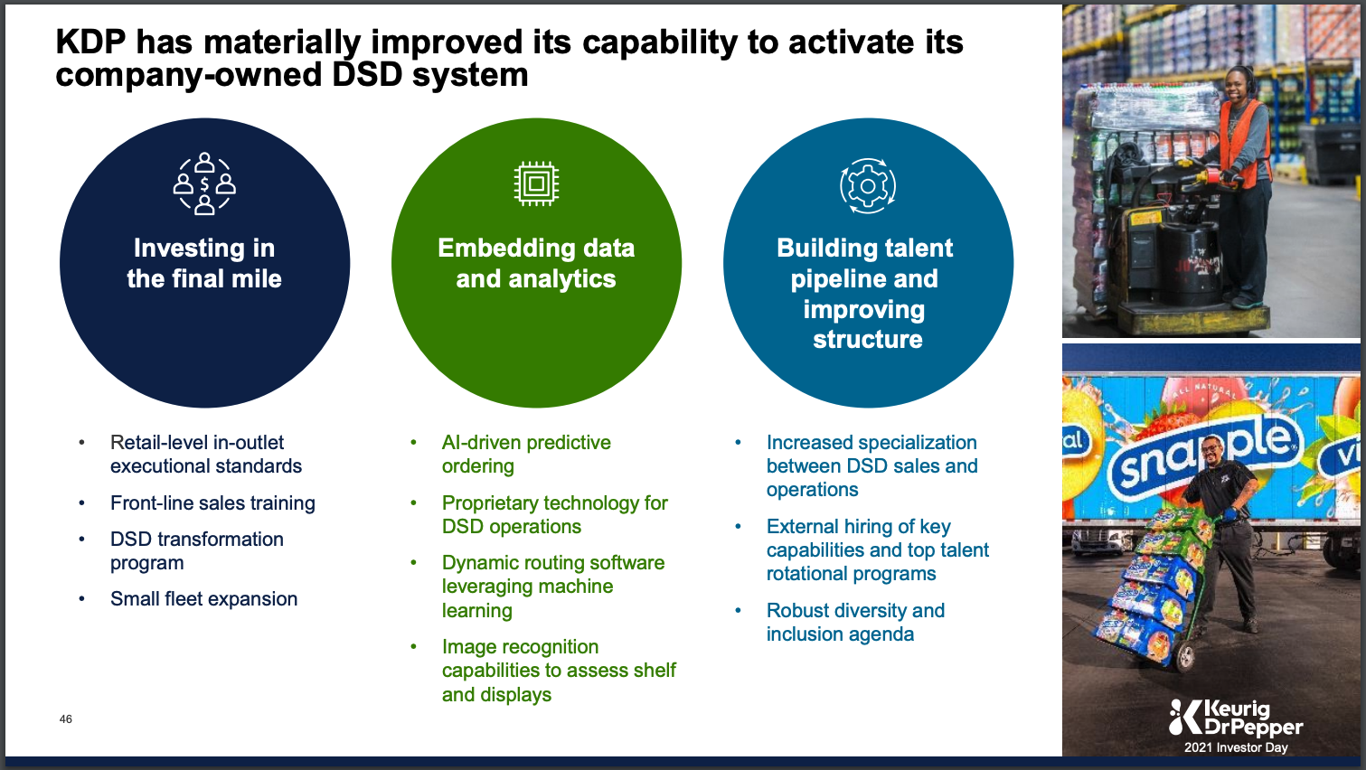
Idea #30: Show, don't just tell
A few well closen images can really bring an idea to life. Think about the content of the slide and if there's a way to bring a human element to what you're writing about.
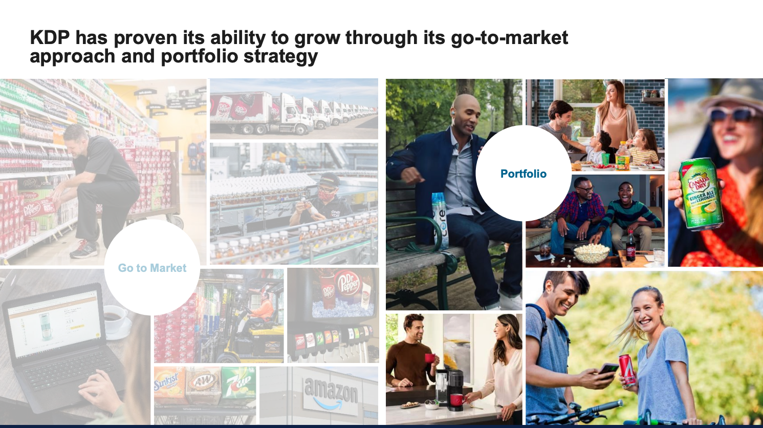
In the KDP slide below, they are talkingabout Direct Store Delivery, a rather dry topic. However, the images of their employees who make it happen, bring the idea to life in a way words alone cannot.
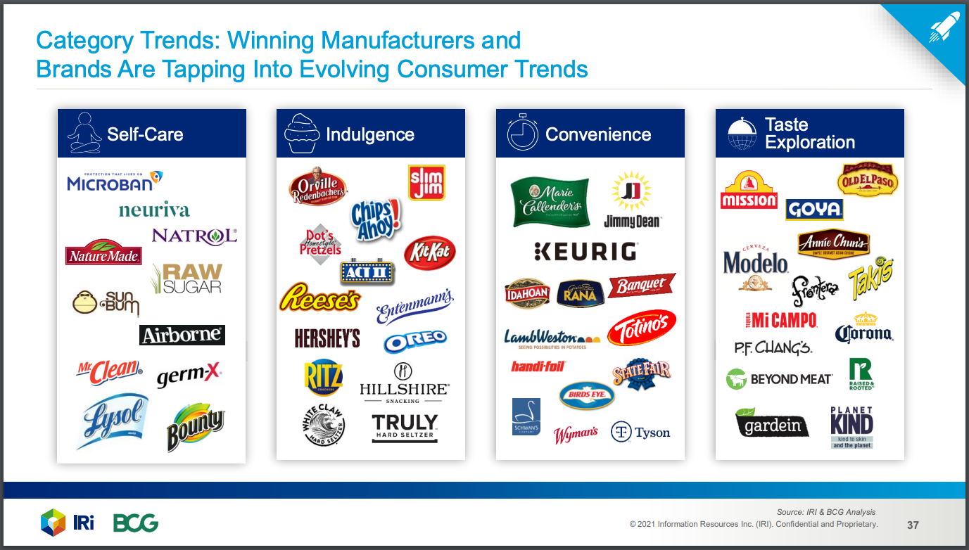
Idea #31: Group like objects together
Instead of one long list of bullet points, try grouping similar objects together. Think about what the buckets are and how you can categorize the items on the list.
Idea #32: Break content into columns
If there is a lot of information you have to cover on one slide, then use columns to do it. I've found this very useful for 1 page type summaries.
Idea #33: Use the quadrant structure
If you have 4 ideas or topics that you want to cover on one single slide, consider using the quadrant structure and putting each idea into it's own quadrant.
Idea #34: Hard pass on the 3D, please
As a general rule of thumb, avoid 3D as much as possible. It doesn't every add any value. And it doesn't even add aesthetic value. It just looks dated.
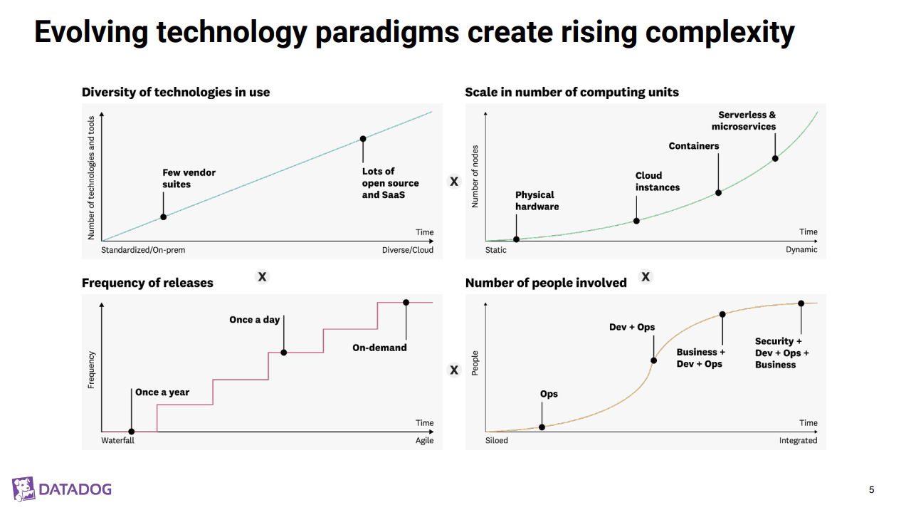
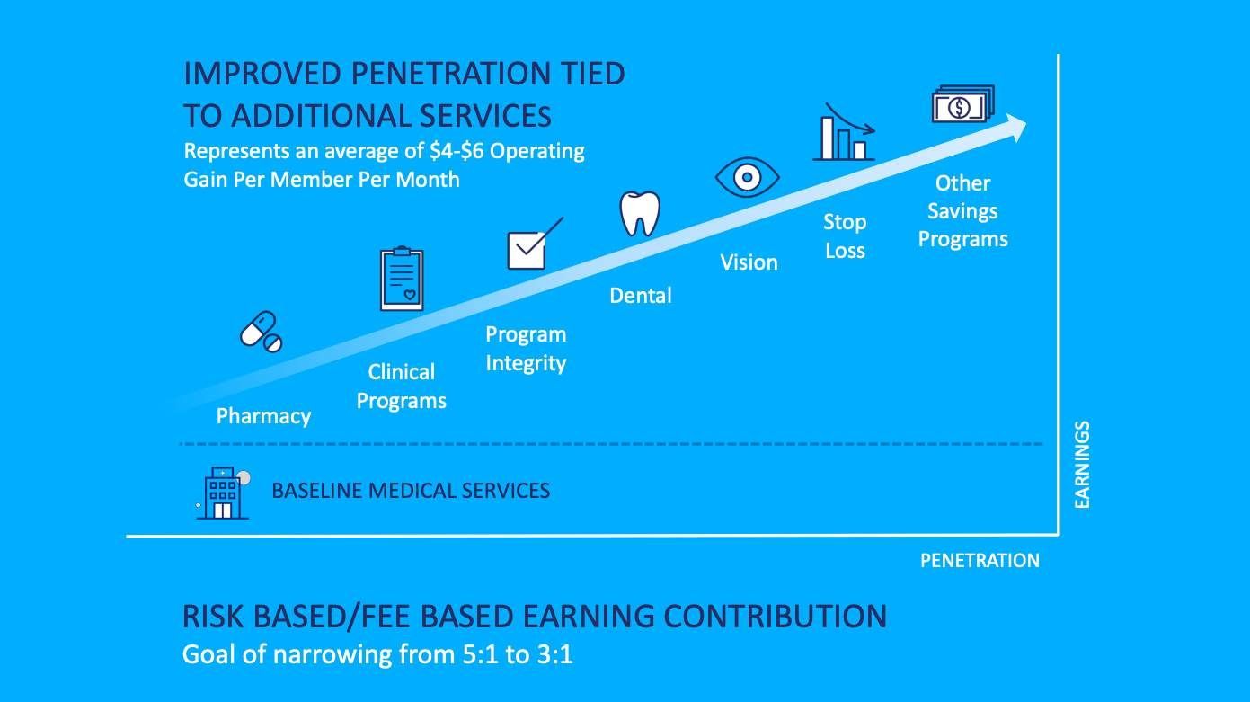
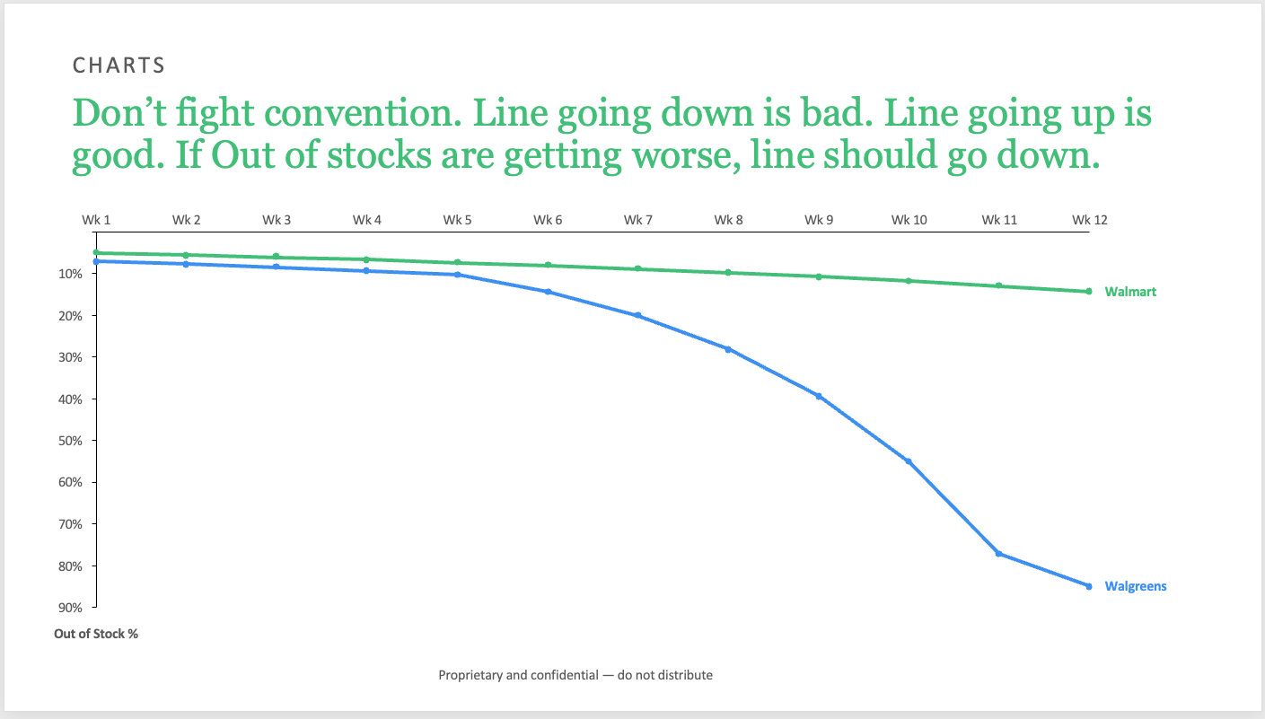
Idea #35: Go with conventions
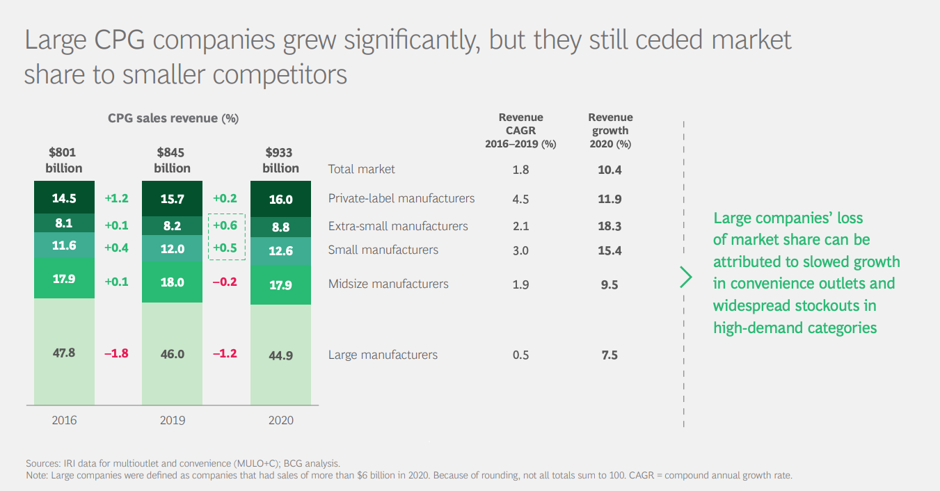
Try to leverage existing conventions instead of rewriting them. For example, if you have a normal line chart, then keep the typical conventions and have the Y-axis on the left and the X-axis on the bottom.
The chart below violates this convention and distracts from the message. Higher penetration means higher earnings. I had to spend extra time digesting the chart and wondering why the Y-axis was on the right instead of the left. When a chart convention is broken, there should be a good reason. There is no good reason for the example below.
Here's an example where you are using existing conventions to illustrate an idea. A higher out of stock number is bad. You want low out of stocks in order to capture all sales.
Idea #36: Go big
When using pictures, don't be afraid to go BIG! A bigger picture zoning in on key details is much stronger visually. Crop in to focus on what matters. This is an key composition idea from photography and carries over in the presentation design.

Idea #37: Drop the clutter
It is perfectly fine to have just one key message on a slide, especially if it's a high note in your presentation. Get rid of anything that distracts from the message. No lines, no arrows, no commentary.
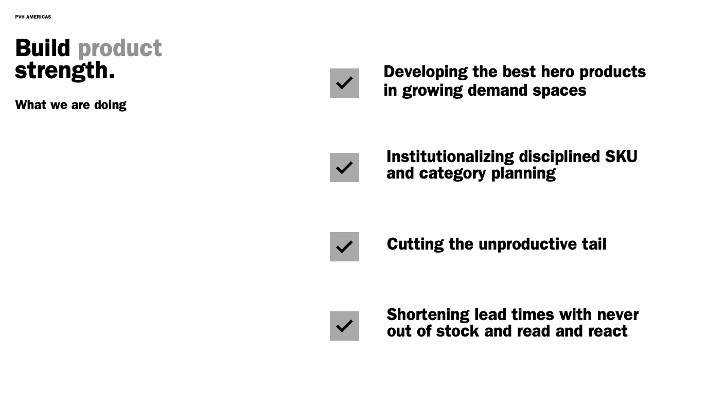
Idea #38: Use icons in the first column
This is a great way to break up a table that has too much text. A simple icon at the beginning of each row makes the slide much more welcoming and visually interesting. The icons are also very simple.
Idea #39: Red is bad, green is good
Use the color red to highlight challenges. Use the color green to highlight what is going well. These are universally understood color conventions.
Idea #40: Match text color
Pull the theme colors all the way through to the text headers. Know what colors are used for what purpose.
This is a nice way to add color with meaning to a slide. Each color identifies a different strategy.
Idea #41: Use your theme colors only
They're in here for a reason. The first four are for text and background. The next 6 are the "accent" colors that you should be using on your slide.
Idea #42: Try AI image generators
If you're trying to find that perfect image, but can't seem to find anything from Unsplash or Pexels, then try one of the new AI image generator tools!
Here are a few quick guides to get you started!
 Tom Tran
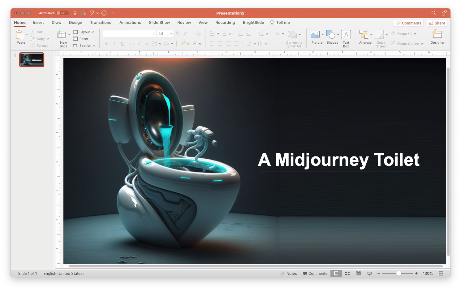 Tom Tran
Idea # 43: Summarize a key takeaway... again
The headline should make your key point clear and easy to understand. However, it's also helpful to add some color or detail to the commentary in the form of a call out next to the chart.
Idea #44: Play with Presenation Designer
This is going to be hit or miss. But try PowerPoint's new Designer tool.
It can help generate some concepts for title slides or transition slides. For analytical slides, it won't be able to offer much assistance. Hoewver, it is getting better and better all the time.
Idea #45: Give text breathing room
Put spacing before and after text so that it is not scrunched up and has room to breathe. This is similar to the idea of using white space strategically.
Idea #46: Add emphasis with bold or color
Use your accent color to highlight what you want the reader or audience to focus on. It's a nice, simple way to call attention to something important without having to draw extra arrows or other shapes.
Idea #47: Use SVG or PNG for logos
SVG logos can scale up in PowerPoint without losing any definition. PNG image files are the next best option because they can have a transparent background which means you can use it on white or black backgrounds.
JPGs are the last option because they lose resolution when saved (unless you set PowerPoint to not downsize any images).
What you want to avoid at all costs is having pixelated logos or images on a slide. You want to strive to be a professionalwith attention to detail.
Idea #48: Add transparency to de-emphasize
You can add transparency to images or content on a page in order to de-emphasize it and have your reader focus on something else on the slide.
Idea #49: Use visual cues
Use boxes, arrows, or other visual cues to point your audience to the key information on the slide. This is most helpful if you are showing a big table with a lot of rows and columns. Use a box to highlight where the focus should be.
Idea #50: Get rid of background images
The principle is to keep slides simple. A white backgrounds is perfectly acceptable. There's no need to put something in the background just to have something in the background.
The example below is what you should aim to avoid. It's hard to tell what the picture even is and teh slide would be much better if it were just plain white. There would actually be higher contrast between the text and the pure white background making the slide easier to read.
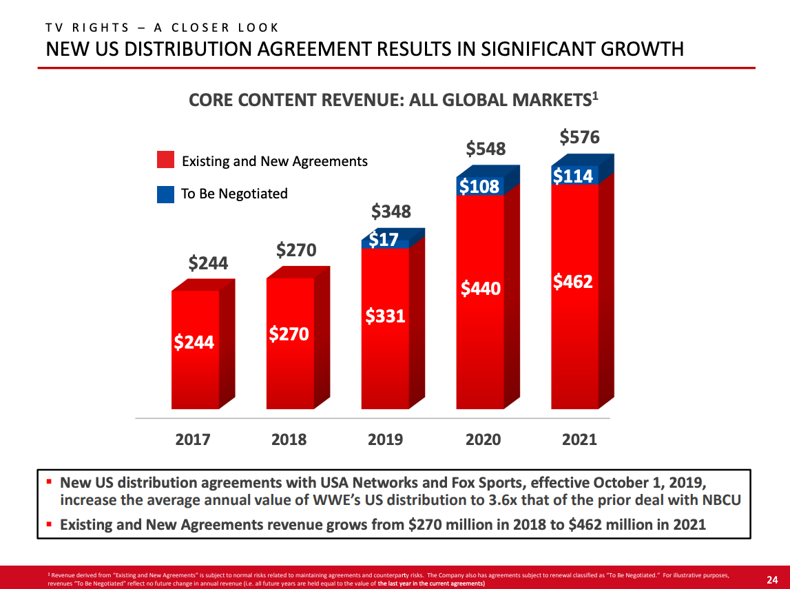
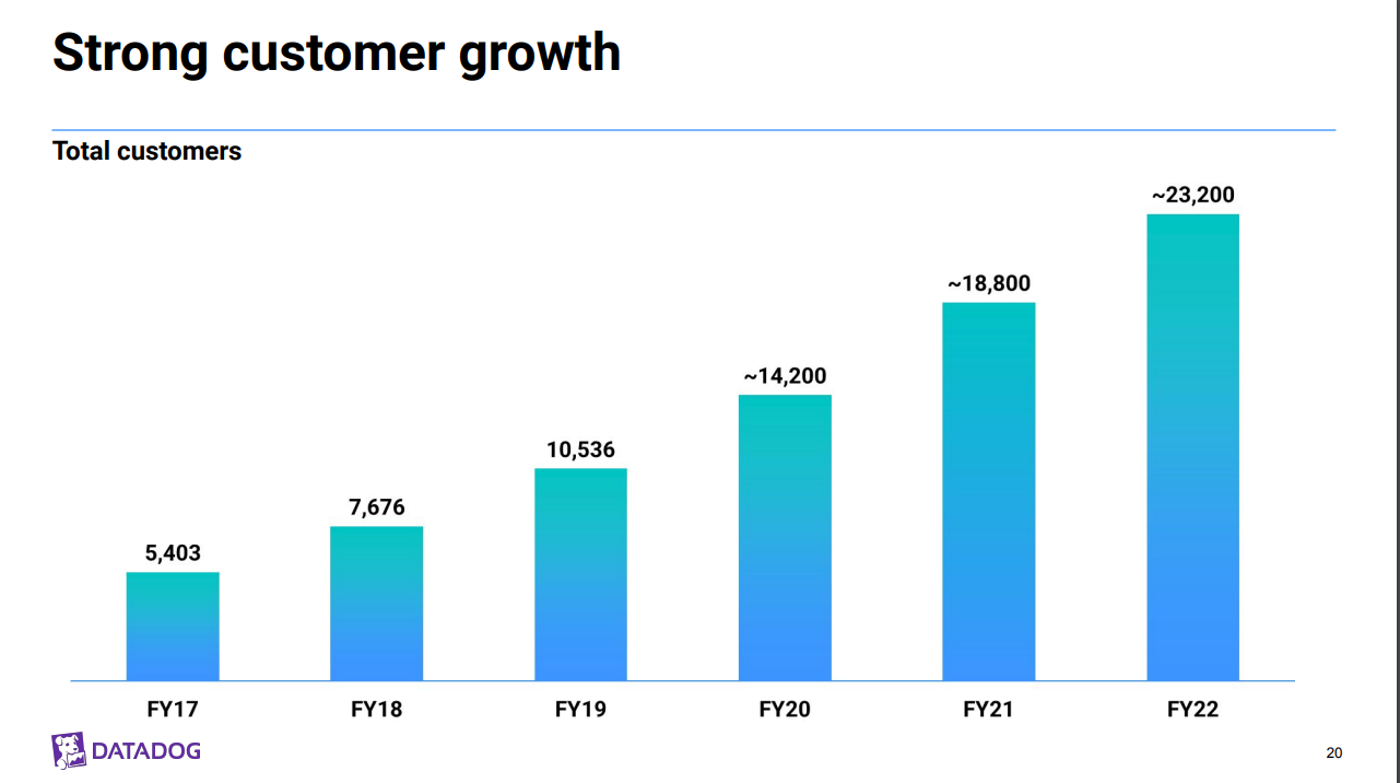
Idea #51: Never underestimate the bar chart
If you make a lot of charts, there may come a time when you're tempted by novelty and want to try a different kind of chart for year over year sales comparison. However, sometimes, all you need is a simple bar chart.
Idea #52: Use color to highlight one bar only
This is a great way to tell your audience where their attention should be and why. Change just one bar to a color that stands out and explain why it matters.
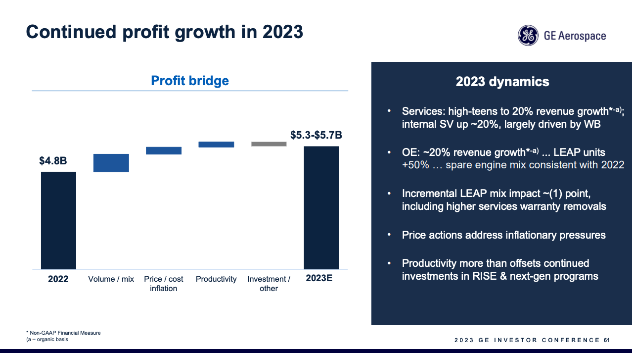
Idea #53: Master the waterfall chart
Often, this is one of the most insightful charts because it breaks down where you were, what happened, and where you will end up. It clearly breaks out different drivers of the business and shows the relative importance of each driver.
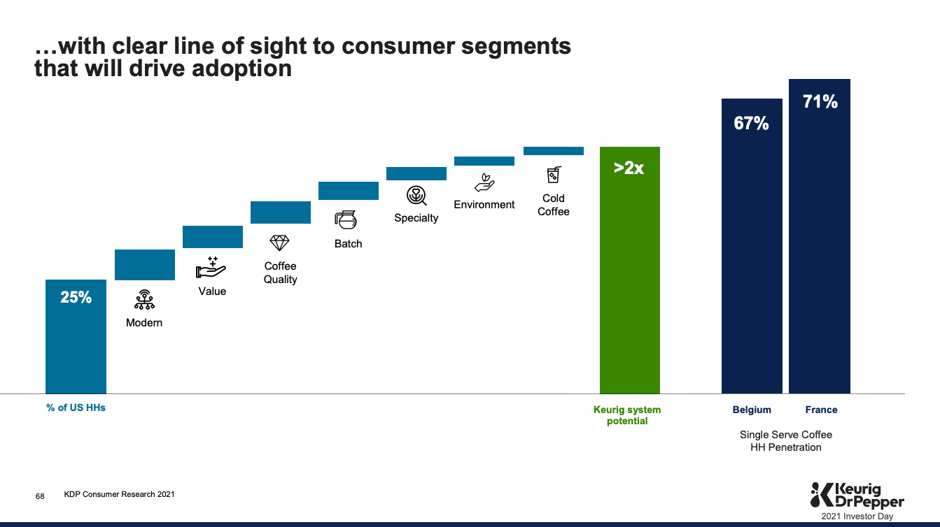
Idea #54: Add a comparison bar to the waterfall
A comparison bar chart is a great frame of reference to help understand where a brand/business should be, even if it is not quite there yet.
The examplebelow shows how KDP is planning to grow their Single serve Keurig cup coffee business so that it can reach the Household penertaion of Belgium or France.
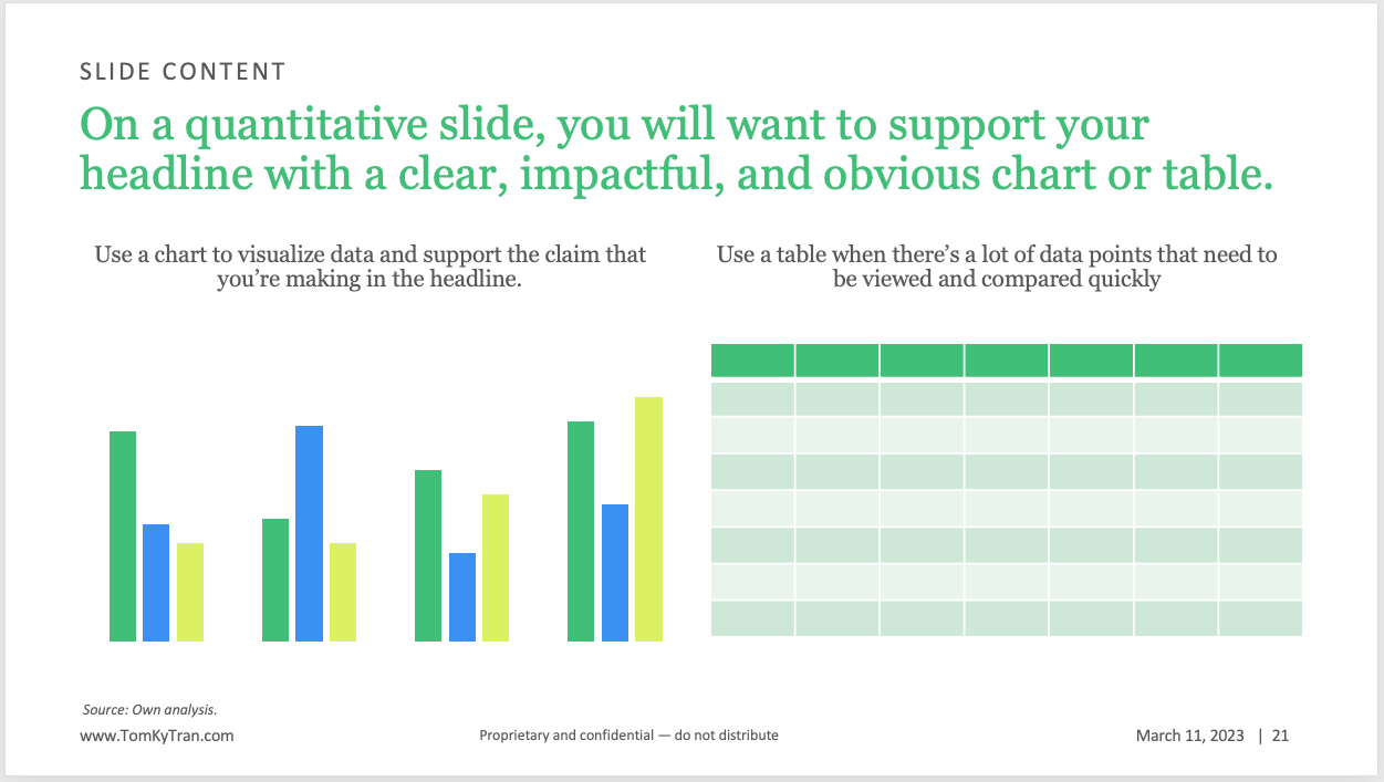
Idea #55: Decide between chart or table
If there's one key idea you want to focus on, then you'll likely use the chart. If there are a lot of numbers and you want to be able to compare quickly, then you will want to use a table.
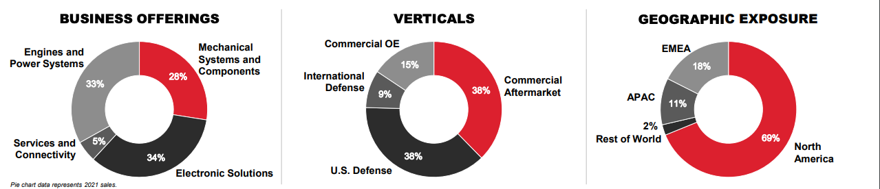
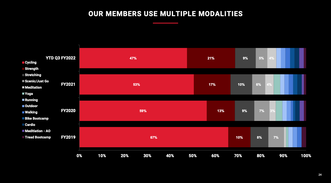
Idea #56: Swap pie/donut charts for bar or waterfall charts
This isn't bad, but it's even easier to compare segment sizes when the data is shown as a bar chart. The waterfallchart s also a modern way of showing how different segments sum up to the while.
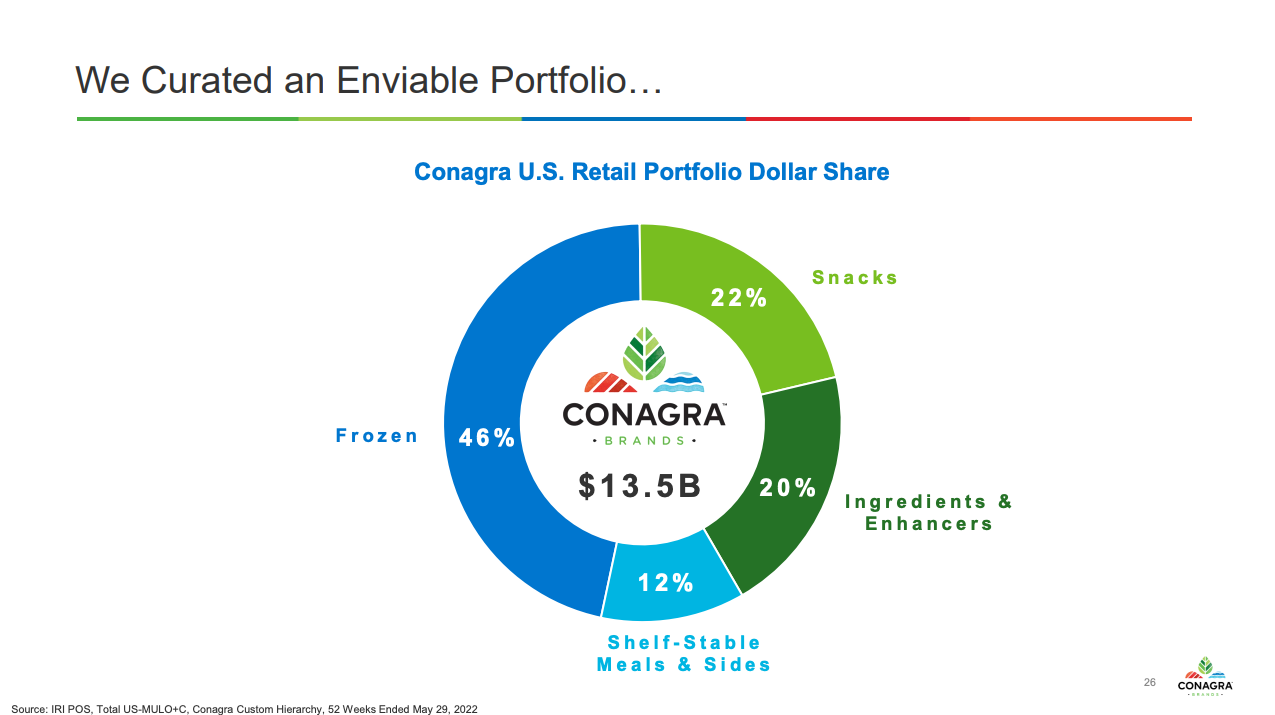
These donut charts might be easier to read as column charts.
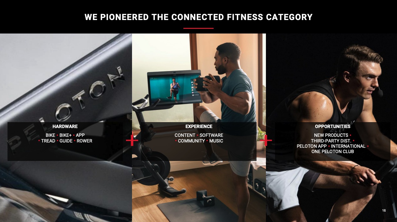
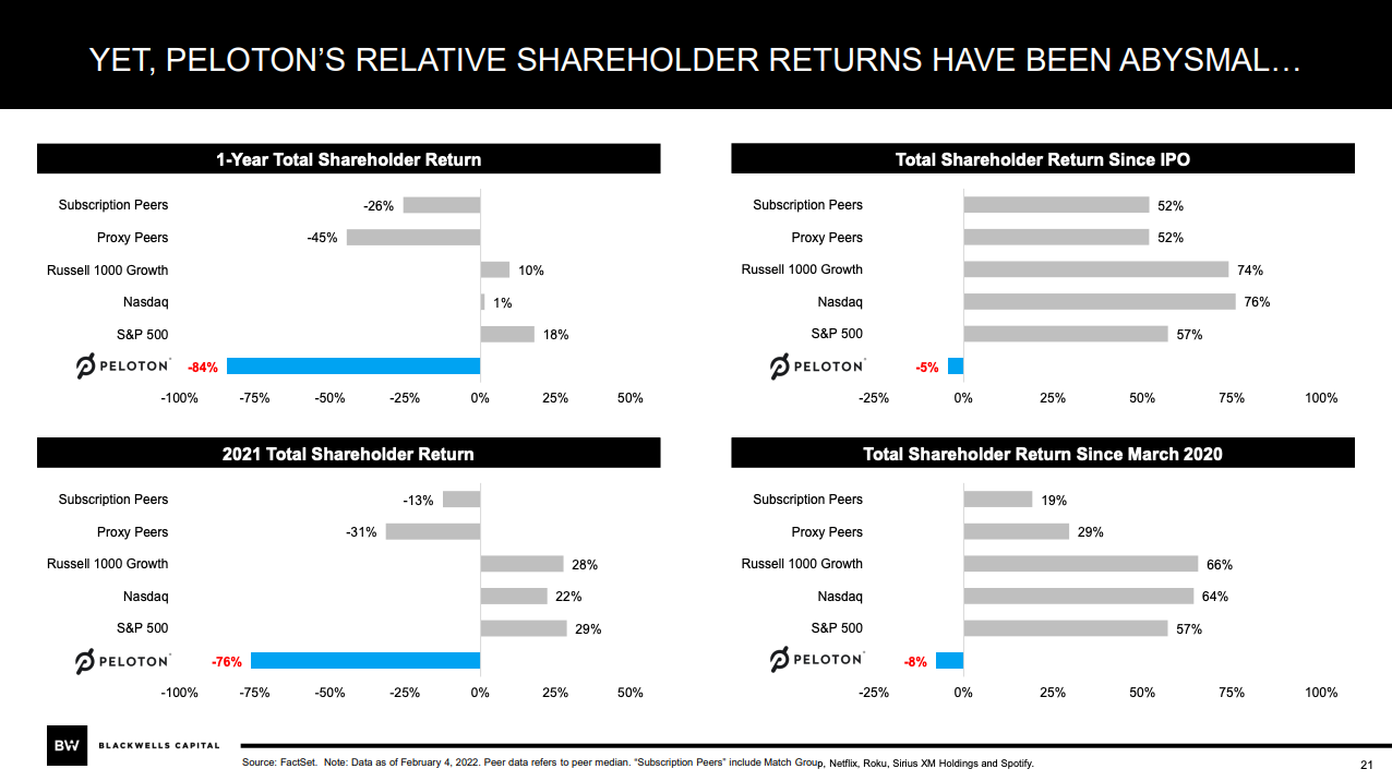
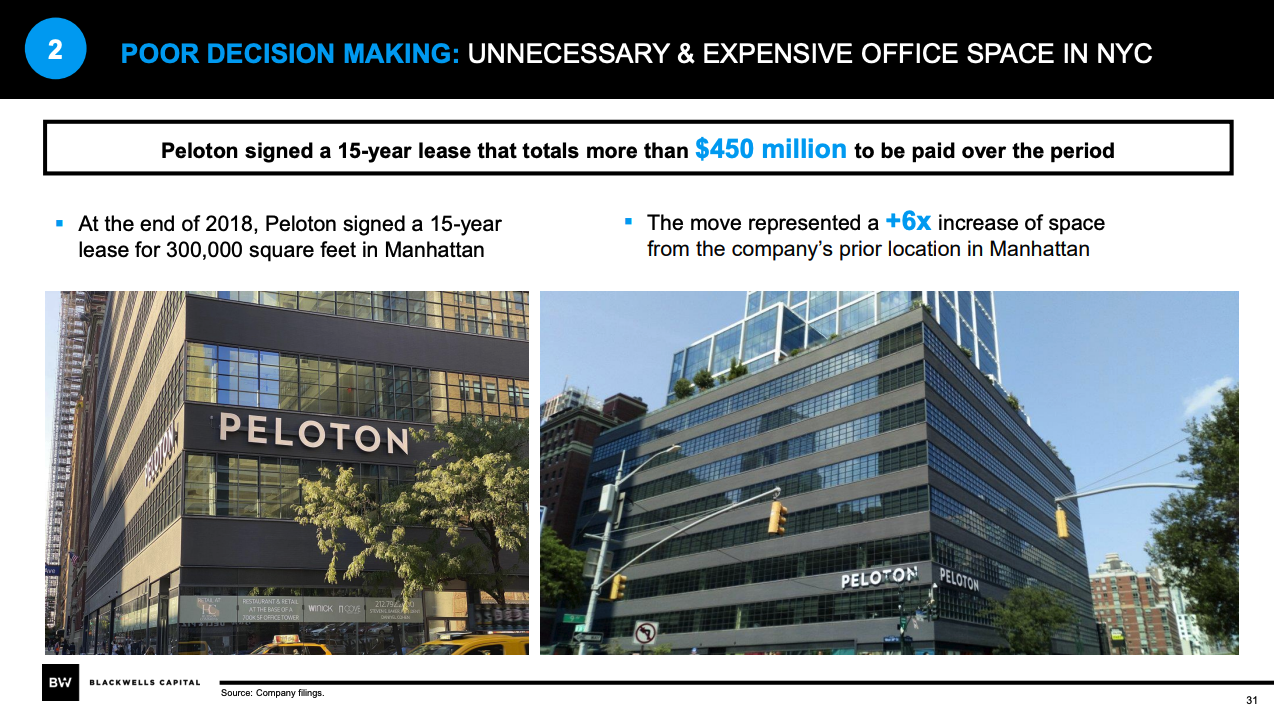
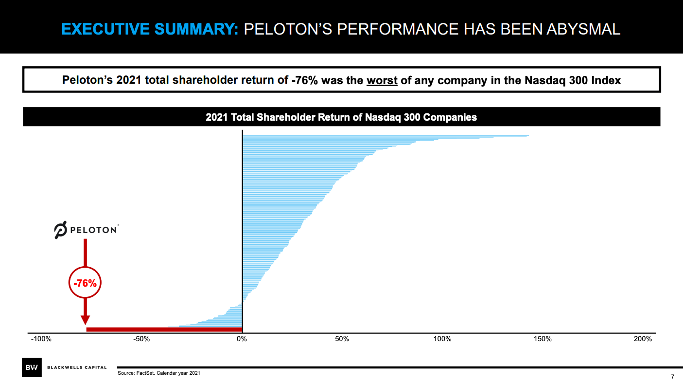
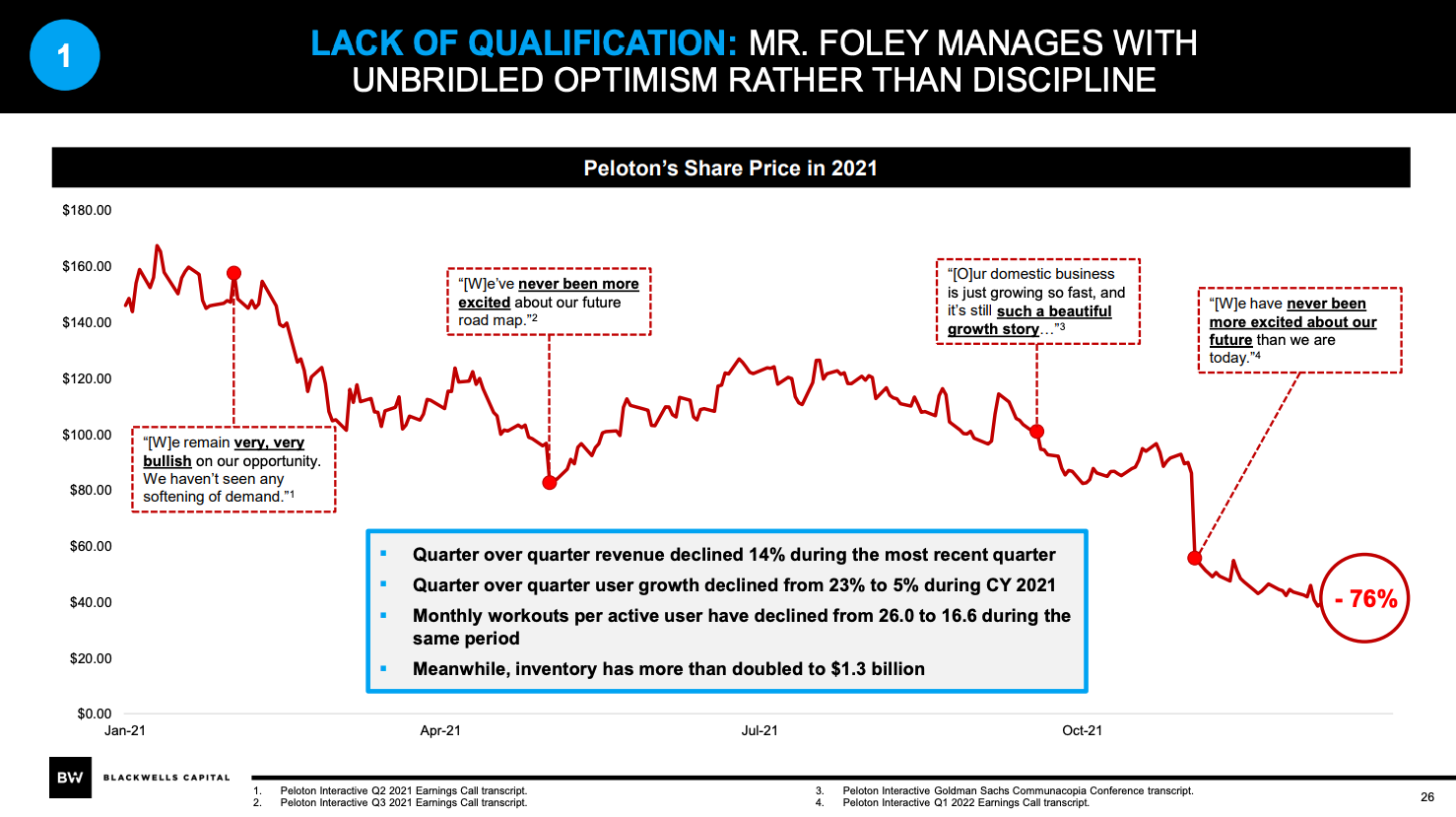
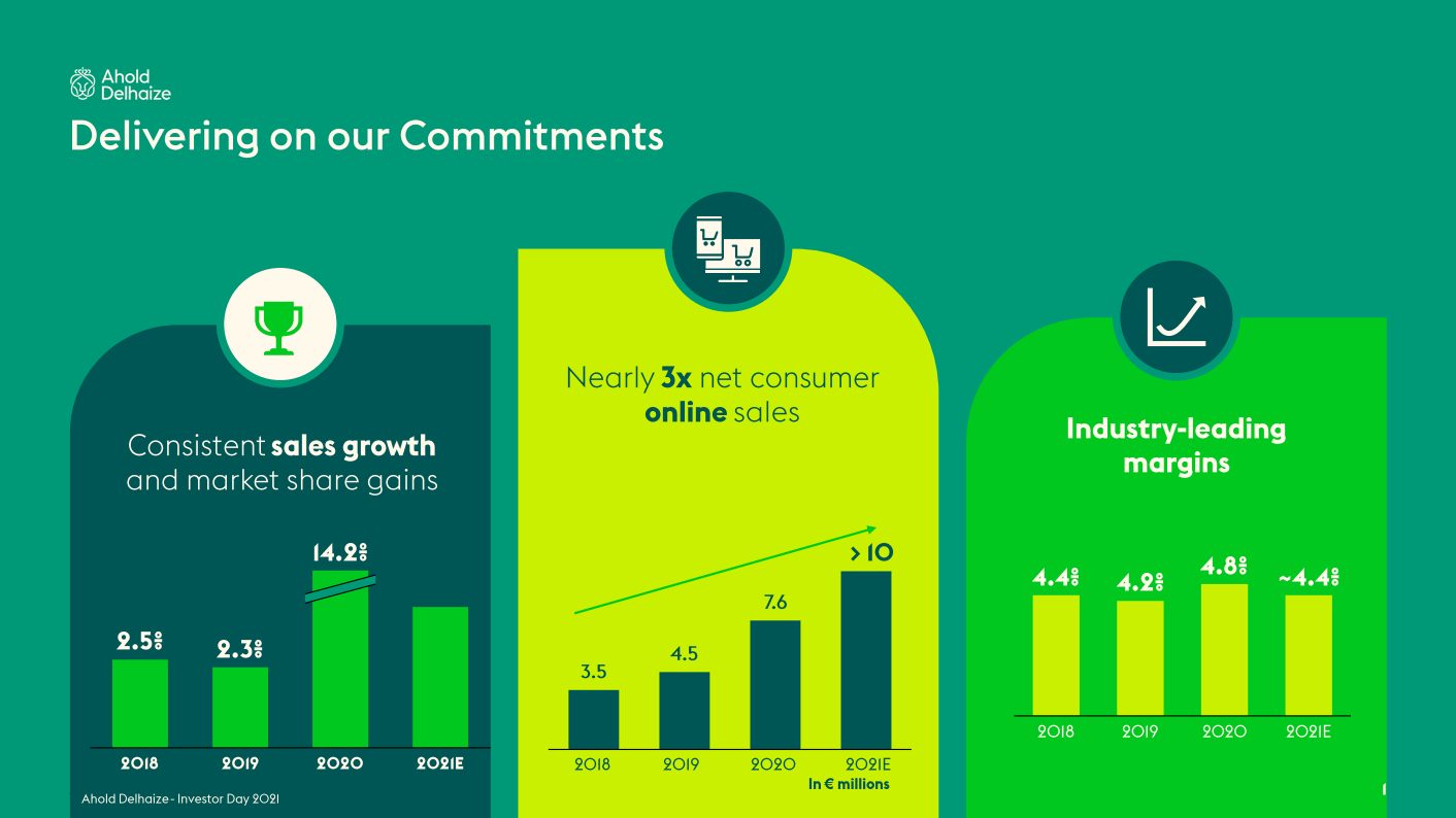
Idea #57: Make a statement with a sorted bar chart
I love how clearly and powerfully the slide below makes the case that Peloton is a stock underperformer. The color red highlights how it is far below peers. No other companies on the chart really matters so their names are not called out on the Y-axis.
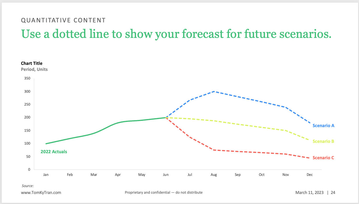
Idea #58: Use a dotted line to show forecasts
To differentiate actualized data and forecasted data, use a dotted line for the forecast. You can add different colors to show low/medium/high scenarios .
Idea #59: Use total difference arrows
If you have Think-Cell, you can add these very easily and they stay automatically updated based on the underlying data. If you don't have Think-Cell, you can draw these arrows manually.
Tom Tran
These total difference arrows makes it very easy for your audience to see the year over year change.
In the context of the whole slide.
Idea #60: Show off with bar charts
Bar charts are so easy to read and so easy to understand that you can use them to show off how well something is going. The difference between column heights will help you drive your message home.
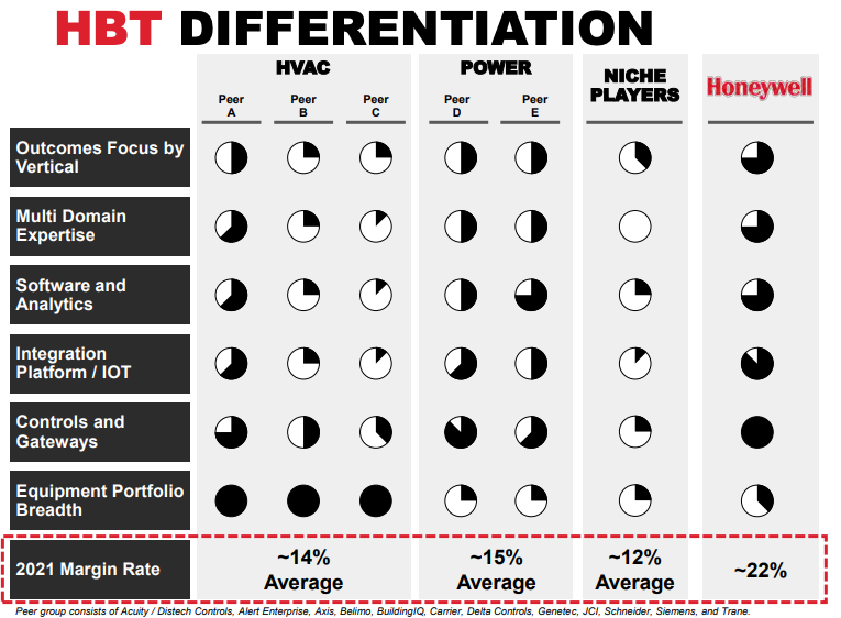
Idea #61: Use Harvey Balls
These are most common in consulting style presentations, but are a really great way to see how much progress has been made on different areas or initiatives.
Idea #62: Add data below column chart
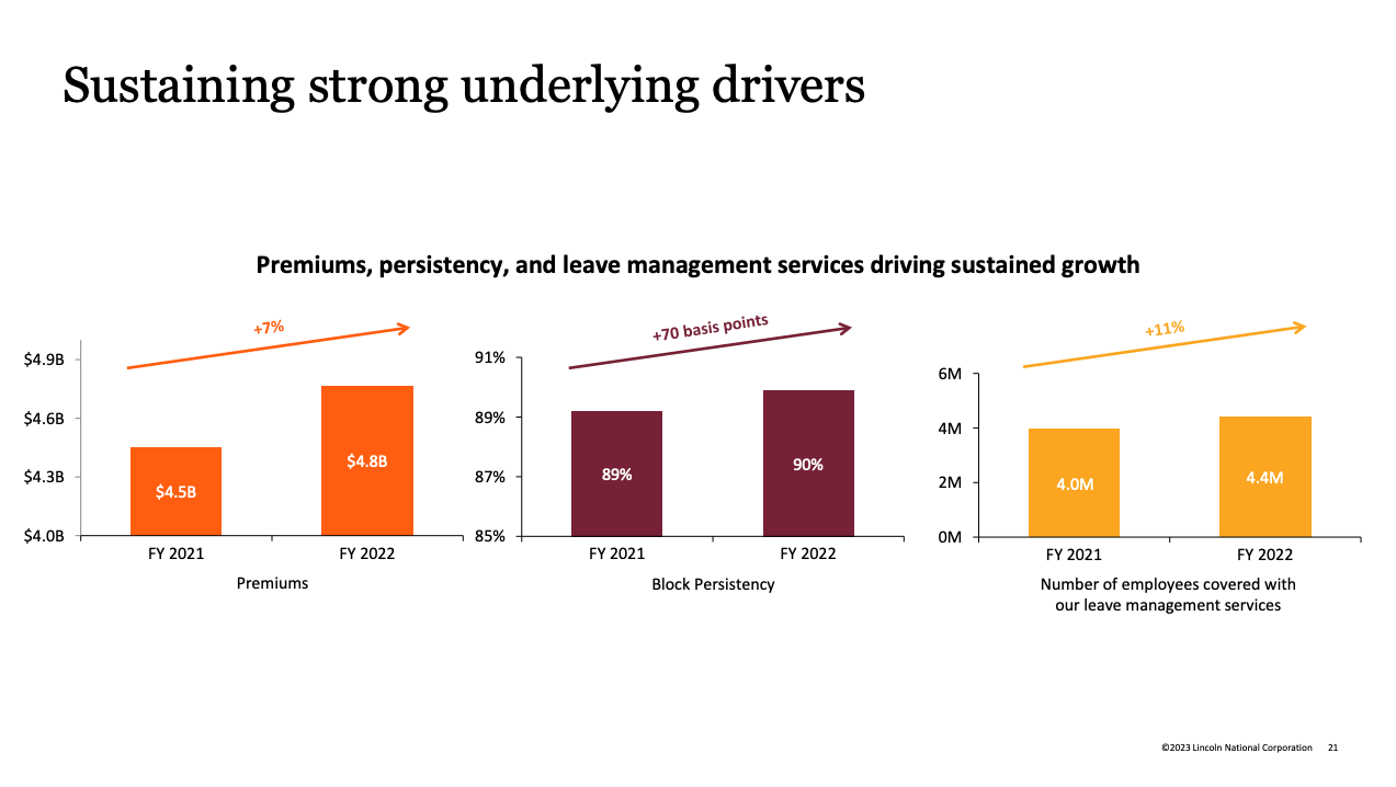
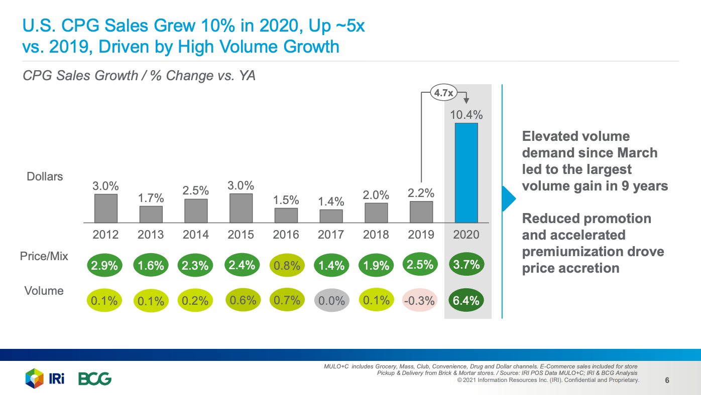
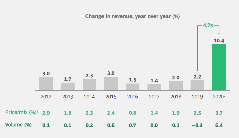
It's could be helpful to see % Change vs Year Ago or some other relevant statistic below a column chart.
The example below shows the impact of increased "Price/Mix" and "Volume." It's helpful because it tease out what is driving the overall $ Volume Growth.
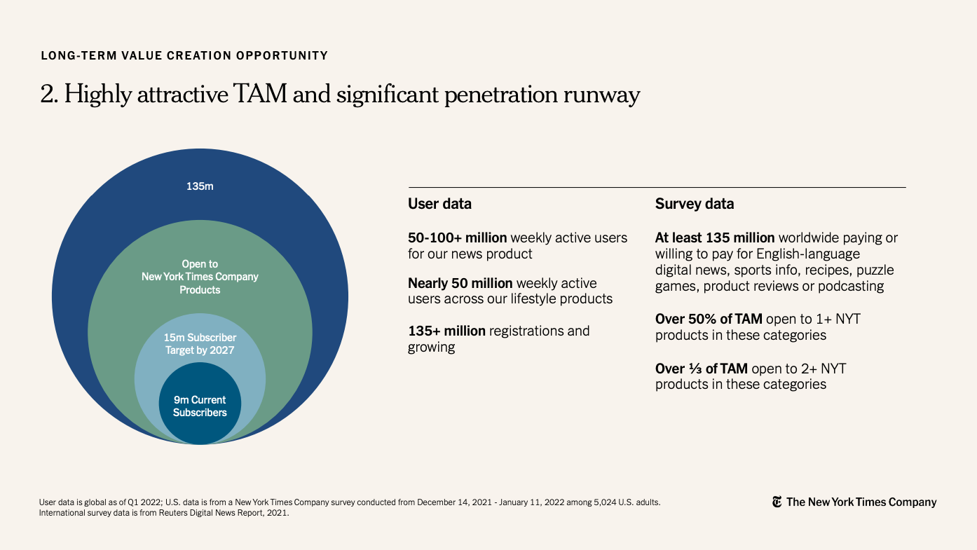
Idea #63: Use overlapping circles to show market size
This is a classic diagram that helps frame up how big the market for a category is. It's visually very easy to understand and it doesn't have to be proportional to the actual area of the circles.
Idea #64: Use breaks on the Y-axis
If you want to zoom in on the difference between numbers that are relatively close together, the sneaky way is to charge the starting point of the Y-axis to a big number. This can cause suspicion for the data skeptics in your audience! Argubly, it tricks your audience into thinking that the difference looks bigger than it actually is.
However, if you add a break on the Y-axis, you are doing the same thing and letting your audience know that there has been some data taken out in order to show the difference more clearly. This is a much better way.
Idea #65: Build a data story with a triptych
Use 3 charts on 3 panels in order to tell a story. Ealier, we talked about the magic behind the number 3. It's back again!
Each part of the triptych reveals more information and ultimately supports the slide's main message.
Idea #66: Get rid of gridlines
Gridlines fall under the category of "chart junk" because it adds visual clutter without adding any value.
The gridlines on the chart below are not needed because the key message is that 57% of the beverage can carbon footprint can be cut. That is very clear from the numbers in the last column.
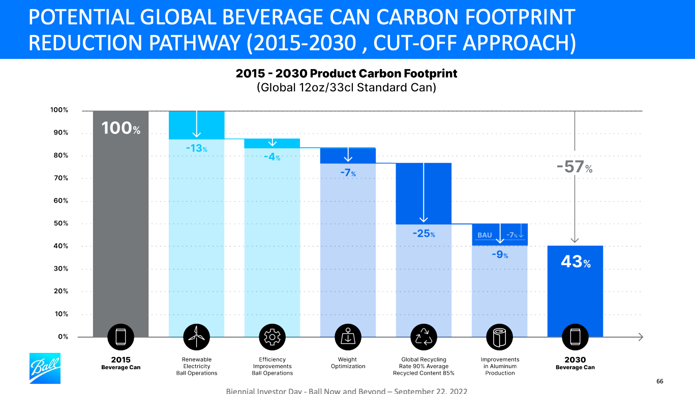
Notice how much cleaner a chart looks with there are no gridlines.
Idea #67: Show growth rates
For stacked column charts, add the growth rate for each category off to the right hand side of the chart. This is great context for the audience and provides a frame of reference and a key metric they'll be thinking about.
Idea #68: Make it obvious
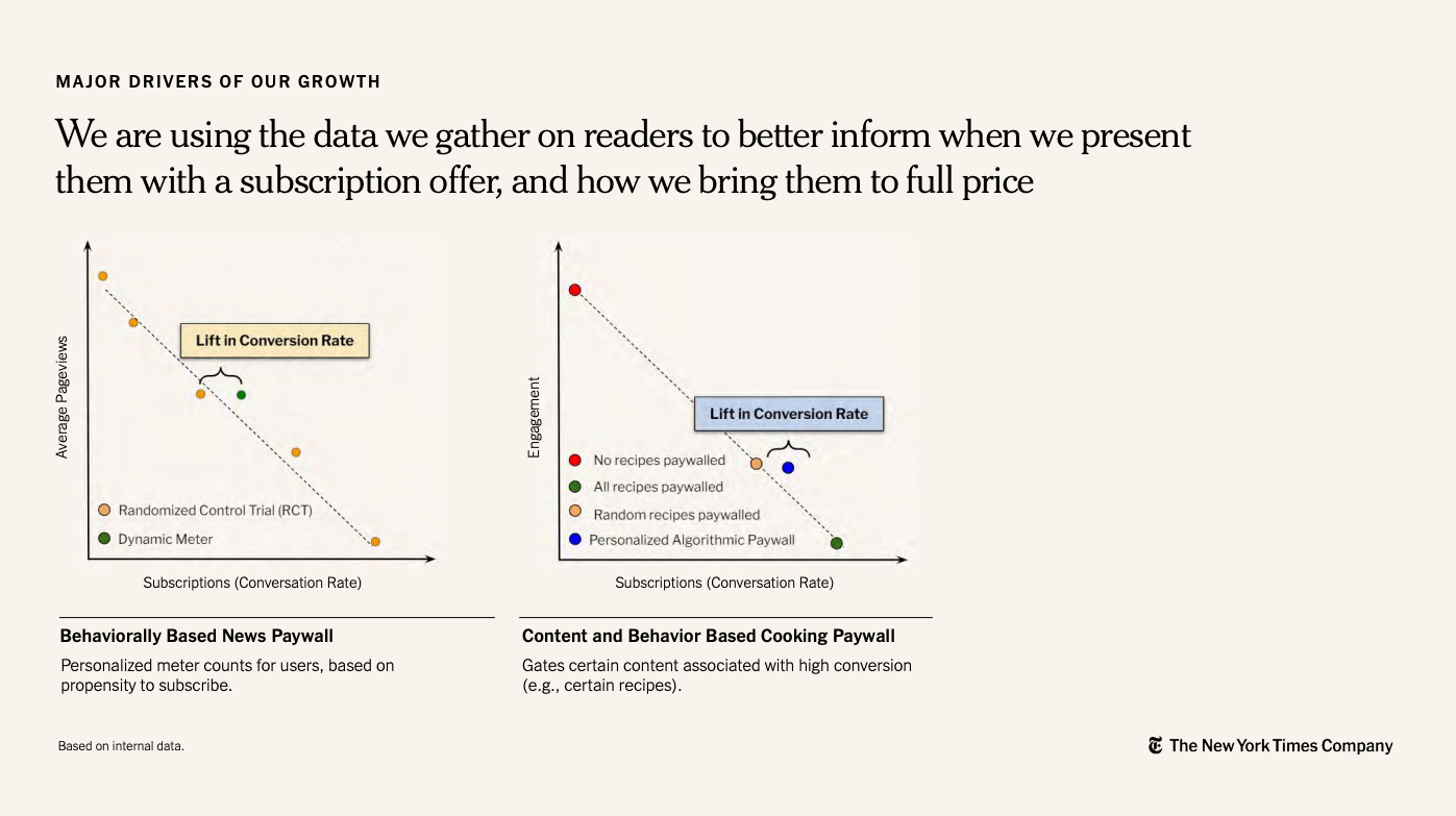
When you are the subject matter expert and worked on a study, it is easy to get enamored with the nuance and the subtleties. Think about the audience and simplify your message and your chart.
The NYT's does a great job of making the insight obvious. The topic at hand are randomized control trials (RCTs) and subscriber conversion optimization. Very heady and technical topics. However, they simplify it and show that conversion are higher with their two marketing tactics at work.
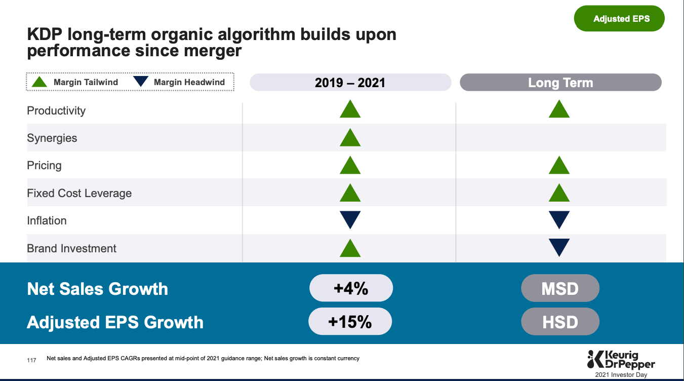
Idea #69: 👍 or 👎
Quickly show if a category or business driver is a good guy or bad guy. You an use Chose an icon that means good and an icon that means not-so-good.
There's an example from KDP. I would've changed the blue to red to make it more clear that those items are headwinds against the business.
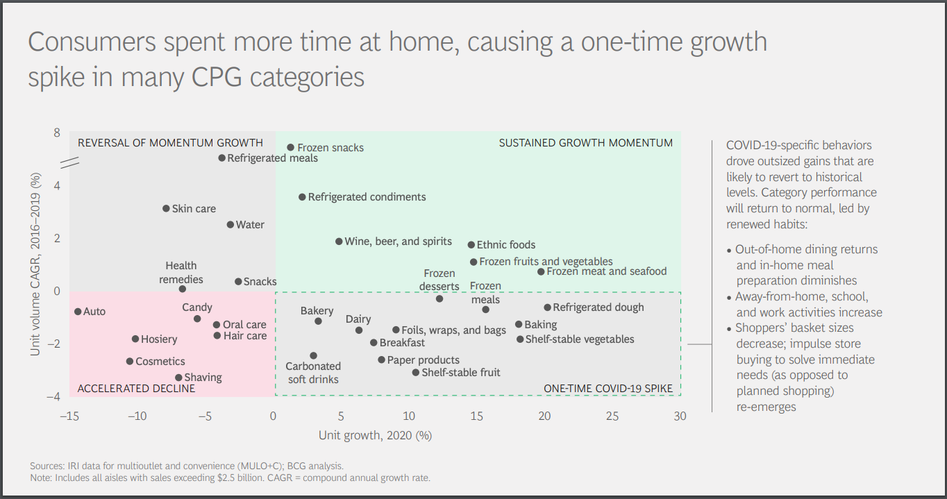
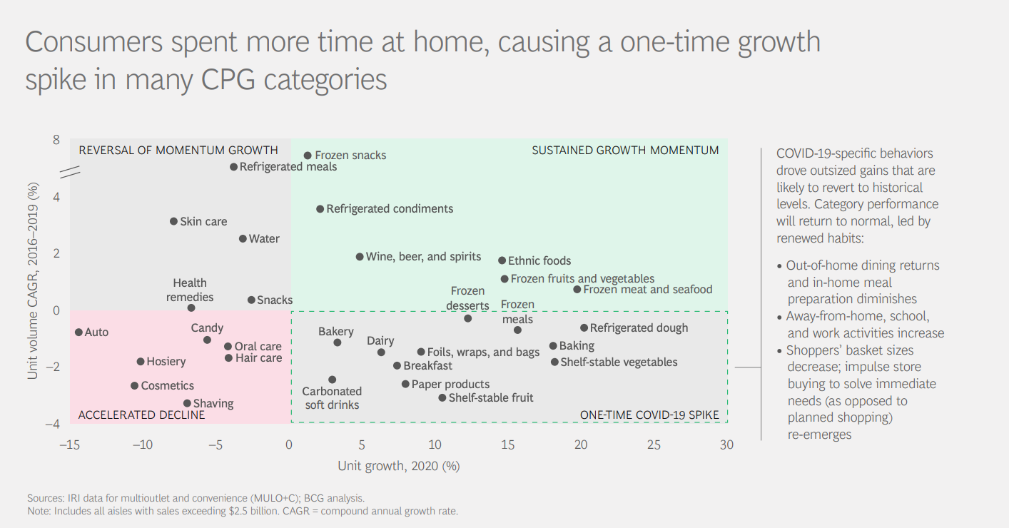
Idea #70: Use a scatter plot to find winners
Charting out categories based on 2 axis will help to identify winners and losers. In the example below, the top right quadrant represents categoriesthat are both (1) have high unit volumes and (2) have high growth rates. These are the categories that are most promising.
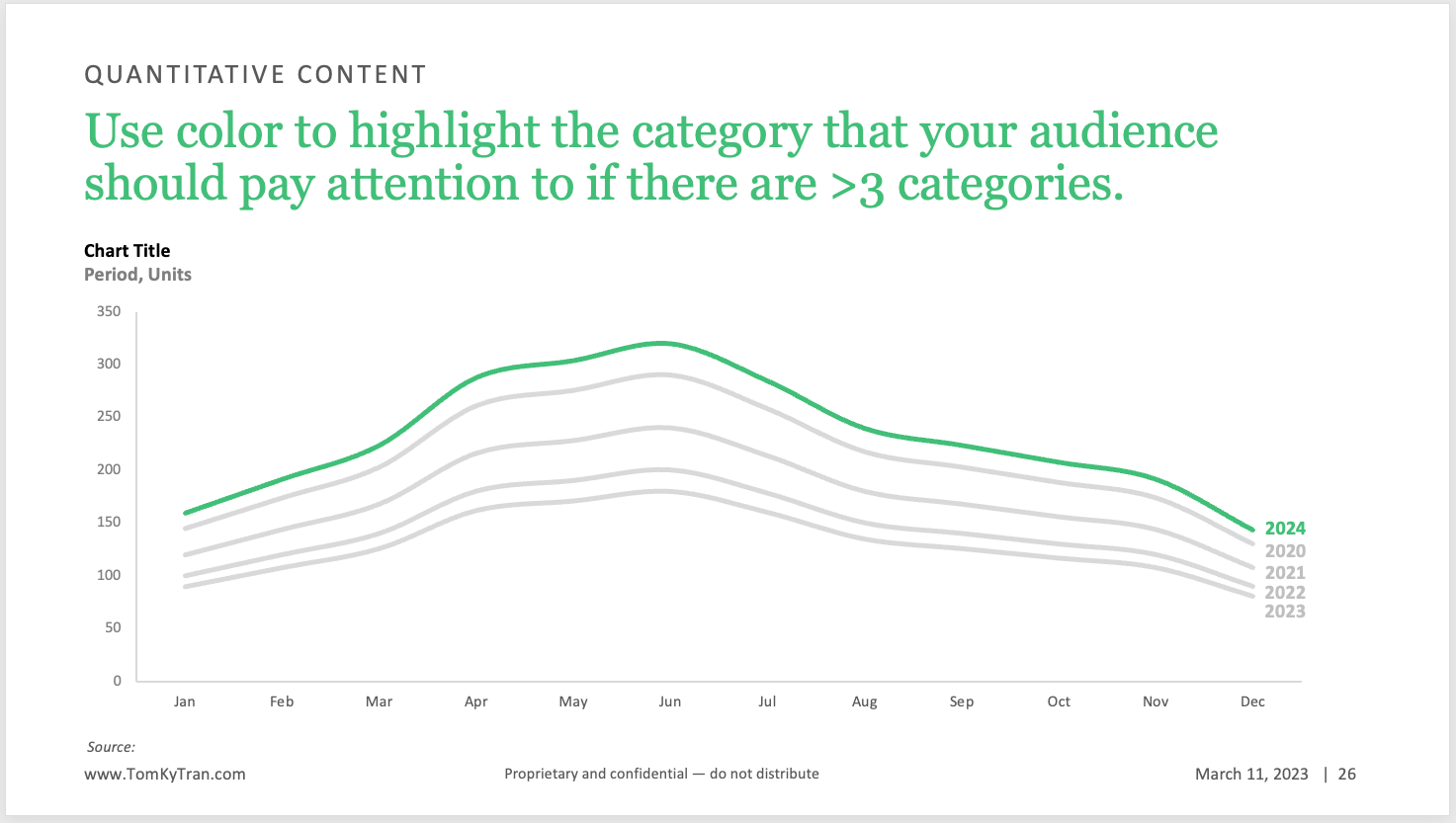
Idea #71: Use color to make one line the focus
Line charts are great to see trends over time. I like using them to look at seasonality over a 52 week period and year over year. Hoever, there's usually n point in giving each year a different color because the year that matters the most is the current year.
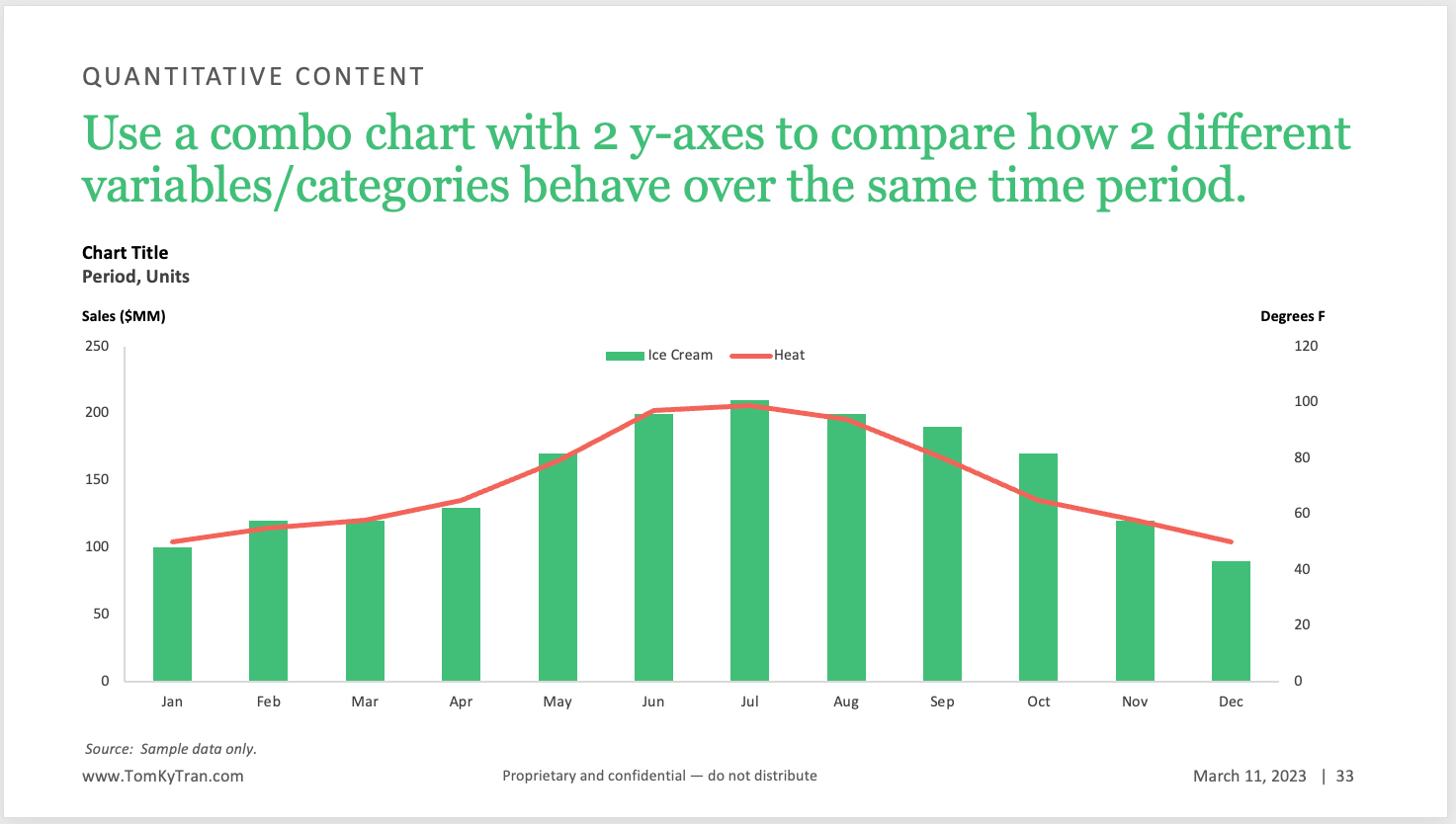
Idea #72: use a combo chart to compare data that is categorically different
Here, we're looking at ice cream sales volume by month and comparing it to the month's average temperature. If we plotted another food category that has seasonality, such as sports drinks, then it would be better to show both categories as lines or bars. But in this scenario, because temperature is categorically different than dollar sales, it is helpful to make that obvious by choosing a different chart type for each category
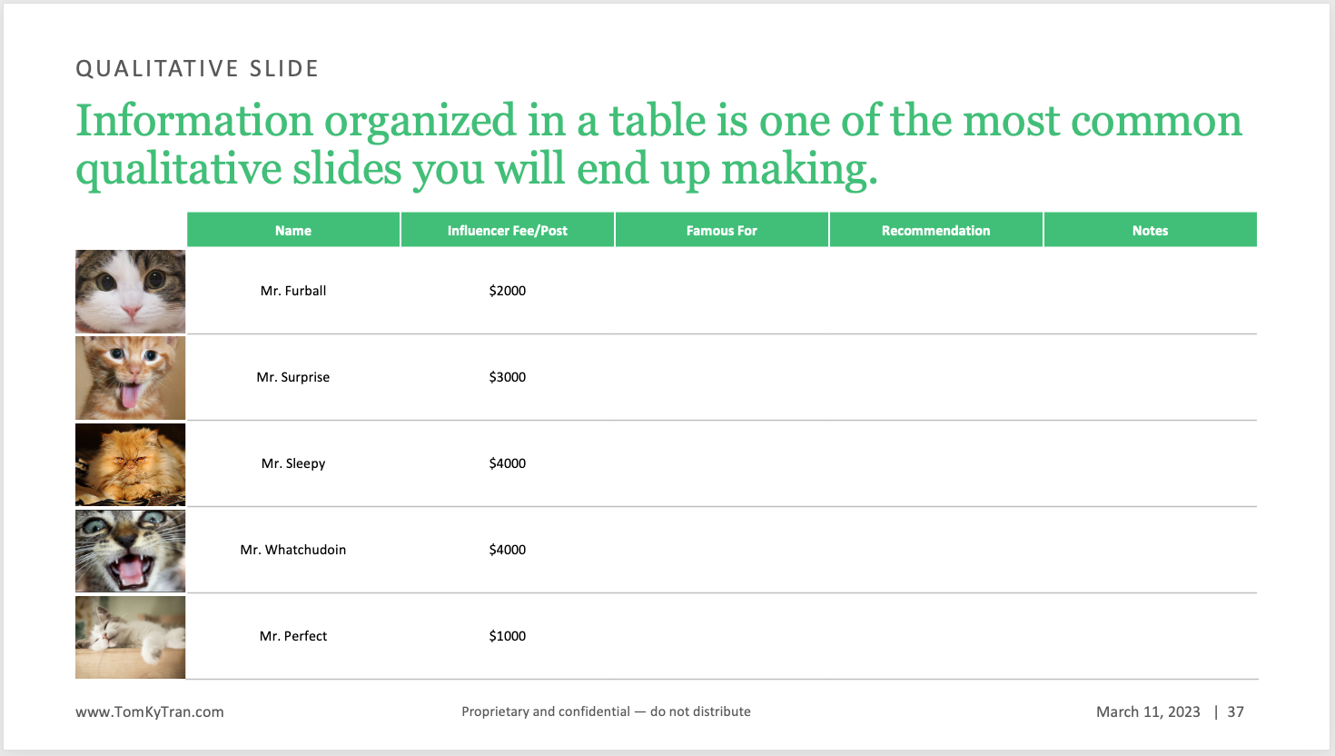
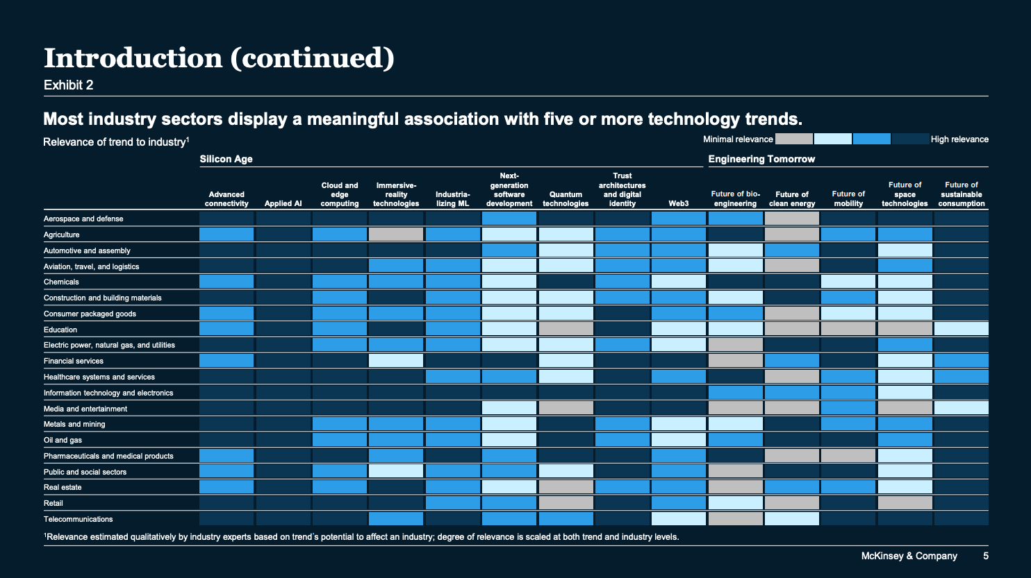
Idea #73: Use tables to organize information
Tables are a great way to organize information. It is always a good idea to start with a table because they can be easily customized and are so flexible. They also provide great structure and organization.
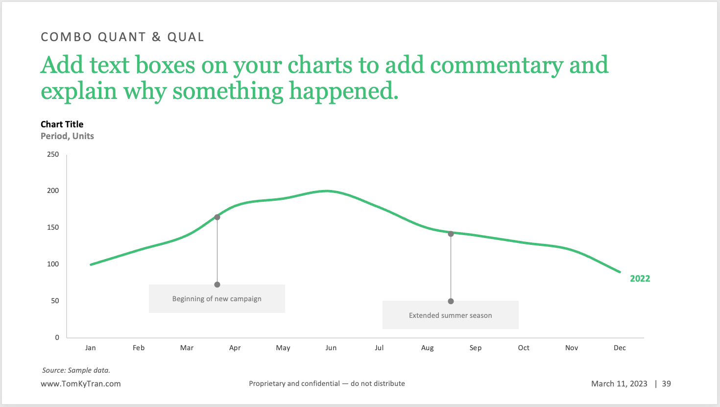
Idea #74: Use text boxes to call out key details
It is very helpful to see this information called out on the chart directly versus reading it in the headline and trying to map it to the chart.
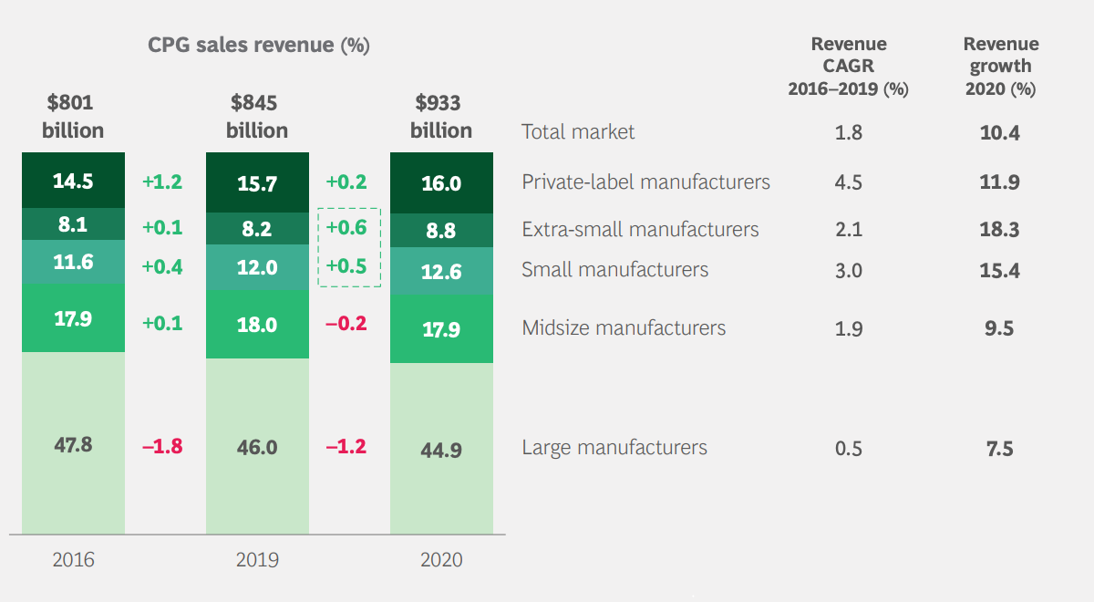
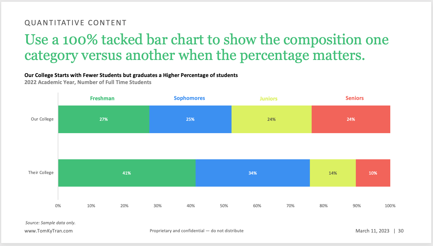
Idea #75: Use a 100% stacked bar chart
A 100% stacked bar chart is used to show the relative proportions of different categories in a dataset, with each bar representing 100% of the data. In this type of chart, the bars are divided into segments, with each segment representing a different category within the dataset.
100% stacked bar charts are useful when you want to compare the relative sizes of different categories and see how they contribute to the whole. They can be particularly effective when the data involves a large number of categories, making it difficult to compare individual values in a regular bar chart.
Idea #77: Use brand logos instead of text
It is more fun to see brand logos than text. however, this requires much more work to find each logo from Google Images and then format and align it on the slide. However, the payoff is worth it.
Idea #78: Just the KPI
Not all data has to be put into a chart. It can be helpful to see a single number for where a brand is today and where it hopes to be at some point in the future. The KPI would suffice and might even be more visually impactful.
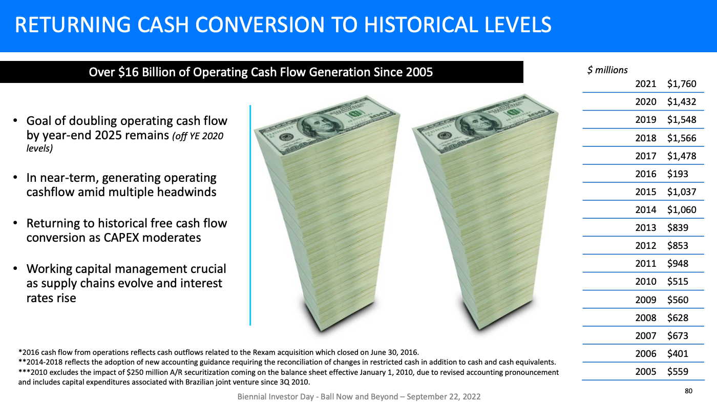
Idea #79: Set the right tone
Make sure that there is purpose and intention for every image/chart/graphic that you use and that it sets the right tone for the kind of presentation you want to have.
If it were up to me, I would've chosen a different visualization for the goal of doubling operating cash flow on this slide from Ball Compay. That kind of stack of Benjamins seems more appropriate in an episode of Breaking Bad or a rap music video than an Investor Day Presentation.
Idea #80: Screenshots are for drafts only
For a final presentation, a professional takes the time to reformat data into a clean and easy to digest format for the reader. Screenshots are great for ideating or drafting an early version of a deck. However, they should be replaced by a table or formatted to be consistent with the rest of the presentation.
Idea #81: Add a line to benchmark
Add a line to show where the average or benchmark performance is. This helps the audience understand the context and what can be considered strong performance.
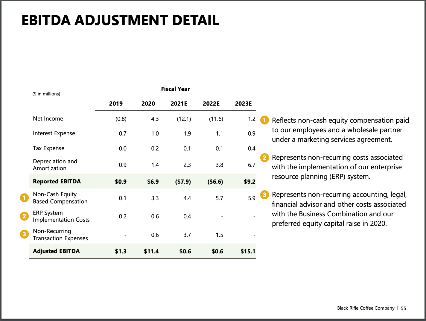
Idea #82: Callout bubbles
Add numbered callout bubbles next to key line items and then add commentary for each bubble. This is helpful for navigation within the slide.
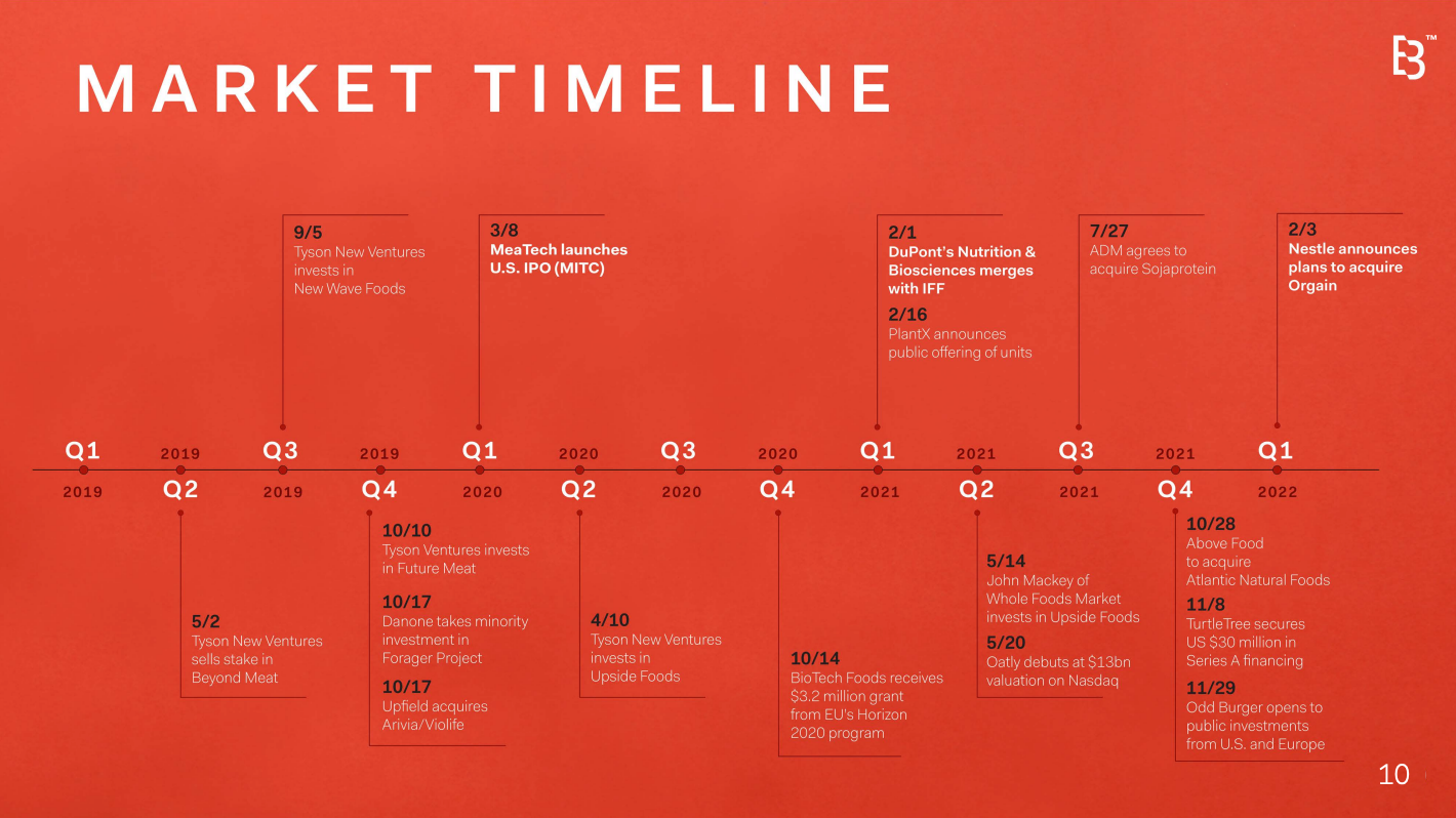
Idea #83: Add a timeline
Timelines are a great way to see where a brand has been and where it's going. It's a lot of work to build a custom timeline, so it's best to use one that comes with the theme or draw one keeping everything as simple as possible.
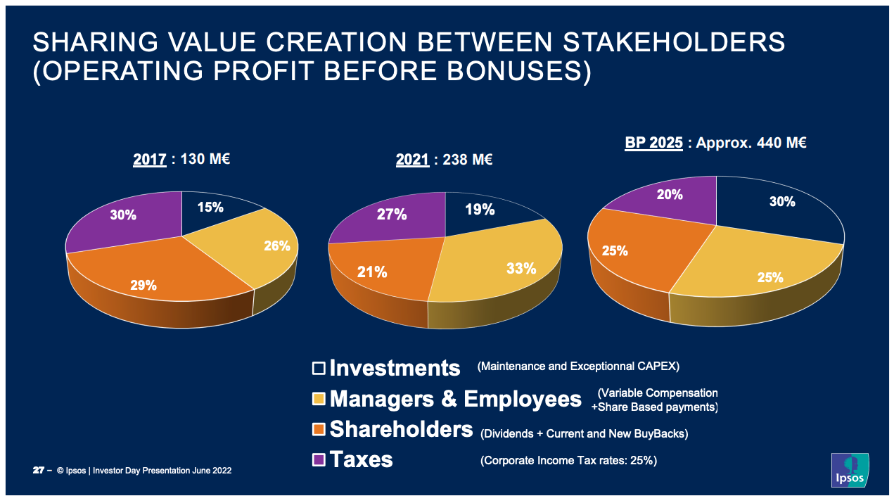
Idea #84: Save 3D for video games
Simplify the pie charts and make them flat. Remember, no 3D needed. In the example below, it would also help to chose a different blue for the "Investments" category since that blue blends in with the background color.
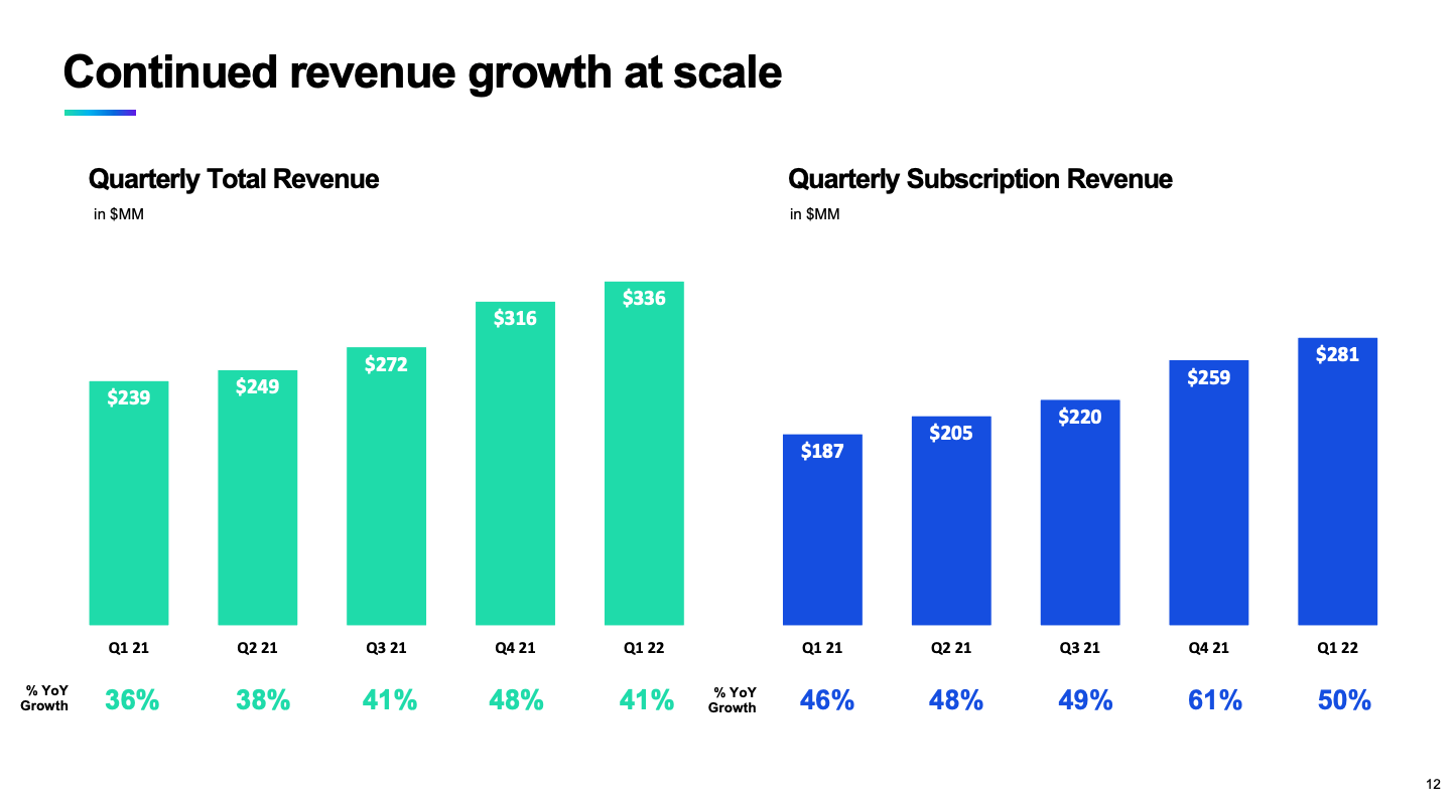
Idea #85: Keep axis the same proportion
To avoid confusing the reader, try to keep the Y-axis scale the same if you have two bar charts on the same page that are aligned and have the same units.
I like the slide below because the Y-axis is the same even though the different colors clearly shows that one chart is abotu Total Revenue and the other chart is about Subscription Revenue, a subset of Total Revenue.
Idea #86: Switch up the good 'ole bar chart
If your presentation has way too many bar charts, it might be time to add some variety to spice up the deck. An alternative is the buble area chart. It's not going to be as exact as the bar chart. The tradeoff is that it is not as easy to compare the area of a circle (pi * r^2) versus the height of a bar.
However, it does add variety. Look at the chart on the left of the slide below as an example.

Idea #87: Don't make the audience turn their head
Try to keep text horizontal as much as possible. This is much more natural and easier to read. When text is vertical, as on the slide below, it requires much more work from the audience to take in the information and to process it.
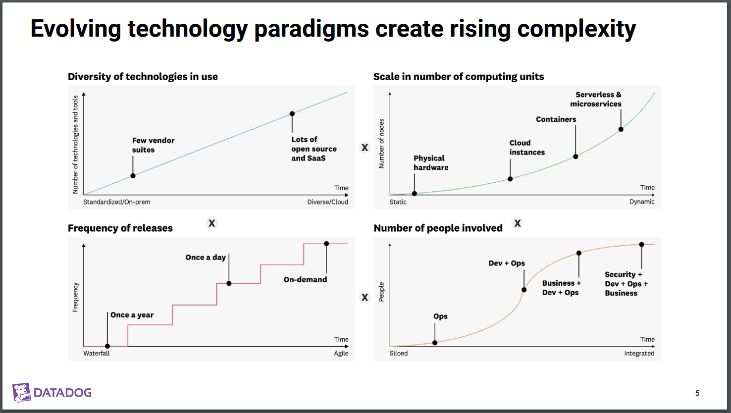
Idea #88: Diagram x Chart
Sometimes a diagram isn't quite right. And a chart alone isn't enough either. Say hello to the Diagram Chart which can be used to explain an overall idea or trend.
Idea #89: Use color boldly
Look how the confident following slide is in its use of color. It's clear that there are 3 different points being made based on the three different charts. A serious presentation can still be bold in its use of color. It doesn't have to be all black and white.
Idea #90: Use a low/med/high grid to rate
This is similar to a heatmap, except there isn't a gradient but rather distinct colors representing how low/high each mapped pair is.
Idea #91: Create a grid of charts
This is. a very advanced data visualization technique and requires a lot of planning and analysis beforehand. Instead of just one chart, it's 9 different, but related, charts in a 3x3 grid. Columns are parties in the value chain. Rows are the supply chain facts under investigation.
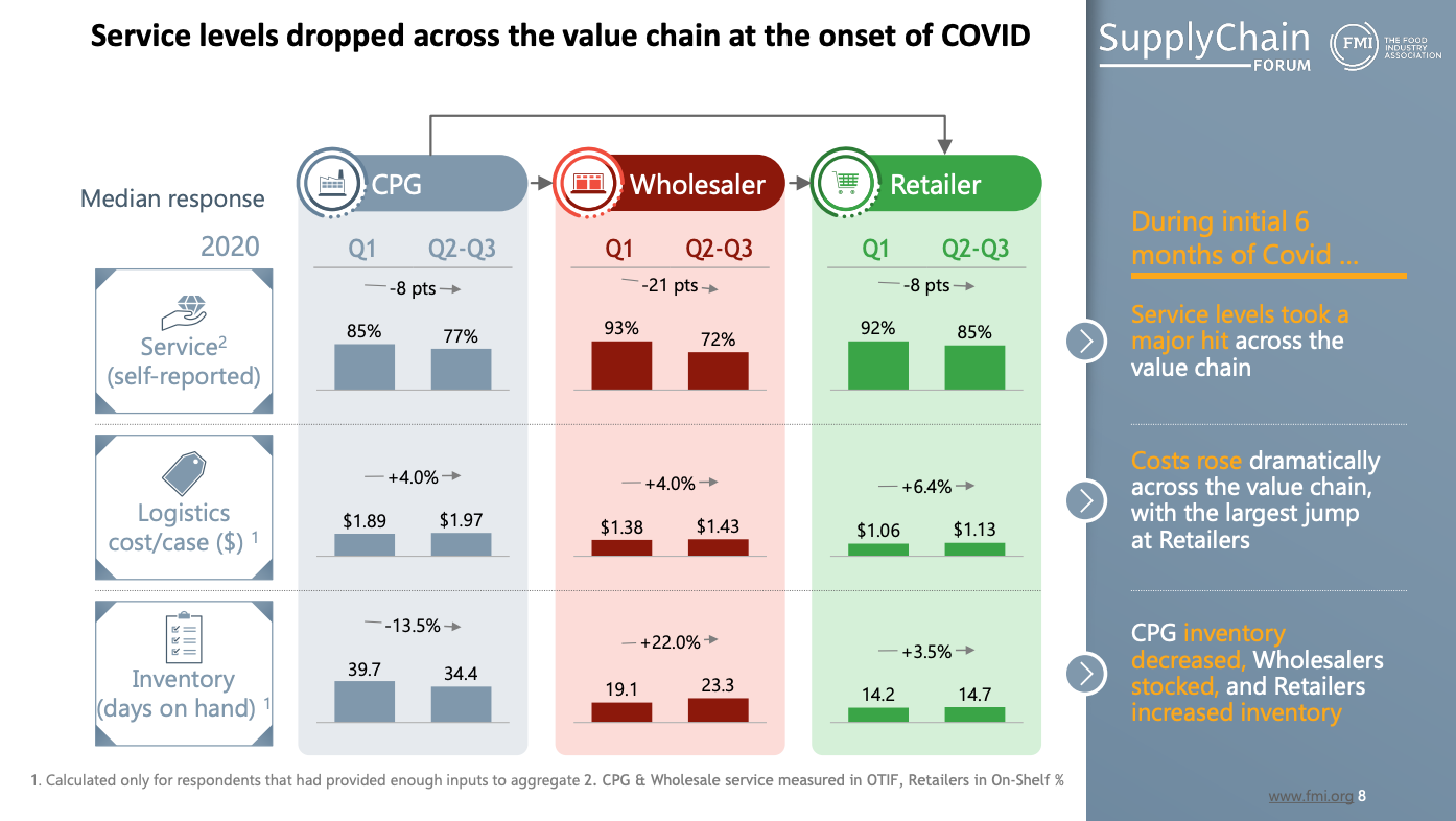
This is an incredible slide that is very, very hard to execute in practice.
Idea #92: Leave the executive summary for last
Once you're done building your presentation, go back and write the executive summary. Highlight the most important insights from the deck. What do you want the reader to take. away if they don't have time to review any actual slides, only the executive summary? That should guide your content on this page.
Idea #93: Add a thank you page
It's always a nice touch to thank your audience for their time and consideration.
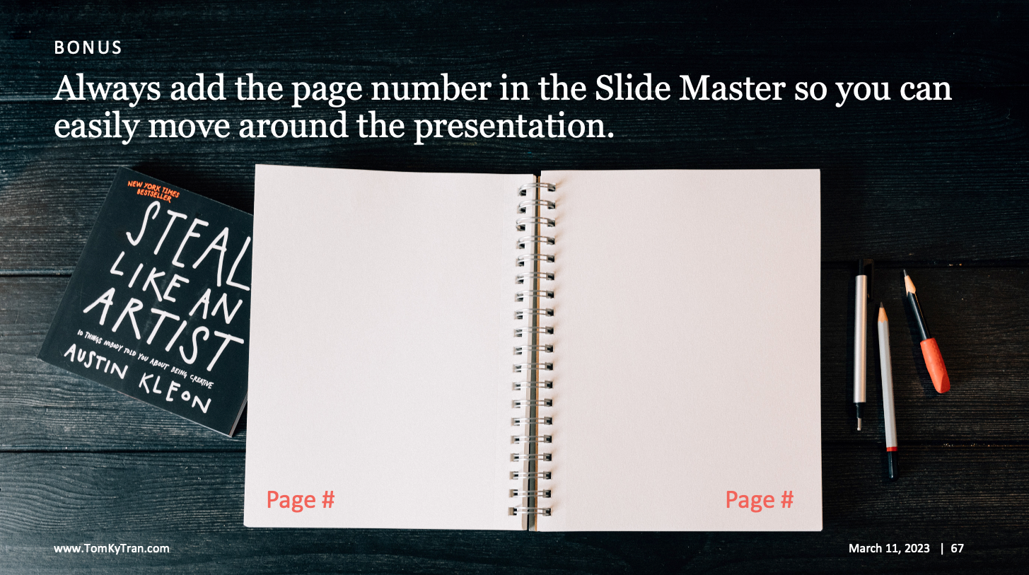
Idea #94: Add page numbers
Page numbers make navigation so much easier. And if you're in presentation mode, my favoritehack is to type in a page number followed by the Enter key. Instead of having to flip through dozens of slides, this shortcut jumps straight to the page number you entered!
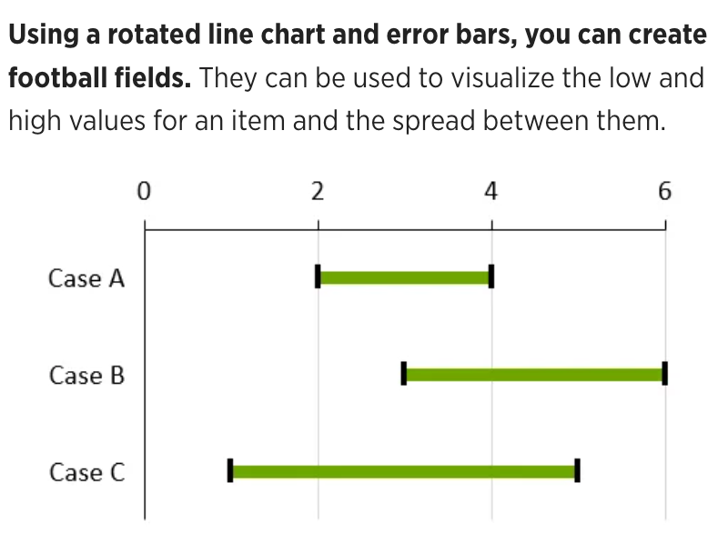
Idea #95: Try out Football Field charts
If you want to compare ranges between different categories, then use a Football Field chart. These are relatively modern charts that I've been seeing more and more often. You may need a PowerPoint add on such as Think-Cell in order to easily create it.
It's basically a rotated line chart with a low and a high number.